
VanillaCoke
Registered User
- Oct 30, 2013
- 24,884
- 14,761

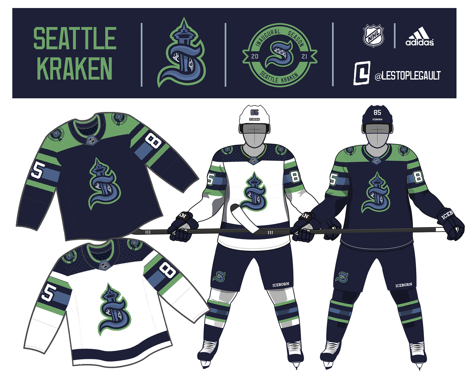
All 3 of these concepts are better than the bland, basic S that they somehow chose.
Funny people keep using this word to criticize the name. And it's not like they are going to be fans of the team anyways, why would they be embarrassed?embarrassing.
On a scale of 0- Jeff Goldblum I care althea amount I care at or around Pauly Shore.
I’d mind the name a lot less if the rest of the branding was equally left field, but this kind of follows the trend that the Jets started: a reserved, classy look. Unimposing blue, a sliver of red. This is like naming an energy drink “Lightning Bolt” and then making the can white with black Helvetica type.I respect that they went to left field for the name. Let's not forget, the kraken is a powerful, horrifying creature beyond all measure. A hockey team can only hope to achieve that ideal.
Yeah the overused Space Needle cliche logo definitely would have been much less criticized by the negative nellies. What's so special about any of those?
All 3 of these concepts are better than the bland, basic S that they somehow chose.
I know thats the irony. Is there any other division that has as many non-cup winners as we do?I'm sorry, the official hockey fan code prevents cheering for 3 different teams, especially in the same division.
A navy hat with the ice blue logo will look really sharp.Logo looks like something that should be on an MLB hat.
That is pretty much a given when one division has the two most recent expansion teamsI know thats the irony. Is there any other division that has as many non-cup winners as we do?


Beautiful! Excited for another Pacific Northwest team. Hopefully, this is the start of a great rivalry with the Canucks.
Not surprised at the bitching and moaning about the name/jersey. It doesn't seem like you can please anyone these days...
Nope. IMO, these are far worse. What they unveiled is better.
All 3 of these concepts are better than the bland, basic S that they somehow chose.
Wait... you think the Kraken came from Pirates of the Caribbean? You do know that the myth of the Kraken has been around for centuries, right?
Just wait until he finds out raptors actually existed and werent created for Jurassic Park. (......yes Im aware whats in the film is not actually a velociraptor, but rather something else)
Nah, Pelicans is quite easily the worst NA pro sports team name.
Nicely put and I'd totally believe you if you didn't put that much effort into it.
Wow you are the first one in the world to make that lame joke.I might be pushing some boundries here but... 'Krackheads'! F-in' hi larious! Pls dont ban me mods.
It's a bit of a weird mix, there's the tentacle in the "S" and then the red eye i guess is supposed to be the Kraken's eye.Where the Hell is the Kraken in the logo? This looks like a Duck. Every logo that we proposed here were better than this.
It's a bit of a weird mix, there's the tentacle in the "S" and then the red eye i guess is supposed to be the Kraken's eye.
They were fully aware of how bonkers Kraken is and tried to tone it down.Where the Hell is the Kraken in the logo? This looks like a Duck. Every logo that we proposed here were better than this.
