NHL Talk Miscellaneous NHL Discussion CIII: 2024 Stanley Cup Playoffs for Thee

Status
Not open for further replies.

ponder719

Haute Couturier
Jul 2, 2013
6,937
9,255
Philadelphia, PA
Wrong! The yellow mains are a bit much for full time. But not the purples.


Right!

The Kings current color template should be thrown into the endless burning fires of the Darvaza gas crater in Turkmenistan. If you think that looks good -- or better than this! -- donate your eyes to someone who could put better use to them.
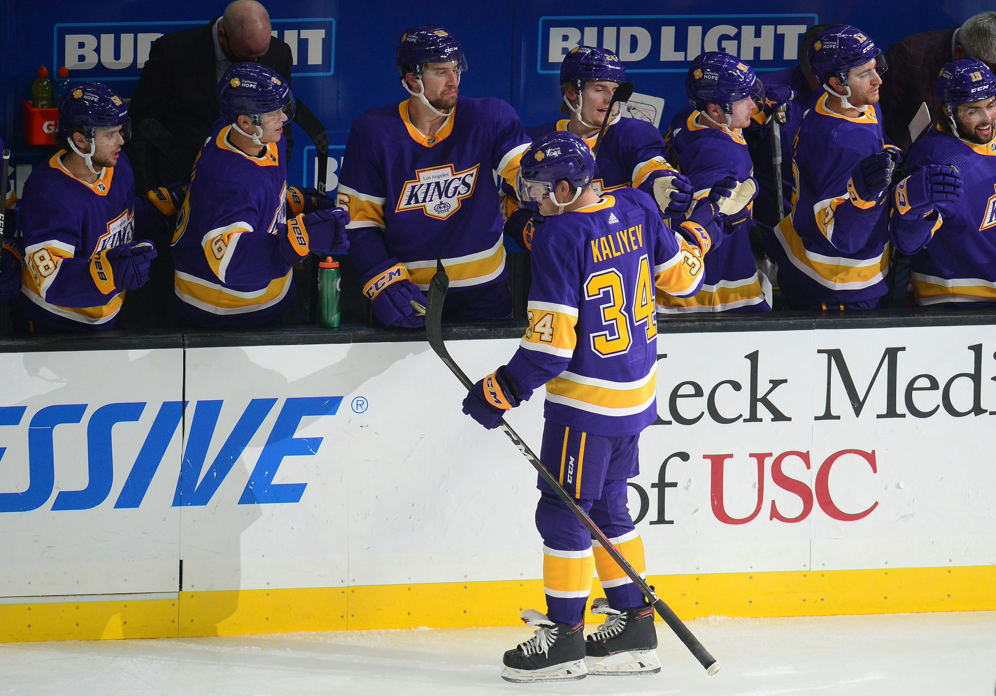
https%3A%2F%2Frinkroyalty.com%2Fwp-content%2Fuploads%2Fimagn-images%2F2017%2F07%2F15522566-1.jpeg
Counterpoint: Those are Lakers colors. F the Lakers.
 
  • Like
Reactions: Chicken N Raffls

Magua

Entirely Palatable Product
Apr 25, 2016
37,785
157,001
Huron of the Lakes
I think I would get sick of them 41 times a year

Imagine watching a team that plays in bright orange and sucks ass 41 times a year. :naughty:

Counterpoint: Those are Lakers colors. F the Lakers.

Actually, the Kings and Lakers first used yellow and purple in the same year (1967-68). Same owner at the time. They're just as much Kings colors. Frankly, they make more sense with the Kings.
 

Rebels57

HFBoards Sponsor
Sponsor
Sep 28, 2014
77,134
123,910
Imagine watching a team that plays in bright orange and sucks ass 41 times a year. :naughty:


Actually, the Kings and Lakers first used yellow and purple in the same year (1967-68). Same owner at the time. They're just as much Kings colors. Frankly, they make more sense with the Kings.

Yeah but our bright blue IBX patch balances it out :laugh:
 

Chicken N Raffls

Here for the chaos and lolz
Nov 7, 2022
3,356
7,059
Douglassville
I know the Flyers were pretty close before the "New Era" of old burnt orange, but did any team in the 80's go straight fluorescent? That would hurt the eyes, but I'd respect the balls to make that move. Imagine a hockey team of Ultimate Warriors.
 
  • Wow
Reactions: Beef Invictus

Strawberry Fields

12x Calder Cup Champs
Sep 29, 2017
8,929
29,155
Central PA
Wrong! The yellow mains are a bit much for full time. But not the purples.


Right!

The Kings current color template should be thrown into the endless burning fires of the Darvaza gas crater in Turkmenistan. If you think that looks good -- or better than this! -- donate your eyes to someone who could put better use to them.

https%3A%2F%2Frinkroyalty.com%2Fwp-content%2Fuploads%2Fimagn-images%2F2017%2F07%2F15522566-1.jpeg
I genuinely like these, too. People think the bib collar on the purple jersey looks stupid, and I could do without the "Los Angeles" on the bottom stripe, but that could easily be remedied.

Kings29.png


But they had two beautiful purple and gold RRs to base a new uniform on and didn't. Oh well.
 
  • Like
Reactions: kudymen and Magua

Curufinwe

Registered User
Feb 28, 2013
56,077
43,393
I’m amazed the NHL thinks it’s a good idea for every visiting team to be wearing the same basic color.
 
  • Like
Reactions: orangey

GKJ

Global Moderator
Feb 27, 2002
188,799
40,790
I genuinely like these, too. People think the bib collar on the purple jersey looks stupid, and I could do without the "Los Angeles" on the bottom stripe, but that could easily be remedied.

View attachment 884975

But they had two beautiful purple and gold RRs to base a new uniform on and didn't. Oh well.
I am a big fan of purple, and especially Mattias Norstrom (I have that jersey), but I think that you should stay with colors you’ve won with. I don’t know how many teams have won a championship in their history and dramatically changed their colors, at least without a substantial period of time passing.
 

ponder719

Haute Couturier
Jul 2, 2013
6,937
9,255
Philadelphia, PA
I am a big fan of purple, and especially Mattias Norstrom (I have that jersey), but I think that you should stay with colors you’ve won with. I don’t know how many teams have won a championship in their history and dramatically changed their colors, at least without a substantial period of time passing.

The most recent example in the NHL would be the Lightning, who wore predominantly black and white with blue accents in 2003-04, eliminating black and going with a straight blue and white primary set in 2011. Before that, the Dallas Stars, whose set when they won featured gold, a much darker shade of green, and a lot more black, switching to their current set in 2013. (to be honest, those may be the only two examples, unless the Bruins won a Cup wearing Brown and Gold, because before that we mostly have the Devils, Avalanche, Oilers, Islanders, Flyers, and O6 teams.)

Depends on if you want to call that a substantial amount of time, but the Kings last won a Cup in 2014, which is further out than the time frame between the Lightning's first Cup and their rebrand.
 

ponder719

Haute Couturier
Jul 2, 2013
6,937
9,255
Philadelphia, PA
Well, while we're putting aesthetic opinions out into the aether, comparing this to today:

Better then: ANA, LAK (Both of these flip next season), SJS, TOR, VAN, WPG, HFD (the greatest aesthetic crime in NHL history was taking away the Whalers.)

Better now: BOS, DAL, FLA, NYI, OTT, PIT, STL, TBL, COL (The Nords unis were amazing. Their logo blows.)

No change: BUF, CGY, CHI, DET, EDM, MTL, NJD, NYR, PHI

Changed, but both suck: WAS (the eagle logo in between was the good one)
 

PALE PWNR

Registered User
Jul 10, 2010
13,272
3,543
Sewell NJ
Wrong! The yellow mains are a bit much for full time. But not the purples.


Right!

The Kings current color template should be thrown into the endless burning fires of the Darvaza gas crater in Turkmenistan. If you think that looks good -- or better than this! -- donate your eyes to someone who could put better use to them.

https%3A%2F%2Frinkroyalty.com%2Fwp-content%2Fuploads%2Fimagn-images%2F2017%2F07%2F15522566-1.jpeg
Those jerseys are fantastic and should be their full time homes
 
Status
Not open for further replies.

Ad

Upcoming events

Ad

Ad