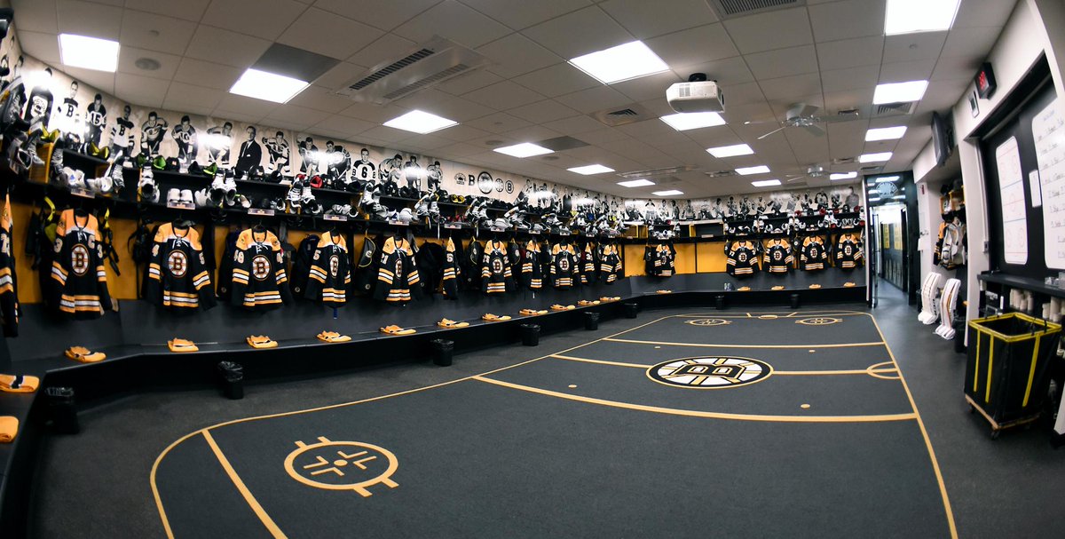
The best NHL dressing rooms - and those most in need of a facelift

  • Work is still on-going to rebuild the site styling and features. Please report any issues you may experience so we can look into it. Click Here for Updates
At least the Jackets have room to breathe in there, yeesh. :help:

On another note, I bet the Sharks locker room was considered "nice" when SAP Center first opened considering many teams were still playing in old barns.

SAP Center is the worst arena I have ever been to that is still active. The concourses are cramped, and the number of obstructed view seats is obscene. The ushers are also rude and power-tripping.
 
St. Louis visiting dressing room looks pretty meh.


This is a pretty old video. FWIW the Blues recently completed a multi-million dollar upgrade to their facility, I believe including both home and visitor locker rooms.
 
Dallas looks pretty middle of the road.

C9O9K5wUMAEq5XB.jpg
 
Go ahead and chalk up Winnipeg's room as right in the middle - nothing special, but not really lacking anything.

winnipeg-jets-heritage-jerseys-hang-in-the-locker-room-prior-to-nhl-picture-id631358084
I'm terms of functionality, I prefer this design. Clearly defined space for each player and room in between some players.

I'd rather use a dressing room like this then a round one.
 
That Detroit room is sweet imo. Classy AF.

Obviously the newer the building the more space they give to the home team dressing room annex.

I'd like to see pics of the different amenities different teams have attached to their dressing rooms.
 
Even though some of these dressing rooms look like an architects wet dream..and look cool in photos..Some of them look way to cavernous (the Oilers room in particular) to me...Seems to be a lot of cookie cutter designs, and far less emphasis on character...
 

I think when the Xcel was built, the trend in the west was “make the visitors’ dressing room as fugly and bare bones as possible”. It was purposeful “pre-payback”
 
  • Like
Reactions: bigtim1988
Looks great and all, but where do they put all there stuff? No shelves for helmets or other equipment, no recessed closets for hanging clothes. Does everything go in their cubbyhole in the bench? :laugh:

When they join the team, each player has a RFID chip implanted in their off hand index finger. There's a scan pad in each position that will lower that rectangular box right above them. They can put their valuables in there & it will lock itself & go back up in the air. Nice & secure. Kind of sucks if you get stretchered off to the hospital & need your wallet ... but that doesn't happen all 'that' often...
 
  • Like
Reactions: bigtim1988
Architecturally, I loathe a drop ceiling. Most of the ones in here that look old and dated would be well served to just renovate to eliminate the drop ceiling, vault it up a little bit, put lights/logos and maybe some kind of digital display like it looks Nashville did, and it would immediately improve things.
 
Seems a little bit of skewed preference to the simi-circle design methinks. I don't see Philadelphia's or Minnesota's and think "Oh that's terrible" it looks like a locker room.
 
DEV_3750.jpg


Looks great and all, but where do they put all there stuff? No shelves for helmets or other equipment, no recessed closets for hanging clothes. Does everything go in their cubbyhole in the bench? :laugh:
They put their equipment on the floor or shelves above. Small but they can fit gloves, helmet... They have a seperate dressing room for clothes I believe
 
Architecturally, I loathe a drop ceiling. Most of the ones in here that look old and dated would be well served to just renovate to eliminate the drop ceiling, vault it up a little bit, put lights/logos and maybe some kind of digital display like it looks Nashville did, and it would immediately improve things.

It feels like the making the leap from “worst” to “best” involves:

- Cover the drop ceiling (40%)
- Slightly curve the benches into an oval instead of a rectangle (30%)
- Install bigass logo in ceiling (20%)
- Paint something fancy on the wall (10%)
- Actual changes to the size or function of the room (0%)
Pretty much. Eliminating the drop ceiling and raising it up visually draws the eye up and makes the space feel bigger and roomier when the footprint hasn't changed. Adding the logo and accent lighting makes it feel luxurious and modern while just being literal window dressing. The curve might actually help, because there won't be any corners to be cramped within, but yeah....

In most cases we're literally debating which teams have best put lipstick on the pig
 
  • Like
Reactions: tarheelhockey
Even though some of these dressing rooms look like an architects wet dream..and look cool in photos..Some of them look way to cavernous (the Oilers room in particular) to me...Seems to be a lot of cookie cutter designs, and far less emphasis on character...

But just think of the possibilities for the NHL to kill time on pay per view or the NHL network in the summers by having series of Nhl dressing room makeovers with possibly celebrity guests to get even more of our hard earned dollars.

Gary if you are reading this I want a finders fee.
 
I wish teams would stop with the logo on the floor shit and the superstition that comes with it. Slap that bitch on the ceiling and get on with life.
 
great thread. the minny and boston rooms with those hockey rinks on the floor, that is some cringy stuff imo
 

Ad

Upcoming events

Ad