Preposterone
Registered User
- Dec 6, 2013
- 843
- 1,011
Meanwhile visitors rooms look something like this.
It’s missing a giant trash bin full or tape and Gatorade bottles that hasn’t been emptied in a month
Meanwhile visitors rooms look something like this.
Holy smokes! I never noticed 'til just now. The front of the helm on VGK's logo forms a V as in for Vegas... Then again I only found out about the H on the Hartford Whalers logo recently.
Old Montreal-style tricks from back in the day. No move was too petty.
A lot of people think that MSG is some great place, but it’s actually a dump.I’m surprised no Rangers locker room shown.
This is just one tiny aspect of the Oilers dressing room. Its ginormous. They've got a kitchen, lounge, games room, hot tubs, pool, full gym, theater... They've got different storage areas for things like gloves, sticks and equipment. Here's a quick YouTube link that shows a little bit more.
Looks great and all, but where do they put all there stuff? No shelves for helmets or other equipment, no recessed closets for hanging clothes. Does everything go in their cubbyhole in the bench?
I’m surprised no Rangers locker room shown.


Some of the college football locker rooms are absolutely insane. Check out Alabama or Oregon for example, it's next level stuff.
A lot of people think that MSG is some great place, but it’s actually a dump.
Way too much dark grey and lighting is too dark. Needs to be a lot brighter. But perhaps that's just the picture. Also hate the layout. But yeah, it's new and modern as expected.This is University of Maryland’s locker room in their new practice facility.
View attachment 480457 View attachment 480458
Way too much dark grey and lighting is too dark. Needs to be a lot brighter. But perhaps that's just the picture. Also hate the layout. But yeah, it's new and modern as expected.
Okay, this is the winner. My god.Edmonton's is cool
Jonathan Toews did say that North Dakota's dressing rooms are better than NHL ones, and I have to agree.
Some NCAA hockey locker rooms are better than 90% of NHL ones., and probably the nicest I have seen.

The Canes locker room I don't think has ever had any major changes other than the pictures on the wall. Perhaps Dundon addresses this in the future, kind of surprised he hasn't yet. I have zero clue what the visiting locker room looks like but I've read it "could use an upgrade". I didn't quite realize how small NHL locker rooms in general were until I looked at this thread.
I think it was the University of Iowa Hawkeyes football coach that painted the visiting locker room walls pink. At least NHL teams don't have to look at pink walls.
When the Carolina Hurricanes begin training camp in mid-September, their locker room will sport a new layout for both the players and coaches.
Demolition began earlier this week, the first step in revamping the look and flow of the team's room.
The initial plan is to remove a number of interior walls to open up the space on the south side of the locker room. The weight room, bike room and players' lounge will essentially reside in one large area, while the coaches' offices will relocate to the north end of the room, previously occupied by storage and the old players' lounge.
"We have a lot of walls down there that we don't need," President and General Manager Don Waddell said. "Any time you open up a room, it makes it feel that much bigger."
The construction plan, which hasn't even been completely finalized just yet, has come together quickly in the last month, according to Waddell. The project also carries a fairly hard deadline - the Hurricanes host their first preseason game on Sept. 19, and training camp is slated to begin the week prior
"It's been high speed," Waddell said. "Demolition is going to be probably 10 weeks. Those brick walls are up 30 feet high, so that's a lot to take out of there. … We'll get to a shell, and already we've met with a designer to start programming."
Removing the existing ceiling exposed 30-35 feet of additional space underneath the lower bowl. Creating a second floor to expand the locker room footprint into that space couldn't be fit into the tight renovation timeline this summer, but it's something that could be explored next year.
Stay tuned for renovation progress updates throughout the summer.
With just a month remaining until the Carolina Hurricanes open training camp, the team's new-look locker room is taking shape.
Just a few short weeks after construction began, a number of interior walls were removed. The result is an open concept training space for the players, in addition to their lounge, on the south side of the room. Meanwhile, the coaches' offices will now be located at the north end of the room, space previously occupied by the players' lounge and storage.
Since demolition, drywall has been installed in the new lounge area and the frame for the ceiling - now a foot to two feet higher in some areas - has been reinstalled.
The finishing touches, which will include removing some stationary bikes and adding additional equipment, are next.
"I like the bigger space because we're going to be able to do a little bit more movement stuff. I think movement is really the cornerstone of everything we do, whether it's on land or on ice," said Bill Burniston, head of strength and conditioning, on the latest episode of CanesCast. "I'm really pleased that it's going to be a bit bigger. … I'm excited about it. I think it's going to allow for us to have more team workouts instead of breaking guys up into groups."
Stay tuned for additional renovation progress updates over the next month.
The Carolina Hurricanes' new-look locker room is coming together with three weeks left on the calendar prior to the start of training camp.
The previous walk-through detailed the open concept in a space that was very much a work-in-progress. Construction continues, but the room as a whole is now more defined.
Let's take another tour of the locker room.
The coaches will now be located at the north end of the locker room, space previously occupied by the players' lounge and storage. In the video above, the coaches' office is the first room seen on the right, with their (future) bathroom positioned adjacent.
Flying past the players' stalls, the locker room begins to feel much larger, as a number of walls were removed to introduce the open concept space. A new players' lounge, complete with a kitchen featuring color-changing LED lights, occupies the far south side of the room alongside the expanded footprint of the team's training area. The functionality of the two spaces is divided by a three-quarter wall that extends a few feet out from the back wall.
The finish line of this project is near, so stay tuned for further updates over the next three weeks.


The ceiling looks like someones rec room in need of major updating. Also, the ceiling fans make it look extra bad! Also they didn't get their own logo right, the carpet guy had one job!
I only noticed it when you pointed it out, but to clarify, are you talking about what looks like a really bad looking rug on the floor? Or the actual carpet underneath it?
That rug is hilariously bad. Unless somehow it's upside down?
I was talking about the logo rug, but both are bad.


The drop ceiling is the same as my parents basement!Go ahead and chalk up Winnipeg's room as right in the middle - nothing special, but not really lacking anything.

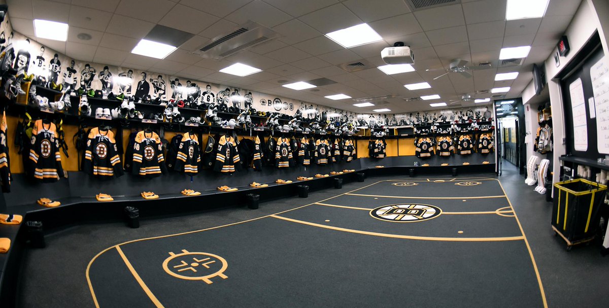
I like the first one betterThe Bruins went from this:

to this:

Call me a biased Leafs fan but I think their dressing room is very nice.

This is just one tiny aspect of the Oilers dressing room. Its ginormous. They've got a kitchen, lounge, games room, hot tubs, pool, full gym, theater... They've got different storage areas for things like gloves, sticks and equipment. Here's a quick YouTube link that shows a little bit more.
Canes were like let's hang up the stuff on the floor, take the picture from a different angle, and call it a renovation.
