The best NHL dressing rooms - and those most in need of a facelift

Figgy44

A toast of purple gato for the memories
Dec 15, 2014
13,951
9,284
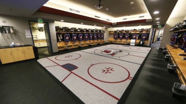
The ceiling looks like someones rec room in need of major updating. Also, the ceiling fans make it look extra bad! Also they didn't get their own logo right, the carpet guy had one job!

I only noticed it when you pointed it out, but to clarify, are you talking about what looks like a really bad looking rug on the floor? Or the actual carpet underneath it?

That rug is hilariously bad. Unless somehow it's upside down?
 

Oddbob

Registered User
Jan 21, 2016
16,726
11,291
I only noticed it when you pointed it out, but to clarify, are you talking about what looks like a really bad looking rug on the floor? Or the actual carpet underneath it?

That rug is hilariously bad. Unless somehow it's upside down?

I was talking about the logo rug, but both are bad.
 
  • Like
Reactions: Figgy44

Eisen

Registered User
Sep 30, 2009
16,737
3,104
Duesseldorf
It's stupid that they even put the logo on the rug. Makes the dressing room all the much smaller because you can't walk over it. Seems much smarter to put it on the ceiling as the new trend seems to be.
You can't walk over the rug?
 

TheNeutralPresident

Registered User
Feb 29, 2020
253
406
The Neutral Planet
I can't get over just how cramped some of the older and even renovated rooms look, especially Vegas in such a new rink. Oilers seem to be the gold standard but really impressed with what the Canucks and Sabres did given their arena age.
 

John Eichel da GOAT

Registered User
Oct 7, 2008
6,486
2,097
colorad-avalanche-dressing-room.jpg

Better view of the Avalanche. its pretty blah. Vegas's was shockingly bad for how new that arena is.
 
  • Like
Reactions: 63 others

MuckOG

Registered User
May 18, 2012
15,866
5,846
The Wild have a better dressing room at their practice facility than they do at the Xcel. But I think I read that they were renovating that dressing room as well.


HolyCrap

Registered User
Oct 2, 2015
5,251
6,110
I like the idea of the logo all light up on the ceiling. Would having it light up a hologram logo onto floor be alright to step on? I have no clue.
 

BCNate

Registered User
Apr 3, 2016
3,355
3,353
Scrolling through here, I think Oilers looks the best, Flames the worst, and Vegas the most disappointing.
 

HisIceness

This is Hurricanes Hockey
Sep 16, 2010
41,832
74,725
Charlotte
Carolina for me is a mix between plain and looking good.

general-view-of-the-carolina-hurricanes-locker-room-prior-to-a-2019-picture-id1266870055

The Canes locker room I don't think has ever had any major changes other than the pictures on the wall. Perhaps Dundon addresses this in the future, kind of surprised he hasn't yet. I have zero clue what the visiting locker room looks like but I've read it "could use an upgrade". I didn't quite realize how small NHL locker rooms in general were until I looked at this thread.

I think it was the University of Iowa Hawkeyes football coach that painted the visiting locker room walls pink. At least NHL teams don't have to look at pink walls.
 

Ad

Upcoming events

Ad

Ad