Aggie204
Expect the worst, you’ll never be disappointed.
I just cut and pasted McDavids red soulless eyes.That jersey looks like a scary clown smiling. Mcdavids nipples are the gacy eyes.
I just cut and pasted McDavids red soulless eyes.That jersey looks like a scary clown smiling. Mcdavids nipples are the gacy eyes.
oh hell ya, I couldn't agree moreThe fake laces on modern jerseys, need to go away.
Only 2 episodes in, but enjoying that podcast a ton so far. Highly recommended for anyone on this board!On this Jets podcast they discuss the choice of the team name on 2011.
Chipman says he called the Boston Bruins about using the name "Bears" and the Bruins said "No"!
Start at 9 min 32 sec.
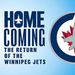
Episode 2 - Homecoming: The Return of the Winnipeg Jets
The announcement had been made and the race to the start of the season was on. Sara Orlesky had a front row seat since the beginning of the NHL's return to Winnipeg and with the help of players and staff you too will get access to the stories of t...www.buzzsprout.com
On this Jets podcast they discuss the choice of the team name on 2011.
Chipman says he called the Boston Bruins about using the name "Bears" and the Bruins said "No"!
Start at 9 min 32 sec.
Episode 2 - Homecoming: The Return of the Winnipeg Jets
The announcement had been made and the race to the start of the season was on. Sara Orlesky had a front row seat since the beginning of the NHL's return to Winnipeg and with the help of players and staff you too will get access to the stories of t...


Both of those jerseys are legitimately bad and far far worse than our RCAF jersey.
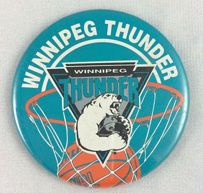
Look, if Chipman had such a hard on for that uni he could have avoided the whole intellectual property, all your bear are belong to us mess by calling the team the Thunder. And teal beats aviator blue every day and twice on Sundays. Or would we then have had to ask permission from the fricking San Jose Sharks?What if the Bruins told Chipman "Yes."
The good version is NYR and the bad is Columbus. Of the two, I'd much rather look like NYR.
The stripes on the arms and socks just need a bit of red accent. It would pull it all together and solve the issues I see people have about the lack of red. This took me about two seconds but I’m sure you’ll get the idea.
The current logo is first in terms of design (clean, iconic, symbolic), and last in terms of nostalgia (because it's new). The uniform is a bit monochrome and dull.
The best logo in terms of nostalgia was probably the logo in use when you were 15-25 years old.
The 80s pie plate logo was the worst in terms of design. Just too much going on (An airplane! The J is a hockey stick! The word "Winnipeg"! The word "Jets"! Circles in circles!). A mishmash of poorly executed ideas. The 90s logo was just a lame refresh of the previous logo...but the uniform overall was much better (got rid of the weird shoulder/sleeve strip, Red Pants!).
The 90s uniform or the pre-NHL Jets (current Heritage) uniforms are tied. Either of those with today's logo would rock.


The current logo is a muddy boring mess, IMO, but this stuff is subjective.The current logo is first in terms of design (clean, iconic, symbolic), and last in terms of nostalgia (because it's new). The uniform is a bit monochrome and dull.
The best logo in terms of nostalgia was probably the logo in use when you were 15-25 years old.
The 80s pie plate logo was the worst in terms of design. Just too much going on (An airplane! The J is a hockey stick! The word "Winnipeg"! The word "Jets"! Circles in circles!). A mishmash of poorly executed ideas. The 90s logo was just a lame refresh of the previous logo...but the uniform overall was much better (got rid of the weird shoulder/sleeve strip, Red Pants!).
The 90s uniform or the pre-NHL Jets (current Heritage) uniforms are tied. Either of those with today's logo would rock.
The current logo is a muddy boring mess, IMO, but this stuff is subjective.