
I picked up a black McLean 50th and white Bure 1994 skate last year in anticipation of Adidas not being the maker anymore. The white Bure is way too big since stock was very low and its the old style cut so it is on the livingroom wall. McLean is a perfect fit and the Adidas style looks and feels awesome. I ordered from Hockey Authentic IIRC, they are Vancouver basedFlying skate is and always will be my favorite. Should I buy one before they change the brand/manufacturer next year?
GDT: GM 24 | Vancouver Canucks vs. Vegas Golden Knights | Nov 30 | 7:00PM PST | SNET
- Thread starter Mr. Canucklehead
- Start date
-
Work is still on-going to rebuild the site styling and features. Please report any issues you may experience so we can look into it. Click Here for Updates
You are using an out of date browser. It may not display this or other websites correctly.
You should upgrade or use an alternative browser.
You should upgrade or use an alternative browser.
- Status
- Not open for further replies.

Oh fellow Dark Souls Enjoyer I see
Played all Dark Souls games, even a little bit of Bloodborne. Got Elden Ring recently, have not tried it yet.
For me, THE thing that sets this series apart was, when I first reached Anor Londo and got my ass handed to me by those two archers a few times, then finally reached them I was like oh yeah you guys are archers now I'm this close you're so f***ed.
In other games, archer enemies are screwed when up close, not so in Dark Souls...the silver knight switched to sword and shield, then kicked my ass even more.

Hit the post
I have your gold medal Zippy!
I"m more of a Leisure Suit Larry player.Played all Dark Souls games, even a little bit of Bloodborne. Got Elden Ring recently, have not tried it yet.
For me, THE thing that sets this series apart was, when I first reached Anor Londo and got my ass handed to me by those two archers a few times, then finally reached them I was like oh yeah you guys are archers now I'm this close you're so f***ed.
In other games, archer enemies are screwed when up close, not so in Dark Souls...the silver knight switched to sword and shield, then kicked my ass even more.


Brookbank
Registered User
- Nov 15, 2022
- 2,549
- 2,365
Vegas hasn't been playing that good. Everyone just assumed they were this dynasty because they won the cup and had a hot start. They are no dynasty.The ultimate test. The Canucks better wake up, or they're going to get destroyed in this one.
It is a huge game for bragging rights but not so much an actual hockey test imo.
Mr. Canucklehead
Kitimat Canuck
Irwin has always made sense as the depth call up / 7th/8th guy. Makes no sense to have a guy like Hirose rotting in the press box.
If the Canucks play a full 60, this game is up for grabs. If they take whole periods off, though, I think this will be ugly.
If the Canucks play a full 60, this game is up for grabs. If they take whole periods off, though, I think this will be ugly.
Agreed. This team can't get away with the patented slow first 5 minutes and 2nd period vanishing act against Vegas, they'll get ventilatedIrwin has always made sense as the depth call up / 7th/8th guy. Makes no sense to have a guy like Hirose rotting in the press box.
If the Canucks play a full 60, this game is up for grabs. If they take whole periods off, though, I think this will be ugly.
Banned. Due to be reinstated after Christmas.
Christmas 2033, right?Banned. Due to be reinstated after Christmas.
Petey O
I can teach you how to play gicky gackers
He has a way to go to match my 16 infractions and 2 bans, but he'll make it.Banned. Due to be reinstated after Christmas.
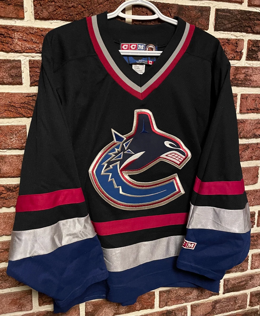
Its one of the worst logos in sports, certainly in the nhl. Twenty seven years are only good if the product is good, the orca is so bad, there are literally eight year old kids who could do better.
A stupid simple ugly whale C....I can’t believe anyone likes it, at all, clearly the organization isnt a huge fan now with the skate comeback.
Stick n rink is the only available, viable option, yeah its a bit boring but thats what makes it classy.
I'd be interested in a new logo but I have less than zero confidence they'd pick one I want, or even a good one period.
If aqua ever sells I'm not married to the team name, colours, or logo tbh, that'd change if they won something though.
The WCE era Orca jerseys are so ugly... easily the worst Canuck jerseys.
Also what year did we get rid of the "Vancouver" writing on the jerseys? Those were also terrible..
mossey3535
Registered User
- Feb 7, 2011
- 14,211
- 11,586
100%. It's possible Fanatics will stop sucking but it's unlikely. They might up their game on the pro/authentic line that goes directly to teams but the stuff they have out already is mostly ugly and seems poorly made (thinner fabric, etc). That's probably going to be how the replica and mid-level priced gear is going to be.Flying skate is and always will be my favorite. Should I buy one before they change the brand/manufacturer next year?
Stock up on the Adidas. Always buy in person from the team shop if you can.
okay, since we're talking about jerseys
i just found my dream jersey and pounced on it

it will require a date with some amodex but that's a small price to pay
i just found my dream jersey and pounced on it
it will require a date with some amodex but that's a small price to pay
- Oct 26, 2019
- 2,341
- 3,723
So uhh not to go super off topic but I think theres a game today and I hope its a competitive one.
Mods pls dont ban me for changing topics tho T.T
Mods pls dont ban me for changing topics tho T.T

theguardianII
Registered User
- Jan 30, 2020
- 4,007
- 1,978
We will see if the coach tries to match lines or just tries to roll them.
Vegas is getting scoring top to bottom.
Joshua is not going to be as physical on the forecheck, those are big boys back on defence.
Hughes and Hronek? Will Tocchet keep them away from ? Stone? They are faster than him but then most of the NHL is too, Eichel? Can Tocchet keep them away from the bottom two gigantic and fast bottom lines.
Vegas is on average larger than the league average, a playoff team.
Canucks are still one of the daintiest. They have Johsua and Myers.
Canucks are well rested.
Just a thought as a coach, sometimes how you finish game is more important. Shooting the wad in the first period but being tired at the end might look promising but may not win as many games. Pacing themselves.
I used to ask the players how many goals do you need to score? Because I taught, "just one more than the other team". And that it doesn't matter who scores but everyone can make sure their player doesn't. And an in game "goal", one shot on net per shift.
Canucks weather the storm at first then turn it on in the third. This can be demoralizing to tired players who have played all out for two periods. OF course this can back fire if they get too far behind or the other team is just better. Most NHL teams can ice 5 pretty good players so the PP and PK can make a huge difference. The rest just need to not be scored on, playing against the clock.
Vegas is relaxed and not feeling any pressure, confident.
It would make great media fodder if the Canucks win.
Vegas 5-4 OT
I dislike all of the orca stuff, would trash that logo immediately if it was my call
It's the worst.
It's basically the 1990s corporate branding of a bad ownership group to signify the New Messier Era.
It was a big trend in the mid-late 1990s to re-brand your uniforms and change colours/logos or both and basically half the league did it (Buffaslug, Captain Highliner, Pointy Penguin, etc) and literally every other team has ditched the changes and switched back to their original look - as we've done with the colours - but we keep grimly hanging on to that f***ing awful, ugly logo.
Bojack Horvatman
IAMGROOT
- Jun 15, 2016
- 4,754
- 9,014
It's the worst.
It's basically the 1990s corporate branding of a bad ownership group to signify the New Messier Era.
It was a big trend in the mid-late 1990s to re-brand your uniforms and change colours/logos or both and basically half the league did it (Buffaslug, Captain Highliner, Pointy Penguin, etc) and literally every other team has ditched the changes and switched back to their original look - as we've done with the colours - but we keep grimly hanging on to that f***ing awful, ugly logo.
I started watching during the WCE so I don’t mind the Orca, but I’m not opposed to switching logos/jerseys. If we do I’d prefer to switch to the stick in rink. I love the skate jerseys but I think they are best suited as an alternate.
I started watching during the WCE so I don’t mind the Orca, but I’m not opposed to switching logos/jerseys. If we do I’d prefer to switch to the stick in rink. I love the skate jerseys but I think they are best suited as an alternate.
I definitely prefer the 1990s jerseys (and actually I love the pure Flying V from the late 70s/early 80s) but I understand they're more polarizing so my choice would also be just to go back to the stick in rink and the original jerseys, which are just a nice, simple, clean, classic look. And yeah, skate jerseys as alternate.
Bojack Horvatman
IAMGROOT
- Jun 15, 2016
- 4,754
- 9,014
I'm good with pretty much any of our logos, but just please no Johnny Canuck as a main logo. It's closest to a Canuck but it looks silly and cartoony as anything other than a shoulder patch.
Flik
Canucks fan for life
You can tell our board's vibes are back and things feel alive again when our pre-GDTs have enough posts about our billion logos that those posts alone have eclipsed the total number of posts other boards have in their full GDTs.
Never change HF Canucks fam, y'all rock.
P.S. Stick in rink for me personally.
Never change HF Canucks fam, y'all rock.
P.S. Stick in rink for me personally.
- Status
- Not open for further replies.
Ad
Upcoming events
-
 To Advance Newcastle United vs Arsenal - Newcastle United leads 2-0Wagers: 9Staked: $1,795.00Event closes
- Updated:
-

-

-

-