
Florida Panthers completely changing jersey (logo leaked post 661)
- Thread starter ucanthanzalthetruth
- Start date
-
Work is still on-going to rebuild the site styling and features. Please report any issues you may experience so we can look into it. Click Here for Updates
You are using an out of date browser. It may not display this or other websites correctly.
You should upgrade or use an alternative browser.
You should upgrade or use an alternative browser.
- Status
- Not open for further replies.
aufheben
#Norris4Fox

Hackett
BAKAMAN
- Mar 4, 2002
- 21,545
- 9
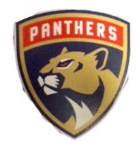
That would be a pretty nice side patch. The shield does not scream primary logo to me.
The colour scheme/numbering on the mock jerseys looks fantastic though.
Periwinkle
Registered User
- Apr 3, 2014
- 1,027
- 104
I like the logo.
I hope they alter/tone down the color scheme, the deep blue and deep red + loud yellow/orange decorations -combo hurts my eyes.
I hope they alter/tone down the color scheme, the deep blue and deep red + loud yellow/orange decorations -combo hurts my eyes.
Past Considerations
Registered User

F L Y E R S
Orange & Black

Novacane
Registered User
The eyes tell me it should be furious but it instead just looks mildly annoyed.
Gotta see the actual jersey before I make a decision on whether it works
Gotta see the actual jersey before I make a decision on whether it works
rumrokh
THORBS
- Mar 10, 2006
- 10,171
- 3,402
Would be way better without the lettering and if the panther emerged from the crest a bit. The best logos tend to have identifiable shapes/profiles. It's also a little too slick in general, but I don't think we can expect much better at this point because these projects are subject to so much groupthink, it's a miracle if you get something interesting and iconic.
ATypicalCanadian
Registered User
PanthersPens62
Paul & Stanley
Josepho
i want the bartkowski thread back
Phosphophyllite
Registered User
GeorgesLaRAWK
Registered User
- Mar 12, 2009
- 580
- 54
PeterSidorkiewicz
HFWF Tourney Undisputed Champion
Walkingthroughforest
I got the worst ******* attorneys
- Aug 19, 2007
- 7,678
- 1,958
jetsforever
Registered User
- Dec 14, 2013
- 28,335
- 25,181


Ziggy Stardust
Master Debater
uhhhhhhh
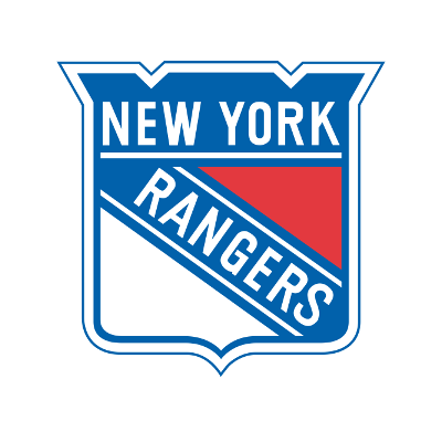
The Rangers don't use that crest on their uniforms though, they use a diagonal text logo.
Voight
#winning
Looks amazing. A lot of the time re-brandings end up worse than the previous, but this one looks great.
Vesa Awesaka
#KeepTheSenate
- Jul 4, 2013
- 18,236
- 25
Big McLargehuge
Fragile Traveler
First reaction is that it looks like it belongs on the front of a car. I don't know if it's a good or a bad thing that they went with a shield logo and it looks more like a car logo than a soccer logo.
It's better than I thought it was going to be.
It's better than I thought it was going to be.
Been told from an inside source that design is not it.
dubey
$$$$$$$*NICE*$$$$$$$ 69 in 79 $$$$$$$*NICE*$$$$$$$
It should beBeen told from an inside source that design is not it.
Remove the 'Panthers' part of the shield and it looks great
LeafFever
Registered User
- Feb 12, 2016
- 18,890
- 6,184
I like the look of the panther a lot, but im not a fan of crests as a logo.
Exactly how I feel.
- Status
- Not open for further replies.
Ad
Upcoming events
-

-

-
 Beanpot Boston University vs Harvard - TD Garden, BostonWagers: 1Staked: $100.00Event closes - 4 days from now
- Updated:
-
 Beanpot Boston College vs Northeastern - TD Garden, BostonWagers: 1Staked: $100.00Event closes - 4 days from now
- Updated:
-
 Super Bowl LIX Kansas City Chiefs vs Philadelphia Eagles - New OrleansWagers: 8Staked: $48,771.00Event closes - 10 days from now
- Updated: