DrandonBudinsky
Black & Blueshirts
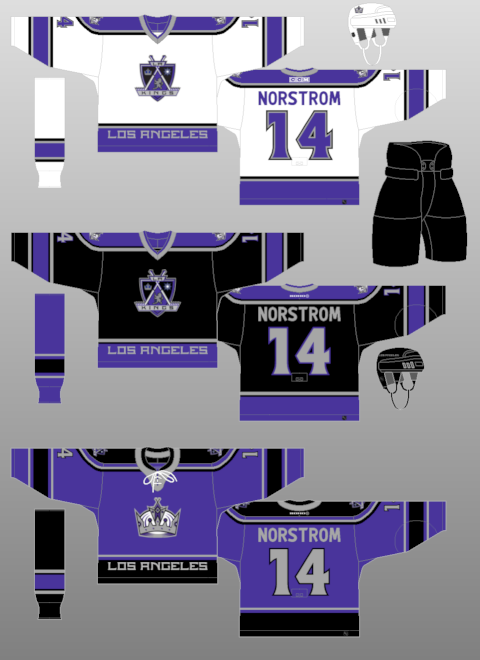
Los Angeles Lakers wore blue prior to 1967. It was BECAUSE of the arrival of the Kings expansion in 1967 that the Lakers switched to purple and gold since the new owner of both franchises wanted both teams to match. Purple and gold has just become associated more with the Lakers because of all their championship teams in that color scheme.The problem with purple and gold is basically right in the same building. It'd not be seen as a reference to purple being the royal color but as a Lakers knock-off. If the franchise wanted to lean in on that, they would have already done it. I think they want to cultivate black/silver as their thing because that's the look with which the team got popular first in L.A. after the Gretzky trade.
Then since the Kings wanted to capitalize on the arrival of Gretzky to LA, they hopped on the trendy silver and black colors of the LA Raiders hoping to make that the hip new thing. (Since at the time, Bo Jackson was a superstar in pro sports)
Anyone here remember the saturday morning cartoon, Pro Stars? ::Wayne’s hot, slapshot!::