
njdevils1982
Hell Toupée!!!
Eat fresh
off topic but i love how that puke jared fogle got the pulp beat out of him in prison...deserves more
Eat fresh
I find this thread funny. I mean, I’d love the Kings to go back to the retro purple, but everyone back in the 90s thought they were incredible when they went to black and grey. These things go around in circles. I also have to point out despite the fact that I hate black as a jersey colour, the new Tampa 3rd jersey (black with the circular logo) is so popular that you can barely get a hold of one (without a wait at least).Just go back to the 80s Kings uniforms, and concede that mistakes were made.
The problem with purple and gold is basically right in the same building. It'd not be seen as a reference to purple being the royal color but as a Lakers knock-off. If the franchise wanted to lean in on that, they would have already done it. I think they want to cultivate black/silver as their thing because that's the look with which the team got popular first in L.A. after the Gretzky trade.Just go back to the 80s Kings uniforms, and concede that mistakes were made.
LA has been black and silver since 1988. 3 dozen years now. Think they just stick with the black.I find this thread funny. I mean, I’d love the Kings to go back to the retro purple, but everyone back in the 90s thought they were incredible when they went to black and grey. These things go around in circles. I also have to point out despite the fact that I hate black as a jersey colour, the new Tampa 3rd jersey (black with the circular logo) is so popular that you can barely get a hold of one (without a wait at least).
Pretty cool, where did you come across that?^^This
A few years ago, I stumbled on a prototype jersey the Kings originally had when they came into the league in 1967. The “crown” they had was less ornate. I wouldnt mind a modernized version of that.
View attachment 880521
I get it. I’m just trying to point out that the general consensus at the time was that this jersey change (in 88) was brilliant.LA has been black and silver since 1988. 3 dozen years now. Think they just stick with the black.
Logo wise not a fan of reading your logo, in having the team name be the main part of the logo like the Chevy and baseball diamond ones. Prefer the crown.
‘Hey Jared, I heard you ordered a footlong’off topic but i love how that puke jared fogle got the pulp beat out of him in prison...deserves more
They weren't black and silver for all of those years, though, for one of those dozen they were a black and purple team with silver only used as a minor accent, not as a primary color. Easy to ignore that era because those uniforms were atrocities, but it did happen.LA has been black and silver since 1988. 3 dozen years now. Think they just stick with the black.
Logo wise not a fan of reading your logo, in having the team name be the main part of the logo like the Chevy and baseball diamond ones. Prefer the crown.
They just added purple as another secondary color. Main dark jersey was still black though on the whites the numbers were purple.They weren't black and silver for all of those years, though, for one of those dozen they were a black and purple team with silver only used as a minor accent, not as a primary color. Easy to ignore that era because those uniforms were atrocities, but it did happen.
Because Samueli, like Foley, has this obsession with the black and gold look that the Army NCAA rocks. Samueli wanted the Ducks to have more intimidating branding. The old branding was seen as too catered to a family friendly image or something along those lines with a logo viewed as cartoony and outdated. The orange with the black and gold is symbolic of the team playing in orange county. I don't see the team ever moving away from the orange while Samueli is owner, no matter how many times the fans beg for a return to the old colors.Why do the Ducks insist on forcing this orange/black color scheme? The eggplant/green is far more popular and flat-out looks better.
I can’t recall where I originally saw it. It was during my research for why the Los Angeles Lakers chose purple and gold for their jerseys and I ran across a description of that early Kings jersey. Then recently saw it again on site where they were doing a NHL prototype jerseys series over the years.Pretty cool, where did you come across that?
Purple was a primary part of their color scheme during that era and silver was demoted to an accent. Sorry, but you're just wrong here.They just added purple as another secondary color. Main dark jersey was still black though on the whites the numbers were purple.
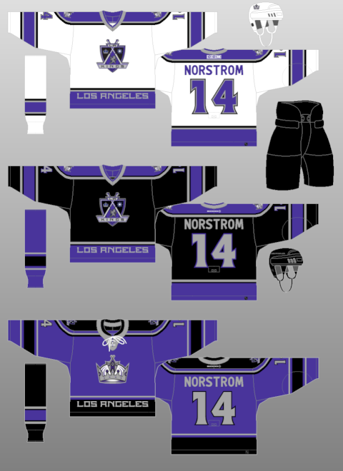
I didn’t mind these versions of that black and purple era. Could have done with out the “Los Angeles” at the bottom of the hem though.They weren't black and silver for all of those years, though, for one of those dozen they were a black and purple team with silver only used as a minor accent, not as a primary color. Easy to ignore that era because those uniforms were atrocities, but it did happen.
Found one of the initial places I found it:Pretty cool, where did you come across that?
whoa, very cool. the crown over the sleeve numbers is a nice touchFound one of the initial places I found it:
View attachment 880642
Because Samueli, like Foley, has this obsession with the black and gold look that the Army NCAA rocks. Samueli wanted the Ducks to have more intimidating branding. The old branding was seen as too catered to a family friendly image or something along those lines with a logo viewed as cartoony and outdated. The orange with the black and gold is symbolic of the team playing in orange county. I don't see the team ever moving away from the orange while Samueli is owner, no matter how many times the fans beg for a return to the old colors.
Found one of the initial places I found it:
View attachment 880642
