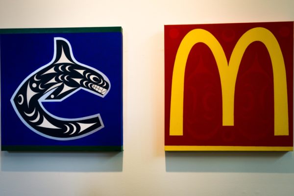
I'm pro-Salish art representation in all ways all forms but this one is a bit of a busier example. Too much going on and it doesnt scale well for a logo. Love the colours and the concept though. Chase Grey's last year was great but also got a bit too busy towards the bottom.
They also didnt change the original logo enough, redo it your own style instead of draw over it
I love that they talked about and went into the specifics on Salish design ideology though
What I would f***ing love to see is them let a Salish artist like LessLIE go at it, who is a pure genius of simplicity, proportion, and form. He would tackle the logo's silhouette and come up with something brilliant.
lessLIE Sam - Stonington Gallery
He actually did a painting titled "Culturally Correct Canucks" that was featured in a 2017 show at the Bill Reid Gallery, taking a jab at the cultural appropriation in the current logo.
The above left is the design, using the same logo silhouette but reinterpreting it within Salish design ideology. I think everyone gets caught up on the tail part where the whale is crashing through the ice. The crescent pattern is nice but the trigon and eye in the corner makes it too busy. Need to keep it simple and so many artists are getting overwhelmed with the space.


