Ziggy Stardust
Master Debater
Canada’s aren’t bad, though I prefer the logo they used in 2010/2014 over this “edgy” redesign Nike went with.
Canada’s aren’t bad, though I prefer the logo they used in 2010/2014 over this “edgy” redesign Nike went with.
Canada’s aren’t bad, though I prefer the logo they used in 2010/2014 over this “edgy” redesign Nike went with.
Canada’s aren’t bad, though I prefer the logo they used in 2010/2014 over this “edgy” redesign Nike went with.
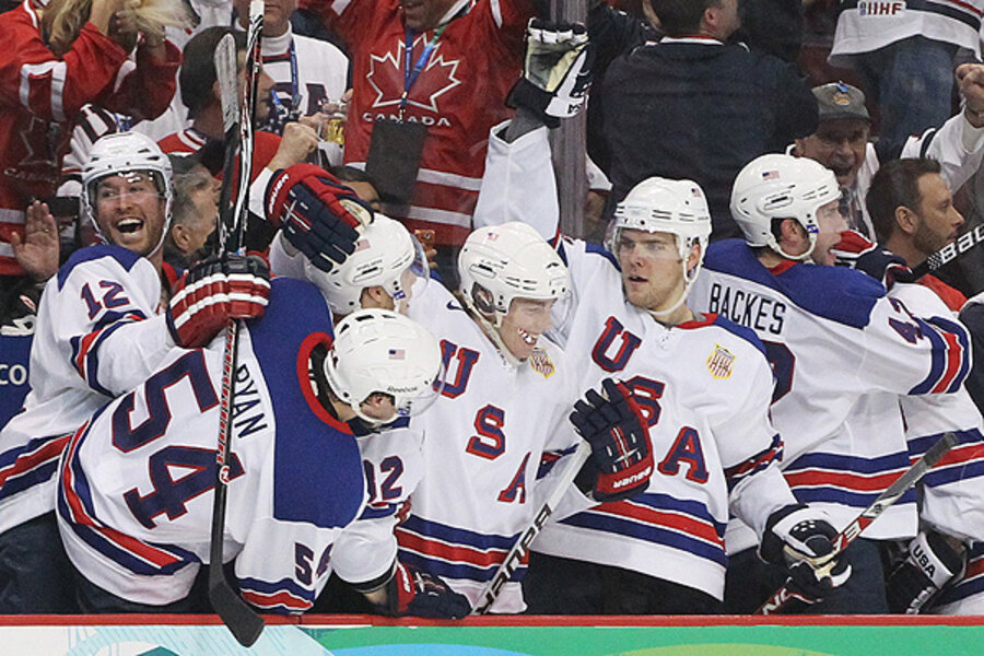
And the US hockey jerseys are utter garbage.
And the US hockey jerseys are utter garbage.

better than Canada...too close to Finland though?
I think these are the most boring sets we’ve seen so far. Uninspiring crap that looks like it was designed by Tommy Hilfiger.

From the thumbnail I thought "oh this can't be so bad" but blecccch. I can't unsee the boldfaced
The whites might look good on the ice but what's with the overwhelming various shades of blue and shiny?
From the thumbnail I thought "oh this can't be so bad" but blecccch. I can't unsee the boldfaced
The whites might look good on the ice but what's with the overwhelming various shades of blue and shiny?
I think these are the most boring sets we’ve seen so far. Uninspiring crap that looks like it was designed by Tommy Hilfiger.
Canada’s aren’t bad, though I prefer the logo they used in 2010/2014 over this “edgy” redesign Nike went with.
The black one looks like shite! Looks like they're trying to be super trendy or something, especially with that glowing looking red outline. And what's with the satin around the groin area?
I think these are the most boring sets we’ve seen so far. Uninspiring crap that looks like it was designed by Tommy Hilfiger.
And the US hockey jerseys are utter garbage.