@NYRFAN218
Great post! I agree with all the points brought up.
The Stadium Series jerseys didn’t look right to me. I mean it’s not overtly offensive to the eye or anything. The colors are basically the white Lady Liberty palette but it felt more like it fit the Hartford Wolfpack aesthetic than the parent club. (Sometimes from afar, those Stadium Series kits almost make them look like the Blue Jackets to me) But, I can appreciate that the NYR were thinking out of the box for that one. Which if the Rangers did not do in the 90s, the Liberty jerseys would never had seen the light of day. They’d have been traditionalists like the Red Wings who have zero changes to their kits for as long as I can remember(Outside of the outdoor games special jerseys)
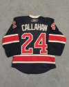
But to add to your statements, the whites are GREAT. Since they’re the Broadway BLUEshirts, the blue jersey will always be revered. I’m not knocking those at all since I love them too. But, I think the elbow/hem striping and shoulder yoke designs just gives it the extra oomph factor. This is why I also really like the Winter Classic jerseys they’ve trotted out. The 2018 navy blue was really helped by the addition of those shoulder yoke stripes:
View attachment 517152
Now, the 2012 Winter Classics were just in a class of their own. I can not believe they’ve never managed to incorporate them as alternates over the years. It’s a shame to keep them relegated to one and done unlike most of the other WC participants who have used their jerseys here and there. (Philly would eventually use their WC as their third jerseys)
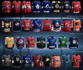
This brings me to another point of why the 2012 Winter Classics are special. Up until then, I’d chuckle to myself that the Rangers are the only team in the league who DON’T wear their official logo on their jersey crest. Of course I wouldn’t have it any other way since the diagonal RANGERS lettering is iconic. They should never stray from it. But it is an interesting tidbit that they are unique in this (This graphic is older and not updated, but you get the idea):
View attachment 517172
So, when the 2012’s were unleashed, I thought it was great that they created a mashup of the eras with a nod to the 76-78 Winnipeg , errrr, NY Rangers logo

‘shield jerseys’. Tastefully marrying what they were trying to do in those 1976 crests yet giving it that vintage look. IMO, they hit it out of the park.
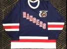
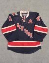
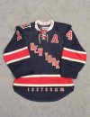
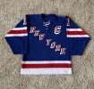
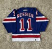
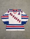
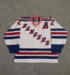
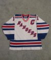
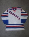
I haven’t gotten my hands on a 2018 Winter Classic jersey (Can never find a good deal on one) but , I would add these four along with that one to my personal favorites of the last 25 seasons:
(They’re all replicas)
View attachment 517160


 )
)