
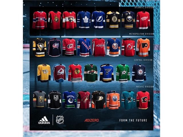
Adidas Bruins uniforms
- Thread starter chizzler
- Start date
riverhawkey91
Registered User
For a lot of these teams' sake, I hope the NHL revisits the rule about tucking in jerseys 
The Bruins jersey is fine. The triple rings around the bottom/arms look a little weird in the picture, but they looked fine on last year's jersey so not much has changed.
The Bruins jersey is fine. The triple rings around the bottom/arms look a little weird in the picture, but they looked fine on last year's jersey so not much has changed.
Last edited:
smithformeragent
Moderator
I was a bit worried the Bruins would eliminate the hem stripes likenon their "Men in Black" alts.
Calgary and Washington should have gone retro.
Devils are about ten years too late on their changes.
Looks as stupid as it would have before.
The Rangers' collar is awkward too.
Calgary and Washington should have gone retro.
Devils are about ten years too late on their changes.
Looks as stupid as it would have before.
The Rangers' collar is awkward too.
smithformeragent
Moderator
Sabres should have just gone full retro as well.
Almost there with removing the stupid silver armpits. Why not just go all the way?
Almost there with removing the stupid silver armpits. Why not just go all the way?
riverhawkey91
Registered User
I was a bit worried the Bruins would eliminate the hem stripes likenon their "Men in Black" alts.
Calgary and Washington should have gone retro.
Devils are about ten years too late on their changes.
Looks as stupid as it would have before.
The Rangers' collar is awkward too.
Yeah that red pentagon piece there is just weird...would have been better if they left it out and just did full laces. Their jersey as a whole looks like they just threw the "RANGERS" writing on some old 80s/90s Team USA jersey.
Jdavidev
Registered User
1 down, 1 to go. For me, the Bruins home looks perfect... kept the yoke and the stripes, kept the logo, but got rid of the double outline on the numbers and letters that will make them much more legible on TV (like they did on their road letters, but not their numbers, always bothered me). Hopefully the roads are similar changes, but would like to see the exact same striping yellow-black-white-black-yellow to be in line with the classic jerseys, and maybe get rid of the black below the arm stripes.
Jdavidev
Registered User
I was a bit worried the Bruins would eliminate the hem stripes likenon their "Men in Black" alts.
Calgary and Washington should have gone retro.
Devils are about ten years too late on their changes.
Looks as stupid as it would have before.
The Rangers' collar is awkward too.
Devils look weird, but their look was very dated and drab. Should have done a hybrid between their christmas tree jerseys and changed the green to black with the extra stripes and white outline around the black yoke.
Caps... man, somehow it looks worse on this template, didn't think that was possible. I like was Calgary did, actually. Got rid of the piping, but kept the color balance with the black. Their will be thirds again next season (and possibly fourths) so those can be retro.
Avs look great. Was worried they would replace the light blue with the navy that was introduced two years ago (which would have been horrible as those navy thirds already were).
Preds, man, those look so bland next to everything else. Hurricanes, welcome back!
Ducks and Kings... why can't you see that you are so wrong?
Also, I really hope the Wild don't change their roads. They were the very best in the NHL the last couple years.
FribbleLine
Registered User
smithformeragent
Moderator
I agree that Calgary improved.
Black and Red is so overdone.
Vegas looks good.
Agreed that Jersey could have split the difference and gone back to their old style, but kept the black.
Still, with Minnesota ditching the red, green on red would have been NJ's to reclaim.
Overall, the league looks better with this change than the RBK edge redesign.
Mr. Make-Believe
The happy genius of my household
They've been leaked to chris creamer's.
B's look the same other than the changes to the name and number font.
Do you have a link dude?
smithformeragent
Moderator
Do you have a link dude?
I tried PMing you, but the site doesn't like it.
Keeps blocking the URL.
Go to boards. Sportslogos . Net and the NHL thread.

DarrenBanks56
Registered User
- May 16, 2005
- 12,027
- 8,873
vegas jersey is awesome. i want one
Yeah that's a filthy jersey.
DarrenBanks56
Registered User
- May 16, 2005
- 12,027
- 8,873
smithformeragent
Moderator
vegas jersey is awesome. i want one
Love it. Though, I wish they used a color other than red for the bottom sleeve strips. Makes me think of the senators (the helmet, red, etc). Should have made it white or a darker shade of gold.
Definitely a badass sweater, though...
PrisonMike
Registered User
smithformeragent
Moderator

Gator Mike
Registered User
Gator Mike
Registered User
PrisonMike
Registered User
Users who are viewing this thread
Total: 1 (members: 0, guests: 1)
Latest posts
-

-

-
 GDT: Round 1 Game 3: Washington Capitals @ Montreal Canadiens 4/25/25 7:00pm EST SN, TVAS (425 Viewers)
- Latest: Kimota
-

-
