Adidas Bruins uniforms

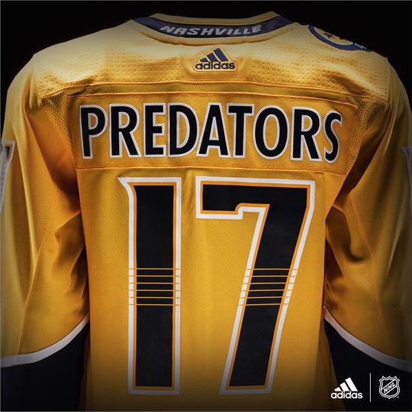
Their probably is, but to me, the blue around the chest broke up all the yellow, now that its gone it just looks like a giant piece of cheese.

yeah good point. Looks like St. Louis remains mostly the same, except for changing the numbers to white (not good) but moving the arm stripes higher (good).
 
Here's the new Nashville uniform, I think this is the first of the ones Adidas is altering.

DCyQTquUQAAkPIW.jpg:large

I like the darker colors but it looks so... plain. I don't like how it just goes from dark yellow to navy blue with just a white stripe in the middle. I think it'll look better with pads underneath it.

The back looks really nice, though.
DCyXy66UwAAoZqI.jpg
 
Baffling that anyone could see the new Preds jersey as an improvement. Horrendous. It's severely, severely lacking even the slightest bit of style/edge. Praying the Bruins aren't this ugly.
 
Remove the logo and it looks like a practice jersey

Yeah, exactly. Way too much negative space on that jersey. The prevailing thought is that piping was bad on hockey jersey's, and it is, but it did help with another issue that most designs these days don't seem to account for: color balance. The Flames and the Avalanche have lines going everywhere, but they also had great color balance. And the Preds, they were an eyesore, but without any piping, as you can see, is just a blob of yellow with little navy at the bottom. Not working. Need a yoke, some more stripes higher up the hem and the sleeves.
 
I hate just about every leak I've seen so far. Oilers collar looks unforgivable. I'm sure we'll be seeing some frantic redesigns next year if the feedback is overwhelming for certain fan-bases.
 
I hate just about every leak I've seen so far. Oilers collar looks unforgivable. I'm sure we'll be seeing some frantic redesigns next year if the feedback is overwhelming for certain fan-bases.

I hate that the Oilers went orange and navy.

They finally looked good again going back to their classic look.

Change for change's sake.
 
Holding out hope that the striping has been switched on the Bruins' away jerseys.

That thick black stripe at the center of the hem and elbows swalllws the gold and white.
 

Ad

Ad