Speculation: 2021-22 LA Kings News, Rumors, Roster discussion part IV Playoffs? I Danault

  • Work is still on-going to rebuild the site styling and features. Please report any issues you may experience so we can look into it. Click Here for Updates
Status
Not open for further replies.
The one thing they didn’t do this draft was reel in a goalie prospect.

As I recall it was on Mayors Manor that Yannetti mentioned that they targeted Wallstedt once they saw he was dropping but with the Wild trading up for him they had to change course. Can't accomplish everything in 1 free agency or 1 NHL draft. Same goes for that coveted 1 LD.

Kings Of The Podcast: Ep. 104 with Mark Yannetti
 
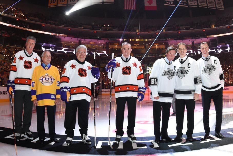
The current jerseys are the worse in team history IMO but because they were the ones worn in 2012 and 2014 I don't think they are going anywhere.
They would be a lot better if they did not have the shoulder to cuff piping. Would be more similar to chevy era.
I still miss these
upload_2021-8-17_13-34-18.png
 
then we would have the same colors as Buffalo tho
Before i posted, i thought thru all the teams to think if anyone had those colors. Nope -- nobody has it surprisingly I thought. Duhhh, Buffalo -- shows how irrelevant they are in hockey currently...not to mention the past 15+ years.
 
  • Like
Reactions: Lt Dan
Got to see them in person against the ducks this season. First time ever for me. Those Jerseys are something else 10/10.

These are still my favorite but I know there is a ton of nostalgia baked into it.

If I remove the nostalgia, the purple 3rds from 2010 or whatever are really where it is at. Love both of them though.
 
  • Like
Reactions: KINGS17
Same goes for me with the Gretzky era uniforms being the best ones (with my second favorite sets being the original Forum Blue designs, and not the 80s era redesign).

I always associate the silver and black era with some tough and high octane Kings' hockey (that is until it all fell apart in the mid-90s). The Kings were also a pretty intimidating bunch in that era with McSorley, Baumgartner, Miller, Rychel, Johnson, O'Donnell, Lappy, etc., plus the likes of Taylor, Blake, Zhitnik, Granato, would also crush opponents at any opportunity.

I would love for them to go back to those and adopt the Forum Blue as alternates.
 
They need to use the same exact jersey they used for the Chevy one last year (same numbers and font, numbers in the stripes, zero striping, retro collar). But instead of the Chevy logo use the original crown in black and white or a newer updated crown. The home plate logo is so bland. I get Luc's reasoning that everyone says "LA" (like why they went with Vegas Golden Knights), but the logo stinks. It's not ugly, it's just incredibly generic and stale. A big beautiful crown on the front with a lot of detail work (similar stitching and quality to the Blackhawks logo) would be amazing. Use shiny chrome thread for the detail work. The home plate logo is a shoulder patch at best. The italic KINGS logo font on the helmets and Chevy is so iconic and looks so good.

Agree 100%!!!! Me personally don't mind any of the color schemes just please don't ever bring back the Chevy Logos. Worst crest in sports along with our current home plate trash. Do whatever you want with the jersey designs, just don't put a stupid car logo and a simple shape as your main crest. Of course it would make too much sense to use a great crown design, so watch they go with a stupid square for our next crest redesign. :laugh:
 
Im probably in the minority here but i always loved the lion in this logo. Its too cheesy to be the center piece of a uniform but throw it on the shoulders or something. Edit, to be clear, I am only talking about the lion.

106.png
I liked the Crest much more than the crown
 
  • Like
Reactions: Basilisk
I'm fine with it.

It's inevitable, and especially after covid. It'll be like the ads on the boards. It's more noticeable that ads aren't there when watching a game from the past.

Maybe it's the Kings sucking recently, or just the world, but I'm worn out. I just don't have it in me to care about the ads coming to jerseys. It's money, and that's the important part.
 
Will never understand their (deliberate) silence on the purple and gold 3rds. They should be such a hit but they refuse to wear them and they were impossible to get a hold of...

Maybe the players, who wear them, don't like them. Wouldn't be the first team who hate their new 3rds.
 
Maybe the players, who wear them, don't like them. Wouldn't be the first team who hate their new 3rds.

I feel like I remember reading how the players liked the black and white better than the purple. Some people see purple as a feminine color, and unlike the Lakers there isn’t a great and wonderful history behind that color for the Kings, just mediocrity. The best Kings years are in silver and black or black and white.

Kids loved Gretzky and maybe new generations strive to be Kopitar, Doughty, Quick etc. But that’s because they won, sadly the triple crown days did not.
 
They need to use the same exact jersey they used for the Chevy one last year (same numbers and font, numbers in the stripes, zero striping, retro collar). But instead of the Chevy logo use the original crown in black and white or a newer updated crown. The home plate logo is so bland. I get Luc's reasoning that everyone says "LA" (like why they went with Vegas Golden Knights), but the logo stinks. It's not ugly, it's just incredibly generic and stale. A big beautiful crown on the front with a lot of detail work (similar stitching and quality to the Blackhawks logo) would be amazing. Use shiny chrome thread for the detail work. The home plate logo is a shoulder patch at best. The italic KINGS logo font on the helmets and Chevy is so iconic and looks so good.
This would be the perfect jersey if they want to stay with Black/White scheme.
 
Status
Not open for further replies.

Ad

Upcoming events

Ad