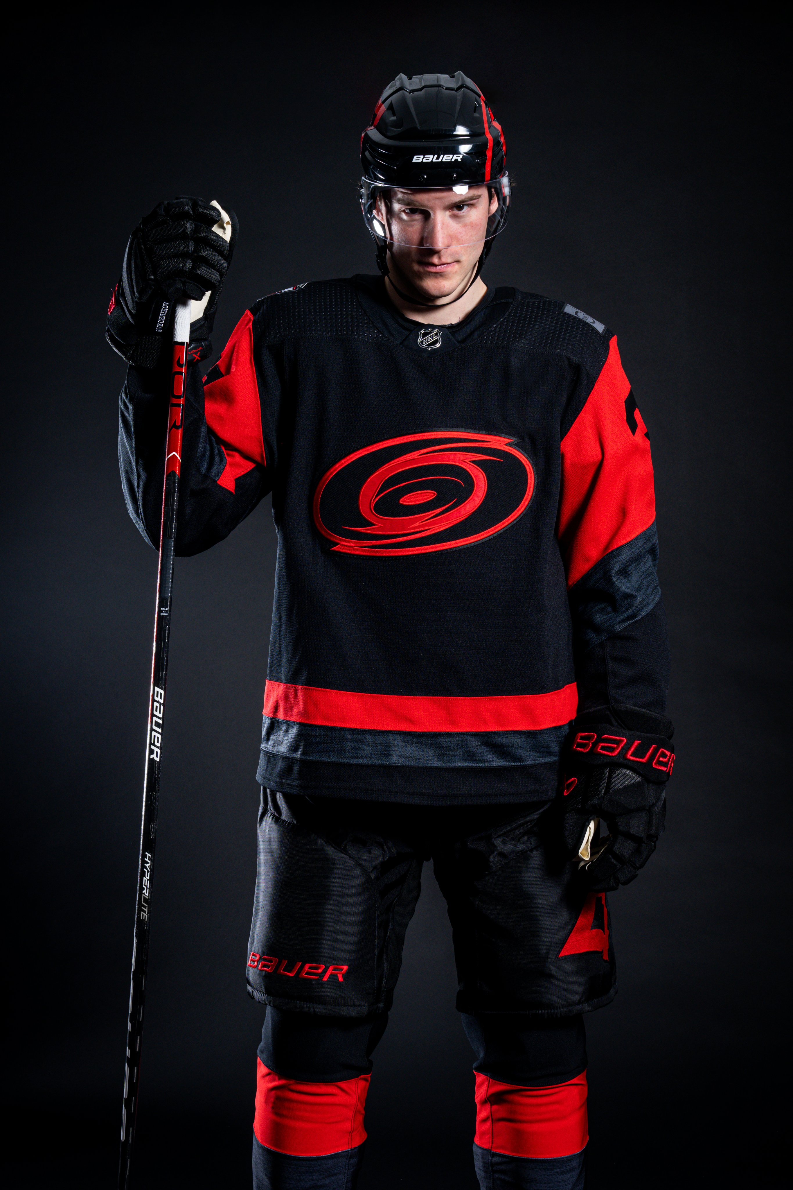
Alright, I tweaked my template to fit the current Adidas template so that it can be a bit more accurate... Based on that, this is what I have for the SS mockup:
View attachment 630300
Its basically the same as before, just with the current neck treatment and added the stitching for the fight strap on the back of the jersey. That actually helps keep everything in proportion.
Now, based on this, I spent a little time mocking up what I would like to see the Canes migrate to in 2023-24 as our full time home and away sets.... What do you think?
View attachment 630285
While it looks familiar, it actually combines design elements from many of our looks. The striping pattern is from the red jerseys we wore last year. The black hem stripe on the pants is what we wore 1999-2006. The numbers are what we wore until 2013. The shoulder patch on the white is from our current aways, and on the home is from the ReverseRetro from this year. The neck treatment is from the 25th anniversary jersey. And then I copied over the stripe and neck patterns to the away, neither of which we've ever used on the away.


