
93gilmour93
Registered User
- Feb 27, 2010
- 19,308
- 28,771
This has to happenThey need to wear their Reverse Retro in Montreal if they meet in the 3rd round.

This has to happenThey need to wear their Reverse Retro in Montreal if they meet in the 3rd round.
I think most of the color difference is just lighting. The OG Avs had the lightest red. They darkened it a bit in the 90's.
It did.I always thought the black matched the puck in the logo with the pants, helmet and skates. I loved it.
I prefer the black gear. But what I really don't get, is that if you want to get rid of all the black, then why keep black numbers and lettering on the away jersey? At least make them blue as well...
I love the blue pants with the home jersey. They look a little off with the white/road jersey. I think burgandy pants would look better than the blue with those. Has any team every done different pants for home and away kits?
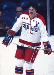
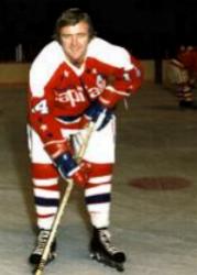
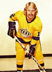
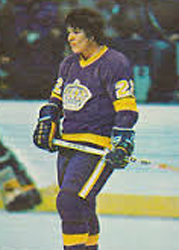
Wow, this was before my time, so I didn't know about these. If people think the Avs are rocking too much blue, I'd love to hear their reactions to those Kings photos.Well the 1974-75 Caps had Red pants with their white jersey and white pants with their red jersey.
They eventually settled on using just Blue pants with this look.
The Kings were another team in the 70's to use different pants for their home and away looks.
I disagree, only because it makes the road setup look horribleThe blue helmet/pants are such a vast improvement compared to what they had before.
The blue equipment looks really nice with the home jerseys. The away jersey equipment should be maroon. Better balance.I wasnt sure how to feel about the blue helmet and pants when they first announced it, but after seeing it on the ice a few times and getting used to it I think it looks great. The uniform flows really nicely together now IMO
So hot.I always liked these. Not the diagonal Rangers stripe but the rest of the jersey.
View attachment 443223
This looks great. I'm a big believer in trying not to overcomplicate jerseys and getting rid of the black and silver is a great step in that direction. Plus more white on dark jerseys almost always helps the dark color pop better visually
For me it's the silver that makes the jersey look dull/dirty. Changed it to white and it looks sharper imo.
How is a Canadiens fan talking about putrid 90's feel when ya'll haven't changed your jersey design in a century lol.All their jerseys have been ugly and have that putrid 90s feel, except these two:


