monitoring_string = "358c248ada348a047a4b9bb27a146148"
NHL unveils reverse retro jerseys | Page 24 | HFBoards - NHL Message Board and Forum for National Hockey League
  • Xenforo Cloud upgraded our forum to XenForo version 2.3.4. This update has created styling issues to our current templates, this is just a temporary look. We will continue to work on clearing up these issues for the next few days and restore the site to it's more familiar look, but please report any other issues you may experience so we can look into. Thanks for your patience and understanding.

NHL unveils reverse retro jerseys

Status
Not open for further replies.
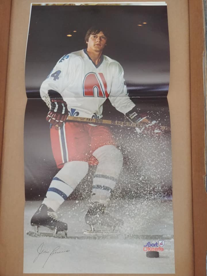
The nords used to use purple for their fleur de Lis and numbering back in the WHA days. The actual logo was the same colour as the nhl.

Perhaps the Avs are using their WHA concept replacing the purple with burgundy for the fleur de Lis, and numbering. Those jerseys used no nameplates which I feel are always a cool look on throwback.

i dont see it

The WHA Uniform Database
 

This is what I was referring to. It says it was game worn so I assumed it's legit.

113830a_lg.jpeg
 
Still disappointed with how boring they went with the islanders jersey. A reverse retro theme and seeing what some of the other teams did the isles jersey is underwhelming. Hopefully it looks clean though.
It's almost as if they don't want to sell any of these things.
 
Yeah, the Nordiques never, ever wore purple... Red was more prominent in the colour scheme in the early days in the WHA, and they used a few different shades of blue, but never purple.

That particular jersey's colours have simply changed with age; everything purple was originally blue.

From the same season:

90147576-10218090154620295-5771741785835438080-n_orig.jpg
 
This is what I was referring to. It says it was game worn so I assumed it's legit.

113830a_lg.jpeg

Looks to me like that shirt is just old and some of the materials have changed color, the auction page says as much too. It was regular blue back in 1975.
 
Dis the teams have a lot of say? Lou doesn’t like 3rds or anything too crazy but I thought it was all adidas. I guess the clubs have to approve the designs.
Exactly, my understanding is that adidas comes up with ideas and designs but the teams ultimately have final say on what they get to wear and promote. And as much as the team at Adidas are trying to push new and fun ideas, they're not gonna argue against someone like Lou.
 
the Ducks cant be doing that logo, come on now!!!

The previews show the Mighty Ducks logo on the shoulder, the same yoke design as the Wild Wing, the Wild Wing font on the back and the year chosen is '95.

They're 1000% doing the Wild Wing in white. This is what pretty much all the leaks have agreed on for the Ducks; only variable's been the color scheme.
 
I can only imagine the shitstorm that would've happened if the Coyotes used Jets 1.0 throwbacks before the Thrashers moved to Winnipeg, we saw the shitstorm of the Whalers debacle...and yet people are celebrating the Avs wearing the skin of the Nordiques and painting them in their own colors, despite no replacement team existing in Québec to soften the blow.

The way I see it, they should've saved the Nordiques stuff for games in QC itself. This comes off less as "respecting the history" and more using an iconic and beloved design for a nice cheap explosion of cash.

If this were about honoring history, Goulet's number would've stayed retired. Dallas doesn't let people use Broten's number, we don't issue out Hull or Steen's numbers. Hell, the Jets have kept the Dan Snyder Memorial Award from the Thrashers to honor their history.
I don't think a fan of the team that did this should be lecturing anyone on numbers that should be retired:

 
Here's all of Icethetics concepts based on the teasers + colour schemes teased:

Em0GvHmVEAAEaVU


EmvUsKpVEAAFLzl


EmrDFd5UcAI_HPP

Well based off of these SJ, Van, Philly, NYI, Winnipeg and a few others really bombed this assignment. Devs, Wild, Avs, Stars, Canes and a few others did really nicely.
 
Status
Not open for further replies.

Ad

Upcoming events

Ad

Top
-->->