Classic Devil
Spirit of 1988
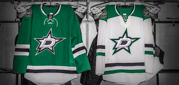
That's so godawful I can't even begin to describe how bad it is.Dallas' new jerseys:

The home jerseys remind me of a green Blackhawks jersey.
That's so godawful I can't even begin to describe how bad it is.Dallas' new jerseys:

The home jerseys remind me of a green Blackhawks jersey.
Dallas' new jerseys:

The home jerseys remind me of a green Blackhawks jersey.

It actually reminds me of this:

The original Stars jerseys were better.
Darren Dreger @DarrenDreger 13m
Visors will be grandfathered in. Hybrid icing tested in NHL preseason. Shallower nets to be used next season. All subject to board approval

wow. Dallas and Carolinas are both awful. theres better fan mocks out there
Dallas' new jerseys:

The home jerseys remind me of a green Blackhawks jersey.

It's the new emblem that's really awful.

I can't find the picture, but someone on Twitter made a mock up of the Hurricanes jersey using the old Whalers template but with Carolina's colors. It looked pretty good actually and would've actually had some history to it instead of this forced "classic look" they went for.
Carolina's process was flawed from the start since the main objective of the redesign was to get rid of the storm flag stripes, which were the iconic part to their old uniforms, especially when compared to their toilet bowl logo.
I feel like Dallas' could have been so much more than they ended up being, though I'm also partial to the star pattern uniforms they had in the late 90s/early 2000s.

