@MapleLeafs - Reverse Retro Jersey Announcement

  • Xenforo Cloud will be upgrading us to version 2.3.5 on March 3rd at 12 AM GMT. This version has increased stability and fixes several bugs. We expect downtime for the duration of the update. The admin team will continue to work on existing issues, templates and upgrade all necessary available addons to minimize impact of this new version. Click Here for Updates
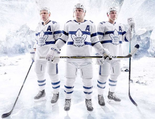
I keep looking at the jersey hoping it will grow on me.... I think it's slowly starting to happen.
 
I've been saying this for years. Just give me anything with that sweet stripe down the arm. I'll buy it in a heartbeat.

Looks like that's the direction they're going. I'm absolutely thrilled!

Well, they've found a way to make a liar out of me. Because there's no way I'm touching one of these hideous jerseys. Its the logo. It's a disgrace.

I wish they had stuck to the current logo. Everyone universally liked it when we switched from the previous one to the current leaf. Why go back a step when this one is already the "retro" feel, and is liked better by everyone? There's no fun history associated with the logo they picked.

Then they went and made it an outline, and slightly changed the shape, and made it worse. It looks like a knock-off. And then, as @The Podium pointed out, the letters n and m are lower case. Because they were going out of their way to screw up the logo as much as possible.

Love the stripe down the arm. But I hate everything else about this. It's an eyesore.
 
Last edited:
Anyone who thinks these are the worst are forgetting about:

r


2018-Maple-Leafs-Stadium-Series-Uniform-590x455.jpg
These new ones are far from the worst. The Jason Blake jerseys are the worst.
 
logo looks like it was designed by a 10 year old. That grey has got to go. We're the Leafs not the Detroit Lions. Will have to see what it looks like on the ice I guess.

I dont know how to post gifs in here but theres probably a thousand to choose from how bad these look.
 
  • Like
Reactions: qqaz
It's not very good. Gives me a cartoon-ish vibe. The shape of the logo is okay I guess but it should be white and sharper. Also a little smaller. Numbers should not be blue.
 
So why is adding an entirely new colour making it a 'reverse'? The team missed the mark with it already.
Silver isn’t a new colour for Toronto, their uniforms from 99-07 had silver lacing throughout the numbers and shoulder patches.
 
We have had some of the most attractive and iconic jerseys in the entire sport and this is what we come up with?

Sometimes all you can do is shake your head
 
  • Like
Reactions: Marshy and qqaz
Silver isn’t a new colour for Toronto, their uniforms from 99-07 had silver lacing throughout the numbers and shoulder patches.

That was an abomination then as well. Imagine the Habs adding noir to the bleu, blanc et rouge. Some things are just meant to stay timeless forever.
 

Ad

Upcoming events

Ad