
Reduce the white stripe at the bottom and I'm buying that.View media item 8194
Why did they make it so hard? It was right there for them ... I mocked this up in 5 mins lol.
@MapleLeafs - Reverse Retro Jersey Announcement
- Thread starter LeafChief
- Start date
-
Xenforo Cloud will be upgrading us to version 2.3.5 on March 3rd at 12 AM GMT. This version has increased stability and fixes several bugs. We expect downtime for the duration of the update. The admin team will continue to work on existing issues, templates and upgrade all necessary available addons to minimize impact of this new version. Click Here for Updates
You are using an out of date browser. It may not display this or other websites correctly.
You should upgrade or use an alternative browser.
You should upgrade or use an alternative browser.

barilko05
People...they're the worst!
- Jan 28, 2011
- 1,208
- 978
I lived through the Ballard era and those clown uniforms. And even though my childhood Leaf heroes (Darryl, Lanny, Tiger, Palmy, etc) all sported it, it still reminds me of the ultimate failure of that era. I agree that the turning the old alt third jersey blue, with perhaps a few tweaks, would have been far superior to this rag, which I would use to sop up the barf I threw up when I first saw it.
I R DISAPPOINT!!!!
I R DISAPPOINT!!!!
Rob Brown
Way She Goes
- Dec 17, 2009
- 17,563
- 14,733
I wouldn't call this silver but yeah.Silver isn’t a new colour for Toronto, their uniforms from 99-07 had silver lacing throughout the numbers and shoulder patches.
Menzinger
Kessel4LadyByng
ITM
Out on the front line, don't worry I'll be fine...
- Jan 26, 2012
- 4,882
- 2,841
Honestly...I think it's awful.
You're far too kind.
Anyone who thinks these are the worst are forgetting about:

Didn't forget the practice jerseys and still think the "remixed" are atrocious if only in comparison to the practice jerseys/pajamas jerseys. The insisted upon cool! of it all reminds of Canadian Tire meets PartcipACTION meets Scotia Bank promotion:
Free Jersey With Every Savings Account Opened This Weekend!
2 double scotches in. Still don't like it.
Drink as many as you want, there's nothing but fire that would make that thing look good. Just pray we hire Mike Keenan to refuse to let the team wear it.
robertmac43
Forever 43!
- Mar 31, 2015
- 25,553
- 17,782
The more I look at it, the more I hate it.
Stephen
Moderator
- Feb 28, 2002
- 83,098
- 62,017
The more I look at it, the more I hate it.
Can't decide if that jersey is the worst piece of Leafs branding ever or this is:
Should have been these
View media item 8194
Why did they make it so hard? It was right there for them ... I mocked this up in 5 mins lol.
this. Literally all they had to do was this ffs. This was a tap in and instead they lipped out and rolled off the green.
Now I will be a bit more patient. I want to see these jerseys fitted and on ice with a full uniform. Maybe a creative sock, pants, gloves and helmet combo and make this work. The jersey, especially a baggy jersey, just doesn’t work.
Man Bear Pig
Registered User
I may be in the minority here but that's one of my least favorite Leafs jerseys.
This era would be cool to see.
Happy Movember!
Stephen
Moderator
- Feb 28, 2002
- 83,098
- 62,017
I may be in the minority here but that's one of my least favorite Leafs jerseys.
It's kind of an ugly 70s-80s look that they could have modernized. But that combination of oversized logo and use of grey is just bad. Maybe just use grey if you're really looking for a strange colourway, but choosing the worst logo the Leafs have ever had and scaling it up 1.5x is just poor design.
BertCorbeau
F*ck cancer - RIP Fugu and Buffaloed

This reverse retro theme across the league is brutal, but this iteration of the Leaf jersey is just bleh.
Clark4Ever
What we do in hockey echoes in eternity...
7even
Offered and lost
The stripe at the bottom is imo the biggest offender, makes it look like a repurposed pillowcase
The rest is, f*** me I dunno, like, I might buy it as a hoodie? But as a jersey naw mayne it ain't it.
The rest is, f*** me I dunno, like, I might buy it as a hoodie? But as a jersey naw mayne it ain't it.
cupcrazyman
Stupid Sexy Flanders
TootooTrain
Sandpaper
- Jun 12, 2010
- 35,522
- 481
Stephen
Moderator
- Feb 28, 2002
- 83,098
- 62,017
Have to pay for all those terrible contracts some how.
The NHL and Adidas would make more money if they invested in good designs... these nasty jerseys aren't exactly cheap buys in a pandemic. Way to read the room!
LeafsOHLRangers98
Registered User
- Jun 13, 2017
- 6,658
- 6,815
tokyoite
I changed my name from "nipponjin" last summer.
supermann_98
Registered User
- May 8, 2002
- 9,721
- 8,246
I'm kinda holding back on my true disgust for this jersey just in case it WAS designed by a 3rd grader or a make-a-wish children's design and don't want to them to see all the negativity.Exact word I was going to use.
The logo looks like it was drawn by a 3rd grader.
Let's be real though this was designed by a recently out-of-university female liberal arts student with facial piercings and neck tattoos
Sad but true.I'm kinda holding back on my true disgust for this jersey just in case it WAS designed by a 3rd grader or a make-a-wish children's design and don't want to them to see all the negativity.
Let's be real though this was designed by a recently out-of-university female liberal arts student with facial piercings and neck tattoos
Face Of Bear
Registered User
- Jul 30, 2012
- 2,144
- 1,374
Worst leaf jersey of all time. We have so many retro jerseys that could have tastefully been 'reversed' and for some reason they chose to bash together a leaf from one era with the stripes of another. The blue on blue enlarged logo is particularly hideous. Makes me wonder how someone got paid to come up with that and how anyone else thought it was the best option.
hfman
Registered User
- Oct 30, 2013
- 3,235
- 1,601
I'm guessing they didn't go with the 80s logo (to go with the 80s sweater) because we are only 4 years removed from it.
But the 1970/71 logo was different than both the 1982/83 and 1987-2015 logo. Yet the sweater was the same in both the 70s and 80s.
So why didn't they just go with the 1970/71 logo?
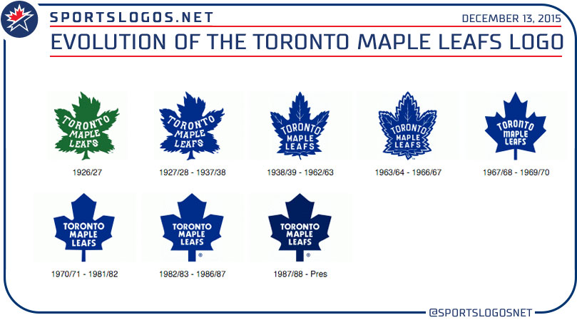

But the 1970/71 logo was different than both the 1982/83 and 1987-2015 logo. Yet the sweater was the same in both the 70s and 80s.
So why didn't they just go with the 1970/71 logo?
Latest posts
-

-
 Trades & Free Agency Thread: 2024-2025 - Trade Deadline Approaches
- Latest: Americanadian