Rumor: Kings rebranding with a new logo?

  • PLEASE check any bookmark on all devices. IF you see a link pointing to mandatory.com DELETE it Please use this URL https://forums.hfboards.com/

Statto

HFBoards Sponsor
Sponsor
May 9, 2014
5,571
7,838
These bad boys sold out faster than our post season this year!

Reverse-Retro-1-640x640.jpeg
Yep. I snoozed and lost.

I love those. I really like the retro 2.0 and have that one but the reverse retro 1.0 is stunning.
 

KingsOfCali25

Start up the Bandwagon!
Feb 21, 2013
4,830
2,078
Santa Clarita, CA
These bad boys sold out faster than our post season this year!

Reverse-Retro-1-640x640.jpeg
I'm happy with the changes they made (way better than the home plate logo), but if these were the jerseys than I'd be okay with it too. Maybe they can use these for the 3rd jersey instead of a silver/gray one.

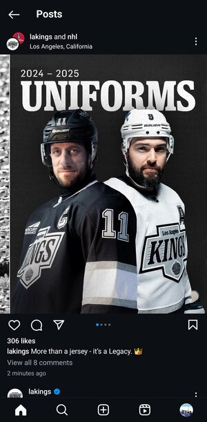
On a more positive note, the recent mayor's article on new uniform information has the Kings going to a matte black helmet for home games and them ditching the "chrome dome" helmets. So Luc actually listened to me when we spoke in the Staples Center elevator!!
 

shuchukfan

Registered User
Mar 11, 2015
730
1,130
OC
These jerseys look cheap and like a grade schooler designed them
Agreed. If you're going to "design" something this uninspired, then I'd rather just keep the home plate jerseys. And I NEVER thought I would say that.
 

kingpest19

Registered User
Sep 21, 2004
12,344
764
Is it me or are the bottom trims look absurdly thick? Other than that it doesn't look as terrible as I thought it would.
That was my first thought. They basically just took the Mitchell and Ness template and used it for these. Just blah
 

Telos

In Byfield We Must Trust
Aug 16, 2008
32,966
8,020
Reno, NV


I don't know how I feel to be honest. It's okay, they've worn all the retro jerseys before, but it just seems so bland.
 

deaderhead28

Registered User
Jul 3, 2010
5,415
3,979
I wouldve liked the purple and forum blue, but these look great. This era is my second favorite with yellow and forum blue being the first.
 
Last edited:

Kudelski37

Registered User
Feb 19, 2021
1,116
1,480
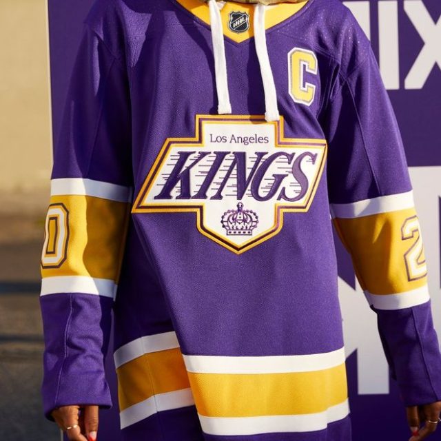
The logo is lower on the chest when compared to the Gretzky era jerseys which adds emphasis on the players belly. Odd. I don't like the numbers on shoulders instead of in the stripes.
 
  • Like
Reactions: Steve Zissou

Ad

Upcoming events

Ad

Ad