johnjm22
Pseudo Intellectual
- Aug 2, 2005
- 20,170
- 16,048
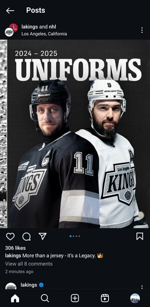
They just announced our new slogan for 24-25.Pride = Passion = Power = We were right there
Pride = Legacy = Determination
They just announced our new slogan for 24-25.Pride = Passion = Power = We were right there
Yep. I snoozed and lost.These bad boys sold out faster than our post season this year!
I'm happy with the changes they made (way better than the home plate logo), but if these were the jerseys than I'd be okay with it too. Maybe they can use these for the 3rd jersey instead of a silver/gray one.These bad boys sold out faster than our post season this year!
Is it me or are the bottom trims look absurdly thick? Other than that it doesn't look as terrible as I thought it would.
Is it me or are the bottom trims look absurdly thick? Other than that it doesn't look as terrible as I thought it would.
Agreed. If you're going to "design" something this uninspired, then I'd rather just keep the home plate jerseys. And I NEVER thought I would say that.These jerseys look cheap and like a grade schooler designed them
That was my first thought. They basically just took the Mitchell and Ness template and used it for these. Just blahIs it me or are the bottom trims look absurdly thick? Other than that it doesn't look as terrible as I thought it would.
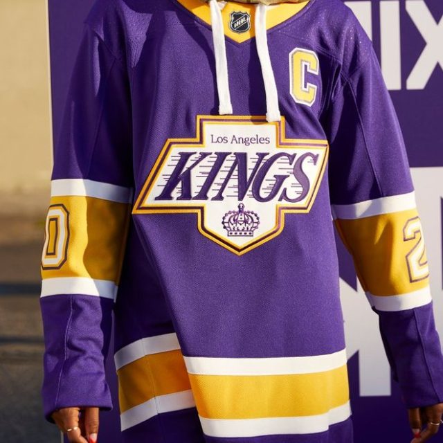
Lmao that’s it! That’s what it looks like.It's a powerlifting belt to symbolize hard work
I don't know how I feel to be honest. It's okay, they've worn all the retro jerseys before, but it just seems so bland.
I don't know how I feel to be honest. It's okay, they've worn all the retro jerseys before, but it just seems so bland.