Rumor: Kings rebranding with a new logo?

  • Xenforo Cloud has scheduled an upgrade to XenForo version 2.2.16. This will take place on or shortly after the following date and time: Jul 05, 2024 at 05:00 PM (PT) There shouldn't be any downtime, as it's just a maintenance release. More info here

BigKing

Blake Out of Hell III: Back in to Hell
Mar 11, 2003
11,564
12,263
Belmont Shore, CA
google.com
The script dialog is kind of terrible though. A bunch words and phrases put together that are supposed to sound cool but make no sense.

"Legacy moves us forward." This means nothing. It's gobbledygook.
My favorite part of the "hype" video was how the shining moments or whatever stopped with the 2014 Cup. Just a reminder that noting has happened for 10 years and counting...
 
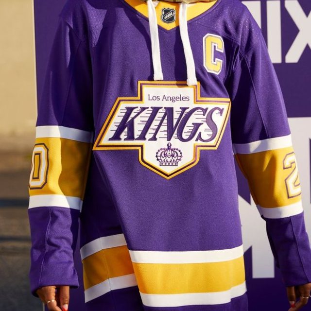
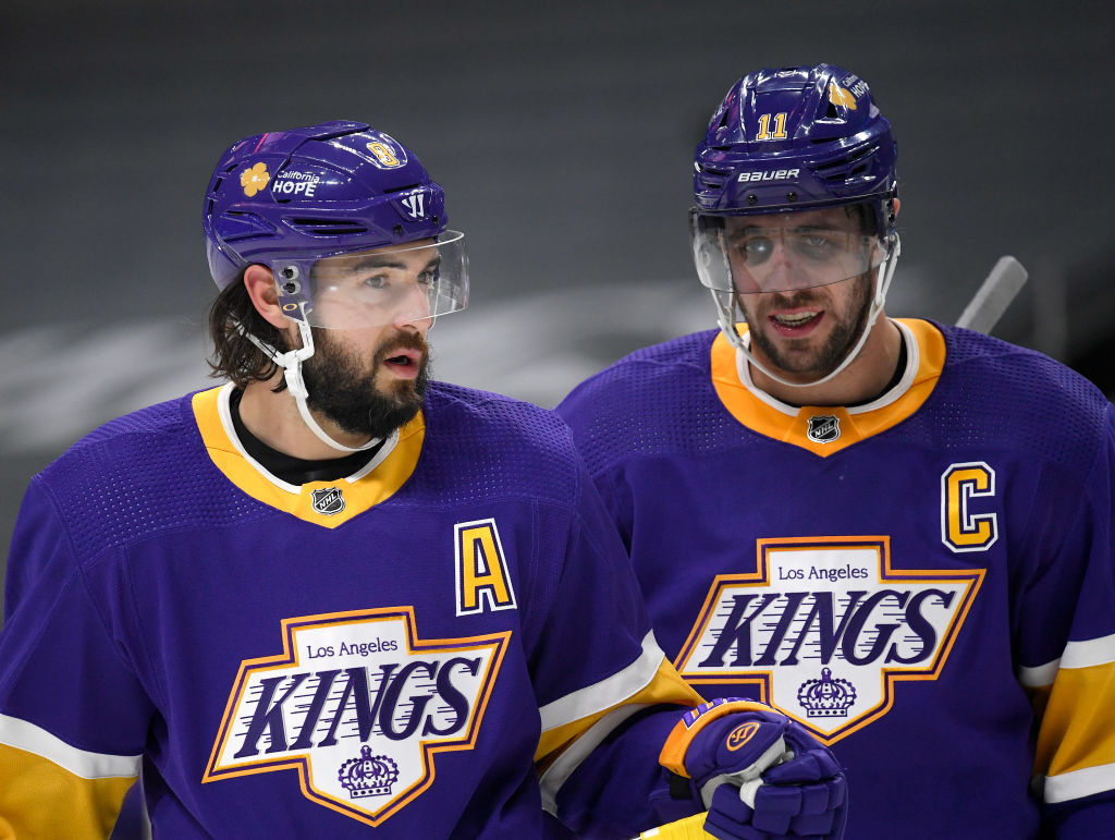
I wish they would just do the reverse retro with the chevy logo and/or old school crown. Or even go with the original jerseys:

gyi0063669163.0.jpg
SPORTS_150219796_AR_0_ASFRRAAPXDLG.jpg
 

SaltyElkHunter

I …. am…. The LA Kings!
Apr 24, 2019
3,137
2,985
Utah
The Kings have this fascination with going back to a time that just doesn’t exist anymore. 2024 sucks compared to 1988. The coke isn’t pure, gas costs over 5 bucks, the Russians are invading countries not pulling out and now the women are men. Maybe Blake will channel his inner McMaster because he’s not even close to Beverly with his SC finals appearance or Vachon’s 7 playoff appearances and 1 division title.
f*** I’m grabbing a shot after reading this. amen brotha!
 

StreetHawk

Registered User
Sep 30, 2017
27,078
10,247
it was literally that easy, they would have been the stars of the league for bringing back something so classic and loved

leave it to luc to overcomplicate something so simple
LA never really had much success in the purple/yellow, so I get staying with the black and silver. I just don't get the team's love affair with minimizing the crown on their logos in place of wording of Kings on the Chevy and LA on the Diamond logos.

Goes with other clubs that changed color schemes. Van, Buf, Ana, etc. Van has been more blue/green than the black/yellow/red scheme, yet there is a base of fans that want that skate look. Anaheim is like half/half between the purple/green and black/orange.

I think all of these teams that swapped colors, have to just pick the scheme they want and just stick with it for a while. End of the day, won't please everyone as people will have a preference to one color or another.
 

Raccoon Jesus

Draft em but don't play em
Oct 30, 2008
62,447
63,624
I.E.
The Kings have this fascination with going back to a time that just doesn’t exist anymore. 2024 sucks compared to 1988. The coke isn’t pure, gas costs over 5 bucks, the Russians are invading countries not pulling out and now the women are men. Maybe Blake will channel his inner McMaster because he’s not even close to Beverly with his SC finals appearance or Vachon’s 7 playoff appearances and 1 division title.


"do you guys remember the glory days in the late 90s?"

yeah that was awful

"remember when we went to the finals?"

yeah blake you were a rookie and we blew it on a stupid stick

"remember when we as the plucky underdogs beat the heavily favored wings in the 2002 playoffs?"

yeah asshole that's after you ripped the C off your chest Cup chasing and beat us with the team you defected to and Luc was about to leave doing the same."

These guys' fascination with the era in which they buttf***ed the whole franchise is either ignorant or totally middle fingering us especially given now they get to do it again in suits instead of jerseys
 

chris kontos

Registered User
Feb 28, 2023
3,694
2,375
it was literally that easy, they would have been the stars of the league for bringing back something so classic and loved

leave it to luc to overcomplicate something so simple
overcomplicate is a very kind word.
all i do is laugh at this point
 

Nasti

Registered User
Jan 30, 2006
4,395
5,886
Long Beach, CA
I was just thinking this the other day. The Gretz era jersey's are easily my favorite design, but I associate them with a bunch of shit things, a Pavlonian response to mediocrity and losing in the Finals. On the other hand, Easy E.
To be fair, do you have good memories of any other design in Kings history other than the home plate era?
 

Nasti

Registered User
Jan 30, 2006
4,395
5,886
Long Beach, CA
One thing I’ve always liked about this logo is that it’s more timeless than the others. If you look at the O6 teams, they’ve all pretty much stuck with the same logos for their entire existence, minus some minor tweaks, and they’re all timeless. The other logos the Kings have used all look dated to me, including both crowns.

Having said that, as someone who used to not like the purple and gold, those throwbacks are sexy as hell in HD.
 

Omni Owl

Mar 9, 2008
6,420
811
To be fair, do you have good memories of any other design in Kings history other than the home plate era?
Maybe early 2000's during the upset of Detroit era, especially the upset game where they came back down from 3 goals to win it in OT, I think on Belanger's goal? No doubt in my mind they make it to the Finals that year if they beat Colorado in Game 7. St. Louis were easy pickings in round 3, especially with Roman Turek in goal.
 
  • Like
Reactions: crassbonanza

Ad

Upcoming events

Ad

Ad