
ujju2
Registered User
I love the Jets' current logo. Definitely shouldn't change it.
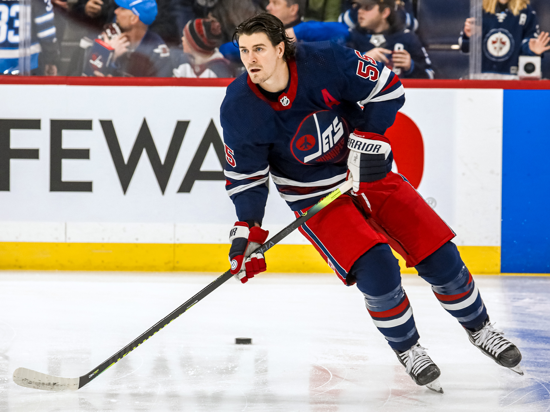
Love these.This is the current alternate jersey I believe they are referencing:


To me, this is not an improvement.
The current set is not bad, it’s just a bit bland in a corporate kind of way. It’s what you would get if you asked an insurance company to design a uniform. Nice and clean, very pro-looking, but no personality.
The old logo is a 1970s aesthetic disaster. I have no idea what people see in it. The jersey set quoted above is fine in a vacuum, but in an NHL context it’s a Rangers copycat. The actual old jerseys were much better except for the awful logo.
IMO they should either combine the best elements of old and new, or just scrap the whole thing and start over with a new identity altogether. They can always roll out retro jerseys as an alt a few times a year. Playing to nostalgia only goes so far, especially when the nostalgia is for an era of perpetual mediocrity.
90-96 for me, i hate the NY jets look ( not NFL)

Do you guys prefer their 1980-90 jerseys or the 1990-96 ones?
Not sure what you mean by disaster at all. The mid 90s jerseys were awesome and easily their best. Their current ones and colour scheme was lame the minute they unveiled them.
I was referring to the logo, not the jerseys. The older jerseys are fine, they’re pretty much a standard issue hockey jersey set. I really think they ought to try and carve out something more contemporary and in-tune with the identity of the franchise in 2023, but you could do a lot worse than the 90s jersey set.
But yeah, that logo is utter garbage. At the time it was the worst in the league by a wide margin. Only nostalgia glasses make it make any sense at all.
I don't see what is so bad about the 90s logo.
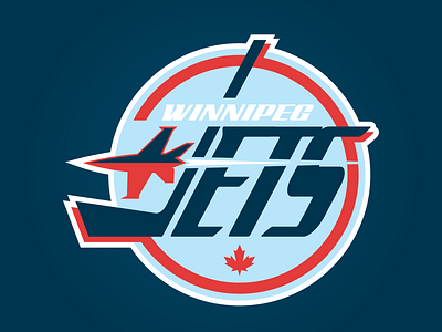
The 90s logo isn’t the one used on the jerseys which are slated to become their primaries. They’re talking about making the 70s/80s logo their primary.
The 70s/80s logo is actual trash. It looks like a literal homemade logo that someone’s mom came up with in her craft room as a project for the fan club.
The 90s logo isn’t that bad, but it’s still below the design standards of a modern team. Nostalgia is the only argument for going back to it.
But then we have the flag logo which is even worse IMO despite being a more detailed designCan't similar things be said about the Hurricanes logo?
Can't similar things be said about the Hurricanes logo?
This is the same person who leaked the Sharks jersey rebrand
