Has Fanatics already given up on the NHL? | Page 3 | HFBoards - NHL Message Board and Forum for National Hockey League

Has Fanatics already given up on the NHL?

I honestly feel the Golden Knights cup winning locker room hat is a pathetically lazy effort by Fanatics. As a Kings fan I really like the 2012 hat (much more than the 2014 hat). On a Stanley Cup winning hat, maybe I'm crazy, but I really like seeing the cup featured on there

HAHDHDHDHDHD.jpg
 
I actually really liked those hats. Something that didn't have the mall airbrush artist aesthetic was genuinely refreshing.

Like these. These are utter garbage. A pudgy 12 year old's idea of cool:
I said the exact same thing last year. The hat designs have been AWFUL the last 3 years.

Even going back before 2018, the designs were pretty good IMO

black-pittsburgh-penguins-2017-stanley-cup-champions-locker-room-adjustable-hat_pi2830000_altimages_ff_2830518alt1_full.jpg


s-l1600.jpg


s-l1600.jpg


41o9qBIThnL._AC_UF894,1000_QL80_.jpg


The designs used to be somewhat original and creative.

Look above.
 
Feel like a lot of it has to do with the NHL too. The people running things are still lost in the Stone Age.
I was thinking the same thing. I wonder how much oversight the NHL has over these designs. I would not be surprised if they dictated them. And it would not surprise me at all if, given that the NHL is run by such simpletons, NHL executives wanted a minimalist look because they thought it would make the hats more wearable and in turn help sell more of them.
 
ive never had an issue with any of their products outside of the sizing of their hats.

Quality has always been great for me.

sometimes i think people just feel off so they find someone to complain about to keep their day moving forward. its ok to not hate something.
 
All of them re 10x better than this years version.
The way I see it, it's the locker room hat given to the players on the ice. It should be over the top and obnoxious because they just reached the mountaintop and that's the time to be in your face about it. If you want other apparel that is a little more restrained, provide it, but the official merch should be loud and proud to coincide with the moment.

To see the boring reserved mailed in bullshit that Fanatics has been providing is an insult to the league. I'd much rather have anything that Reebok did in the past over any of this Fanatics garbage we are getting now.
Fair enough to both of you. I just tend to prefer more streamlined and "clean" designs. And that goes for everything.

Like I think this looks objectively awful even if the subject matter of the photo makes me happy.


There's just way too many clashing design elements here. And that goes for the older hats I griped about. Just too over the top for my taste. The second Penguins one was OK.

But like I said, for this year's hat a stronger indicator that the cup was won would help the design. Do away with the patch on hat look, have an illustrated rendition of the cup with the VGK logo superimposed over it and then some good font on Stanley Cup Champions that isn't overly big and that'd be ideal for me. If I had any talent for actually demoing design concepts I'd whip up a mockup but I don't so. My words are what I've got.
 
Last edited:
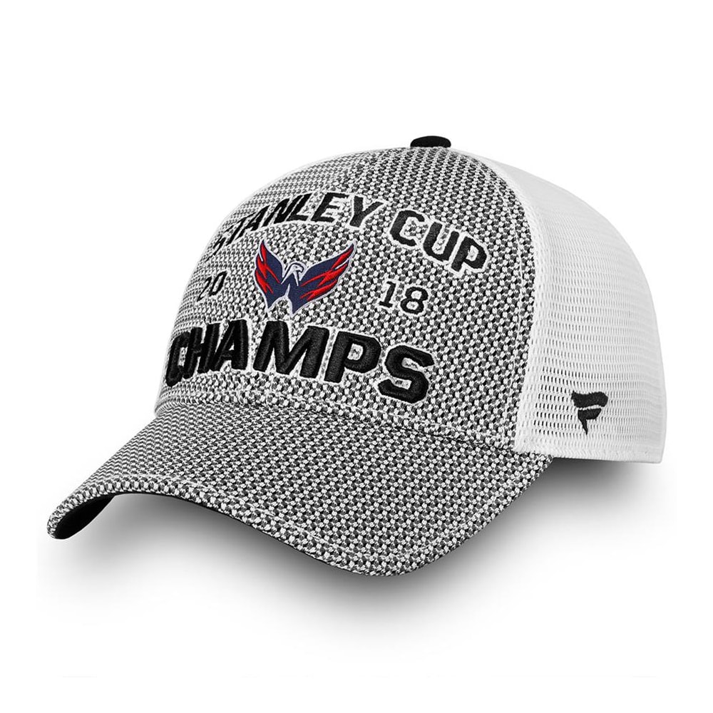
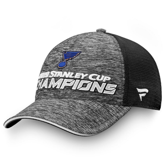
I know the official contract doesn't even begin for another 12 months, but its becoming increasingly hard to ignore just how poor the official player worn Draft and Championship merchandise has become over the last couple years. Lets just look at the official locker room hats of Stanley Cup Champions, which have slowly devolved to a collection of patches on hats, growing pathetically more generic by the year:

2018:
fanatics-washington-capitals-stanley-cup-champions-cap-adult-front-washington-capitals


2019:
0004185_st-louis-blues-fanatics-branded-2019-stanley-cup-champions-locker-room-adjustable-hat-grayblack_625.jpeg


2020:
brayden-point-tampa-bay-lightning-autographed-2020-stanley-cup-champions-locker-room-cap_pi4876000_altimages_ff_4876509-dc0ec16656e648394158alt1_full.jpg


2021:
mens-fanatics-branded-black-tampa-bay-lightning-2021-stanley-cup-champions-locker-room-adjustable-trucker-hat_pi4383000_altimages_ff_4383221-b8deede2f4ba865e8f69alt1_full.jpg


2022:
white-colorado-avalanche-2022-stanley-cup-champions-locker-room-trucker-adjustable-hat_pi4934000_altimages_ff_4934899-ebfbc7d13262cb76b7e1alt1_full.jpg


2023:
mens-fanatics-branded-charcoal-vegas-golden-knights-2023-stanley-cup-champions-locker-room-adjustable-hat_ss5_p-200169823+pv-1+u-62f7iet4nucwyeg9jywp+v-s2dy7jcgablgw2gwncfy.jpg


For the brand that is going to be handling everything about on-ice apparel and fan merchandise going forward, this is an incredibly worrying trend to be seeing playing out, especially as they're still charging a premium for these items.

For comparison sake with the other leagues:


It's absolutely incredible to me that the NHL consistently can make the wrong choices in marketing and anything to do with the fans. The Fanatics choice is absolutely brutal, but hey, at least they actually got the team names right on these, unlike their other stuff!
 
Something to consider here. When COVID hit, it shut down quite a few of the Asian supply lanes for shipping goods, particularly from China. Companies had to resort to finding a manufacturing source as best they could until this very year so to cut cost products were made as simple as could be for best profit margins. Now that the price of freight is back to 2018 levels (Pre-COVID) I expect better options later this year.
 
It's the same with all sports and has been going on for a while before fanatics.

Planned devolvement for what ever reasons
 
LOL, that's terrible. To be fair to them they don't have much to work with either as the VGK logo is simple, bland and boring. Ditto for the colors. Just no pop and looks very corporate.
Its intimidating, direct and to the point. Sharp edges. Silver ,black gold, like the Raiders logo.
 
I like the NHL hat the best. They have a nice clean look to them. Zi cant stand the NBA flashy straight brimmed hats.

I honestly love the clean lines and simplicity.
 
  • Like
Reactions: cptjeff
Put me in the camp of I think the Vegas hat is by far the nicest of the bunch.

I did have to laugh at the Division Champ hats though. Have you honestly ever seen someone wearing a division champ hat for any team in any sport?
 
  • Like
Reactions: cptjeff
That NHL hat is by far the best looking one IMO.
Putting aside looks for a second, what stands out to me regarding Fanatics products is that the hats themselves look (and most likely are) incredibly cheap.

Also, it appears that Fanatics logos are generated from a generic computer template and then literally glued onto the hat.

Looks are objective, quality is not. The NHL doesn't care (or maybe know) that associating their brand with a cheap product like Fanatics is damaging the perception of their own brand.
 
  • Like
Reactions: Nikishin al Gaib
Fair enough to both of you. I just tend to prefer more streamlined and "clean" designs. And that goes for everything.

Like I think this looks objectively awful even if the subject matter of the photo makes me happy.


There's just way too many clashing design elements here. And that goes for the older hats I griped about. Just too over the top for my taste. The second Penguins one was OK.

But like I said, for this year's hat a stronger indicator that the cup was won would help the design. Do away with the patch on hat look, have an illustrated rendition of the cup with the VGK logo superimposed over it and then some good font on Stanley Cup Champions that isn't overly big and that'd be ideal for me. If I had any talent for actually demoing design concepts I'd whip up a mockup but I don't so. My words are what I've got.


That art design was so obviously directed by Michael Bay.
 
I much prefer the simplistic design of the NHL hats over the business and really, unwearable nature of the NBA NFL or even MLB.

The design of the NHL hat, as simple as it may be, will hold up over time and has a wearability about it. Whereas the other hats come across as novelty items.
 
  • Like
Reactions: cptjeff
I've never in my life bought a championship hat. They're usually crowded messes that you'd be embarrassed to wear in any context except perhaps middle school. But it looks like that might be the target audience, so if that's the case then the NHL hats are definitely way too generic and understated.
 
I mean the team is only 6yrs old, how many hats are they projecting to sell???
Well. A lot. I tried to get some championship merch from the team store on my lunch break. The store opened at ten AM. I took an early lunch and was there at 11:30. An employee told me they sold out of all their stock in under an hour. Another sports store known for selling VGK gear had three variations of cup champion hats and they sold out of their stock in 30 minutes.
 
Putting aside looks for a second, what stands out to me regarding Fanatics products is that the hats themselves look (and most likely are) incredibly cheap.

Also, it appears that Fanatics logos are generated from a generic computer template and then literally glued onto the hat.

Looks are objective, quality is not. The NHL doesn't care (or maybe know) that associating their brand with a cheap product like Fanatics is damaging the perception of their own brand.
Hate to break it to you, but championship hats, in all sports, have always had the logos just glued on. They make the hat in a generic color and template and make two sets of patches, and heat press the patch with the winning team on, since the hat is far more expensive to make than the patch. That's just how it's always done, not a fanatics innovation.
 

Users who are viewing this thread

Latest posts

Ad

Ad