I don't hate Vegas' official championship hat. It could absolutely be better, but I'd wear it, hence I ordered one.
I think a design with more contemporary concept work done with the cup with the vgk logo superimposed over it would have been a better look (I can only visualize what that would actually look like, I can't describe it with words) but this is fine. A safe look, maybe a bit boring, but it could've been a lot worse. For example
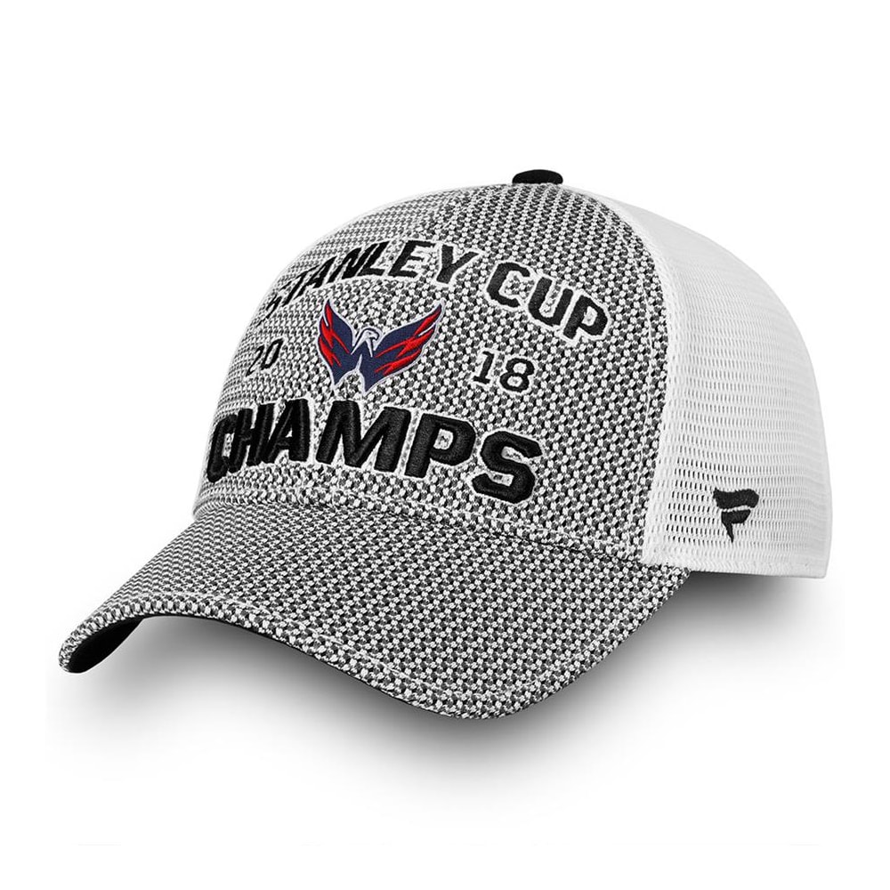
All of those aside from the second Pittsburgh one are pretty awful. I think the problem with concepts like those is there's just way too much occupying the hat. Like, I'm not enough to have cheered on two cup winners but I absolutely had no qualms skipping this f***ing monstrosity.
Like the Fanatics ones are a little too minimalist without showing the cup on the front, but I'll take a more understated look than these busy eyesores.