
cutchemist42
Registered User
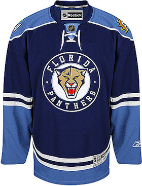
Love the concept, but the Panther logo doesnt look good. Dont think a roaring-panther is needed, personally love when animal logos arent in that pose like the Nittany Lions.
Love the concept, but the Panther logo doesnt look good. Dont think a roaring-panther is needed, personally love when animal logos arent in that pose like the Nittany Lions.

Taken from a post by EnforcetheLaus on ours boards. What you think of these?


Taken from a post by EnforcetheLaus on ours boards. What you think of these?
Taken from a post by EnforcetheLaus on ours boards. What you think of these?
Why does it say there is an accurate mockup in post #325?
There isn't.
If you could design a jersey with a darker red, horizontal stripe, changing the yellow and minimizing blue, using the 101 Airborne logo concept, and having a smaller logo of a "realistic" Panther head facing sideways that doesn't look like that, I'd be quite interested.

I roughly made that a little easier to look at

They're soccer jerseys.
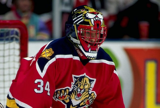
Logo is terrible. Looks like a soccer jersey with long sleeves.


")