Ducks 3rd Jersey, Uniforms & Logo Discussion continued

  • Xenforo Cloud will be upgrading us to version 2.3.5 on March 3rd at 12 AM GMT. This version has increased stability and fixes several bugs. We expect downtime for the duration of the update. The admin team will continue to work on existing issues, templates and upgrade all necessary available addons to minimize impact of this new version. Click Here for Updates
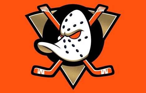
I love your posts Bergey, and I think that you're one of our better posters by a fair margin, but here I think you've erred. If you check any best sports logo poll, or better yet any best NHL logo poll, conducted within the last few years, you'll always find the original Ducks logo at or near the top. People love that logo, even beyond the Ducks fandom. In at least one meaning of the word, it is already iconic.

And I do think it's not just nostalgia, it's just that the logo is a really imaginative take on reasonably iconic but realistic sports equipment that immediately identifies both the sport and the team's name and identity. It's got everything that a logo needs to be a truly outstanding logo. It's unique, it signifies the things it needs to and wants to signify, and it's easy on the eyes.

As long as we re-embrace it fully and keep playing with the logo, there's absolutely no reason it wouldn't be considered an iconic logo by the general public quite fast. To a lot of people, it already is.
All very good points, and you're right - I hadn't looked at any fan polls or rankings of sports logos. Frankly, I didn't realize the popularity of the old Ducks logo was so widespread, and that too is a part of being iconic, It certainly does the things you say!

BTW, thanks for the kind words!
 
Last edited:
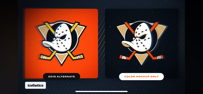
Icethetics posted their preview… seems as though the logo I shared a few days ago that I found on Twitter is pretty much spot on. Only a color mockup and he did confirm the orange eyes
 

Attachments

  • IMG_4316.png
    IMG_4316.png
    567.8 KB · Views: 2
  • IMG_4315.jpeg
    IMG_4315.jpeg
    85.8 KB · Views: 4
  • Like
Reactions: Arthuros
Icethetics posted their preview… seems as though the logo I shared a few days ago that I found on Twitter is pretty much spot on. Only a color mockup and he did confirm the orange eyes
If this first picture is what it's actually going to look like, I think it's a downgrade. The borders of the circle around the mask didn't need to be made sleeker. The thicker edge around the old one was good to begin with, the sleeker design just looks like a needless modernization that looks visually worse. Same with the borders of the triangle, unless those are just blending in with the darker background.
 
Its definitely an upgrade, but I prefer the black eyes.

Edit: I'm trying to be positive about it, but I am actually pretty bummed. This was the chance to get the old logo back and I think this pretty much closes the door on it. I doubt we ever get it back now.
 
Last edited:
I think it's alright - not a big fan of orange stitching around the eyes (I'd prefer black), but otherwise I dig it.
I like it a lot more than the webbed D. I agree that black stitching around the eyes with the eye being orange would be pretty cool. But it is definitely an improvement!
 
  • Like
Reactions: Kalv
Not feeling the orange eyes. Based on this, definitely seems uglier than the previous mighty ducks logo. And do we really need the webbed D represented at all? Let it go.
 
  • Like
Reactions: ohcomeonref
Well. I'm not pleased with the refusal to revert back to the old colors but I can live with a logo upgraded revert and orange sweaters.

Curious to see how they're redoing the webbed D. I think it's fine as is as a shoulder patch/secondary logo. It's not the pinnacle of graphic design by any means but hanging onto it as a secondary keeps a tie to the cup winning team.

Now I'm just nervous about jersey accents/striping. The side/hip striping that they've been rolling with the old thirds/"new" primaries was atrocious. I'll join in concern on the orange eyes thing. If it fills the empty space with orange instead of black, that would probably be a bad look and it seems that's what Icethetics is mocking up.

In any case I'm pleased the team is rebranding and I'm looking forward to the in person reveal at the draft (assuming that's the plan). Just feels like we have to compromise on a number of design elements the fans would prefer.
 
  • Like
Reactions: Arthuros
I get the owners wanting more orange to emphasize the OC and i actually like the brighter orange (which is supposedly going darker now?), but I've never understood how anybody thought gold was a good idea. There's no way that gold doesn't still look like shit no matter how they change it.
 
I get the owners wanting more orange to emphasize the OC and i actually like the brighter orange (which is supposedly going darker now?), but I've never understood how anybody thought gold was a good idea. There's no way that gold doesn't still look like shit no matter how they change it.

Sounds like it's not the same gold. Icethetics described it like the gold Vegas uses.
 
  • Like
Reactions: SmokeyDuck

Ad

Upcoming events

Ad