Around the League Thread part V

Status
Not open for further replies.

Raccoon Jesus

We were right there
Oct 30, 2008
63,454
66,479
I.E.
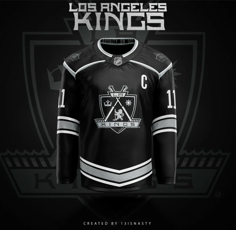
There was a recent post on Reddit with a pretty cool new jersey concept:

Which I really like, except as many pointed out, lining up with K K K at the red line probably isn't a great idea. Here's my tweak on that jersey:

xPQtplG.png


I don't like it but I appreciate the fresh take
 

cyclones22

Registered User
Apr 4, 2003
5,044
5,550
Eastvale
The Sacramento Kings crown looks nothing like any of the LA Kings versions as well. So the departure of adding the home plate border was unnecessary if that played any factor. Anyway, doubtful it will change as they won twice wearing the current version. But how about manufacturing more of the alternate purple jerseys FFS. They always sell out quickly.

I don't like it but I appreciate the fresh take

Circle K or Kmart could start sponsoring the team!
 

kingsfan28

Its A Kingspiracy !
Feb 27, 2005
40,356
9,442
Corsi Hill
That's right, the players are just transients passing through, and I really don't give a flying f what they like in a uniform. Bring back the Forum Blue and Gold.

Imagine if you had to wear this everyday, in public events and practice too [brown docker loafers not show]. Would you be happy? :laugh:

48307d99-e2c0-4ac6-9d70-11aee82db009.jpeg
 

Master Yoda

LA Legends
Aug 6, 2003
1,503
1,624
El Paso
There was a recent post on Reddit with a pretty cool new jersey concept:

Which I really like, except as many pointed out, lining up with K K K at the red line probably isn't a great idea. Here's my tweak on that jersey:

xPQtplG.png

Zw

This one came to mind.

I do like the Andy Murray era crown and colors. Need some purple in the jerseys.

Absolutely love the reverse retro colors, just put the crown on it instead of the Chevy logo.
 
  • Like
Reactions: Rumpelstiltskin

kilowatt

the vibes are not immaculate
Jan 1, 2009
18,683
21,757
Zw

This one came to mind.

I do like the Andy Murray era crown and colors. Need some purple in the jerseys.

Absolutely love the reverse retro colors, just put the crown on it instead of the Chevy logo.

I don't like it but I appreciate the fresh take

Here's an amendment from them:

bgeeqbu1c3m91.png

gua5d7u1c3m91.png

r41p92u1c3m91.png


A little too LAFC for my taste, but still a cool idea.

And I've posted these about 100 times, but there are some really cool black and white ideas here, if the players really hate the forum blue and gold for some reason. A black and white jersey can be really awesome... ours just suck.

Adidas-Los%2BAngeles.png


Setup.png


Los-Angeles-Kings-Jersey-Concepts-2.png


Los-Angeles-Kings-Jersey-Concepts-1.png


los_angeles_kings_adidas_concept_by_ajhftw-dbn7bs5.png
 

Bandit

Registered User
Jul 23, 2005
33,067
23,403
Unemployed in Greenland
Here's an amendment from them:

bgeeqbu1c3m91.png

gua5d7u1c3m91.png

r41p92u1c3m91.png


A little too LAFC for my taste, but still a cool idea.

And I've posted these about 100 times, but there are some really cool black and white ideas here, if the players really hate the forum blue and gold for some reason. A black and white jersey can be really awesome... ours just suck.

Adidas-Los%2BAngeles.png


Setup.png


Los-Angeles-Kings-Jersey-Concepts-2.png


Los-Angeles-Kings-Jersey-Concepts-1.png


los_angeles_kings_adidas_concept_by_ajhftw-dbn7bs5.png
Take out the "LA" entirely and just use the crown. Put the numbers inside the arm bands and it would be 100% better than the shit we've been wearing. Might even get Doughty & Kopitar to stop circle jerking with each other on the powerplay...
I hate hate hate hate hate the numbers ABOVE the sleeve stripes.

The entire point (in my mind) of the arm bands is to be a home to the numbers.

Just a personal thing I guess.
Nope not just you. The numbers belong in the stripes, but then there wouldn't be enough room for 50 shades for gray for Luc.
 
  • Haha
Reactions: Raccoon Jesus

Kudelski37

Registered User
Feb 19, 2021
1,129
1,504
Crowns suck for logos. It is beyond boring and unimaginative for any team named Kings. A king is a person yet the crown logos lack a person.

The bowtie, home plate, and the shield are much better logos. Black/silver, black/silver/royal blue, and royal blue/gold all look good. I can't wait for training camp to start.
 

YP44

Registered User
Jan 30, 2012
27,351
7,687
Calgary, AB
Here's an amendment from them:

bgeeqbu1c3m91.png

gua5d7u1c3m91.png

r41p92u1c3m91.png


A little too LAFC for my taste, but still a cool idea.

And I've posted these about 100 times, but there are some really cool black and white ideas here, if the players really hate the forum blue and gold for some reason. A black and white jersey can be really awesome... ours just suck.

Adidas-Los%2BAngeles.png


Setup.png


Los-Angeles-Kings-Jersey-Concepts-2.png


Los-Angeles-Kings-Jersey-Concepts-1.png


los_angeles_kings_adidas_concept_by_ajhftw-dbn7bs5.png
some of these are great.
The white kopitar jersey is sweet as is the black with the 2000's shield. The doughty set is the easiest way to improve the current set IMO.
If they just got rid of the shoulder piping and put a hem stripe on the black the look would be greatly improved even with a shit logo
 
  • Like
Reactions: kilowatt

Schrute farms

LA Kings: new GM wanted -- inquire within
Jul 7, 2020
2,553
4,628
It seems pretty clear to me that the Organization (or the uniform president in charge) wants LA as the main component and highlighted. So can't they simply incorporate "LA" into the crown and we're all happy?
 

kilowatt

the vibes are not immaculate
Jan 1, 2009
18,683
21,757
This seems like too much too soon for a two-year pro.

If he projects how we all assume he will, it'll be a pretty great contract by the end.

If he doesn't meet those projections though, or gets injured along the way, that's going to be rough. Look at a guy like Sean Monahan.

Still, good for Stutzle, and a big fat L for us so far in the Stutzle vs. Byfield debate :)
 

Telos

In Byfield We Must Trust
Aug 16, 2008
33,073
8,185
Reno, NV
It is a tough call. You hope the deal ages well, but it is a lot to give, and I feel they could have signed the very same deal at the end of the season so I don't see how it hurts to let him play out the year first before making that kind of commitment.
 

YP44

Registered User
Jan 30, 2012
27,351
7,687
Calgary, AB
This seems like too much too soon for a two-year pro.

Could work out. Ottawa has their core locked up to decent money. Big risk big reward, but if I was a fan of the sens I would at least be happy that the players are not constantly going out the door.

for all those wanting to draft stuzle..... 8x8 million for one decent season
Not sure that deal makes sense outside of Ottawa, and therefore may not have been offered elswhere
 

Herby

How could Blake have known?
Feb 27, 2002
26,804
17,035
Great Lakes Area
If you believe in the players it makes sense. The bridge deals are dead for impact young players, it makes no sense for the players or the teams. If Ottawa truly believes in Stutzle and Norris but signed them to bridge deals they would have to offer them 8 year deals for more money and that would carry into their early or mid 30's following the bridge deals.

Now they get the prime years of Norris (ends age 30) and of Stutzle (age 28) for what $16-17m where as if they wait 3-4 years and they are as good as they think its $20+m until they are 34 and 32.
 
Status
Not open for further replies.

Ad

Upcoming events

Ad

Ad