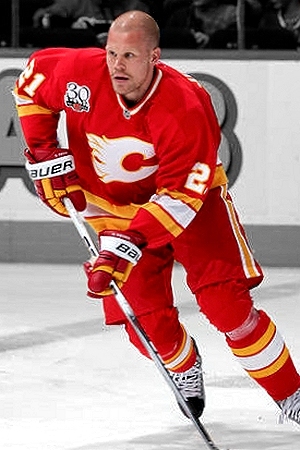
Are you a fan of the Canadian and Alberta flags on the Flames jerseys?

  • PLEASE check any bookmark on all devices. IF you see a link pointing to mandatory.com DELETE it Please use this URL https://forums.hfboards.com/

40oz

..........
Jan 21, 2007
16,953
9
As an Oiler fan and Albertan, I really don't care if the Flames choose to have the Canadian and Albertan flags as shoulder patches. That being said, as a fan of hockey jerseys I think they look tacky and show a lack of creativity and an overall theme.
 
Last edited:

Man Bear Pig

Registered User
Aug 10, 2008
31,147
14,004
Earth
Calgary-Flames-Reebok-Premier-Youth-Replica-Alternate-NHL-Hockey-Jersey-N11045_XL.jpg


Bought this jersey a few years ago, still think it's their best jersey. Never understood the Alberta flag on the shoulder tbh
 

IceAce

Strait Trippin'
Jun 9, 2010
5,166
10
Philadelphia
Calgary-Flames-Reebok-Premier-Youth-Replica-Alternate-NHL-Hockey-Jersey-N11045_XL.jpg


Bought this jersey a few years ago, still think it's their best jersey. Never understood the Alberta flag on the shoulder tbh

while probably my favorite Flames jersey, I dont think they need to go full retro. I think an updated version of this would suffice possibly keeping the black just as an outline color around the yellow parts.

The problem with a red/yellow color scheme is that the two colors are both bright and tend to visually bleed into one another. a black outline could solve that problem. Definitely go back to the red helmet and breezers look though.
 

SaintMorose

Registered User
Jul 21, 2009
3,964
547
Hated the horse head patch, so I enjoyed the change to the flags.
I want to see the retros back as a 20+ sweater though as they bring us from a very average jersey to top3
 

CraigsList

RIP #13
Apr 22, 2014
19,246
7,029
USA
It is, indeed, a pick. Additionally, the hanger effect on their jerseys (the design inside the neck that you'd only see when the jersey is on a hanger) is piano keys.

Nashville-Predators-Reebok-Premier-Replica-Home-NHL-Hockey-Jersey-N10420_XL.jpg

That's amazing. I never thought of getting a jersey from a different team, but I love the piano keys and guitar pick.
 

Bending and Tending

Registered User
Dec 25, 2014
1,128
0
U.S.A.
That's amazing. I never thought of getting a jersey from a different team, but I love the piano keys and guitar pick.

PAMIABAADKJNJJJL_j.jpg


The six lines running through the numbers represent guitar strings

EDIT: it might look like this because it's on the computer, but it also looks like they go from thickest at the top to thinnest, just like a guitar
 

tarheelhockey

Offside Review Specialist
Feb 12, 2010
86,044
141,778
Bojangles Parking Lot
I feel like this is one of those things where if the home fans like it, that's all that matters. It's not really meant to appeal to outsiders.

From a purely aesthetic point of view, IMO the Albertan flag clashes a little too much and looks out of place against the red and yellow. But for the same reason, the Canadian flag looks really good there.
 

Gnashville

HFBoards Hall of Famer
Jan 7, 2003
13,891
3,817
Crossville
The Alberta flag would be nice on the Oilers' Jersey. The colors would match nicely.

I no it's going to be blasphemous here and say it could be cool if each player had shoulder patch with their home country on it.
 

Soundgarden

#164303
Jul 22, 2008
17,913
6,793
Spring Hill, TN
The Alberta flag would be nice on the Oilers' Jersey. The colors would match nicely.

I no it's going to be blasphemous here and say it could be cool if each player had shoulder patch with their home country on it.

I remember they did that at the all-star game way back when it was World vs. NA.
 

Unlimited Chequing

Christian Yellow
Jan 29, 2009
23,663
9,656
Calgary, Alberta
It is, indeed, a pick. Additionally, the hanger effect on their jerseys (the design inside the neck that you'd only see when the jersey is on a hanger) is piano keys.

The six lines running through the numbers represent guitar strings

EDIT: it might look like this because it's on the computer, but it also looks like they go from thickest at the top to thinnest, just like a guitar

I noticed the piano keys, but not the guitar strings. That's pretty cool. Between those and the pick, you gotta appreciate the thought and subtly put into the jersey design.
 

Butch 19

Go cart Mozart
May 12, 2006
16,526
2,831
Geographical Oddity
It's pretty lame. Just another attempt to grab/misrepresent more fans under the premise of being passionate for country and province.

this ^^^^. Didn't they come out with these after lockout 05? IMO, they were trying to one up all the other Canadian teams (look how patriotic WE are!!), and the rest of the league in general.

Ultimately, they look pretty silly, and I just noticed last night that they aren't even the correct flag proportions.

If every team did this it would be totally lame... so it has to be lame when only one team does it.

Like others have posted here, just go back to the red/yellow/white jerseys (NO BLACK!!), and they have such a better product.
 

CraigsList

RIP #13
Apr 22, 2014
19,246
7,029
USA
The six lines running through the numbers represent guitar strings

EDIT: it might look like this because it's on the computer, but it also looks like they go from thickest at the top to thinnest, just like a guitar

You are absolutely correct. That's a mighty fine jersey Nashville's got.
 

DCDM

Da Rink Cats
Mar 24, 2008
38,111
6,470
Calgary
PAMIABAADKJNJJJL_j.jpg


The six lines running through the numbers represent guitar strings

EDIT: it might look like this because it's on the computer, but it also looks like they go from thickest at the top to thinnest, just like a guitar

I've wondered forever why the Preds have lines going through their numbers. That's a great design! Also love the piano keys on the inside of the collar. They might have just jumped into my top 5 jerseys in the league.
 

Gnashville

HFBoards Hall of Famer
Jan 7, 2003
13,891
3,817
Crossville
I noticed the piano keys, but not the guitar strings. That's pretty cool. Between those and the pick, you gotta appreciate the thought and subtly put into the jersey design.
Also has Nashville at the top on the back. Only problem with that Jersey is the piping. And of course Reebok all over it.
 

garnetpalmetto

Jerkministrator
Jul 12, 2004
12,476
11,842
Durham, NC
PAMIABAADKJNJJJL_j.jpg


The six lines running through the numbers represent guitar strings

EDIT: it might look like this because it's on the computer, but it also looks like they go from thickest at the top to thinnest, just like a guitar

Doh! I'd completely forgotten about the guitar string design on the numbers.

It's kind of like the Panthers calling themselves the "Florida" Panthers which seems kind of silly when the league has a team in Tampa Bay.

To be fair, the Panthers named themselves after a specific species of panther
 

Mobiandi

Registered User
Jan 17, 2015
21,402
18,046
Calgary-Flames-Reebok-Premier-Youth-Replica-Alternate-NHL-Hockey-Jersey-N11045_XL.jpg


Bought this jersey a few years ago, still think it's their best jersey. Never understood the Alberta flag on the shoulder tbh

I realize I'm in the minority when I say this, but I much prefer our new jerseys to the retro ones. They were a great design in its time but I felt they looked strange and out of place when we used them as alternates. I would be open to a new design for the home jersey (not to mention the horrible alternates we have now), but I think the one we have now is the best
 

VanIsle

Registered User
Jun 5, 2007
12,342
4,871
Comox Valley, B.C.
Calgary-Flames-Reebok-Premier-Youth-Replica-Alternate-NHL-Hockey-Jersey-N11045_XL.jpg


Bought this jersey a few years ago, still think it's their best jersey. Never understood the Alberta flag on the shoulder tbh

Agreed, this is their best jersey ever, so clean and simple, I feel today teams are trying to do too much.

I wish all teams had their original jersey's as their alternate.
 

Ad

Upcoming events

Ad

Ad