
2022-2023 Blues Multi-Purpose Thread
- Thread starter simon IC
- Start date
You are using an out of date browser. It may not display this or other websites correctly.
You should upgrade or use an alternative browser.
You should upgrade or use an alternative browser.
- Status
- Not open for further replies.
joe galiba
Registered User
- Apr 16, 2020
- 2,432
- 2,713
I am very happy with the schedule, as college soccer is still going on now so I would be missing Blues gamesCount me in the group who isn't at all angry about the Blues schedule. I'm slightly annoyed as a fan, but I think it has been good for the actual team.
It allowed us to take another team bonding trip before the start of the season, which our organization seems to value pretty highly. We got to play Columbus on the tail end of a B2B and their 3rd game in 4 nights. They looked gassed down the stretch and that helped us get 2 points. We're going to be able to play our #1 goalie in at least the first 4 games of the season without putting too much wear on him. This definitely isn't the ideal schedule, but I'd much rather be in our shoes than be in the shoes of the teams that have already played 4 or 5 games in the first 8-9 days of the season.
stl76
No. 5 in your programs, No. 1 in your hearts
- Jul 2, 2015
- 9,671
- 9,423

TK 421
Barbashev eats babies pass it on
- Sep 12, 2007
- 6,634
- 6,508
Bluesnatic27
Registered User
- Aug 5, 2011
- 4,807
- 3,465
Wow the reverse retros are boring this year. I don’t care if the jerseys are ugly as long as some creativity went into them. But the vast majority look so bland. The Lightning have a “so bad it kind of works” look going, so points there. The Devils went for a Rockies color scheme, although they look like the New Jersey Panthers now. The Sabres look great, so nothing to say there. But other than that, I can’t say anything positive.
The color scheme works for the Blues jersey, but I really don’t like it when the logo changes. Especially for something like that prototype nonsense.
The color scheme works for the Blues jersey, but I really don’t like it when the logo changes. Especially for something like that prototype nonsense.
STL fan in MN
Registered User
- Aug 16, 2007
- 7,785
- 5,464
Why have a random dancing while wearing it in poor lighting so we cannot actually see the jersey?
couldn't they actually just have showed it?
or does it suck in normal light or something?

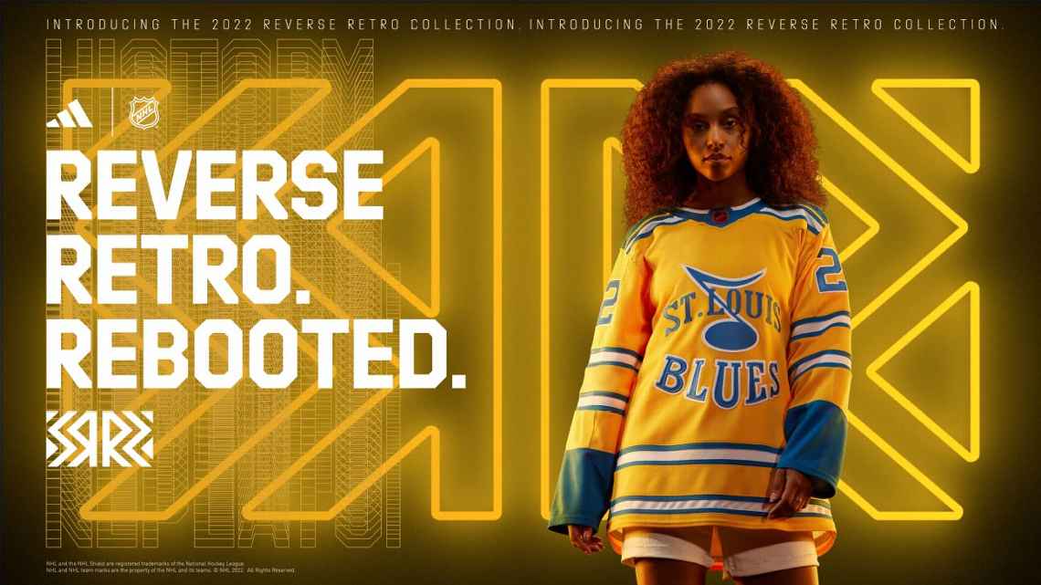
Here's just a still photo without the model shimmying all over the place.
i agree with you whole heartedly.I like the jerseys. Yellow is sooooo much better than red. Going back to the birth of the team is better than an alternate (even worse) take of the ugly 90s jerseys. Those red jerseys were terrible.
stl76
No. 5 in your programs, No. 1 in your hearts
- Jul 2, 2015
- 9,671
- 9,423
Here they all are:

Personally I’m not crazy about the Blues one, but it’s not horrible. Need to see it with helmets/gloves/socks to really tell.
The wild and jets are very nice IMO.
Personally I’m not crazy about the Blues one, but it’s not horrible. Need to see it with helmets/gloves/socks to really tell.
The wild and jets are very nice IMO.
Bluesnatic27
Registered User
- Aug 5, 2011
- 4,807
- 3,465
I’ll be honest, I don’t know what kind of colors for the full kit you can add to make the jerseys look better. They’ll either stay… that, or look significantly worse.Here they all are:
View attachment 596413
Personally I’m not crazy about the Blues one, but it’s not horrible. Need to see it with helmets/gloves/socks to really tell.
The wild and jets are very nice IMO.
I’ve been surprised before, but I feel pretty confident on that prediction.
Definitely getting a Blues Thomas one. Probably also grabbing a Ducks Zegras one as well.Here they all are:
View attachment 596413
Personally I’m not crazy about the Blues one, but it’s not horrible. Need to see it with helmets/gloves/socks to really tell.
The wild and jets are very nice IMO.
joe galiba
Registered User
- Apr 16, 2020
- 2,432
- 2,713
Sparkly helmets!Here they all are:
View attachment 596413
Personally I’m not crazy about the Blues one, but it’s not horrible. Need to see it with helmets/gloves/socks to really tell.
The wild and jets are very nice IMO.
PocketNines
Cutter's Way
By process of elimination I conclude the guy in the dead center of that image is wearing a retro Canucks jersey but I have no idea what that is. Nice of Colorado to honor the Devils and nice of Minnesota to honor the Stars.
joe galiba
Registered User
- Apr 16, 2020
- 2,432
- 2,713
like Chicago, Canadians is terribleHere they all are:
View attachment 596413
Personally I’m not crazy about the Blues one, but it’s not horrible. Need to see it with helmets/gloves/socks to really tell.
The wild and jets are very nice IMO.
Pitt and Philly look like regular jerseys to me
Oberyn
Prince of Dorne
- Mar 27, 2011
- 14,442
- 4,041
bleedblue1223
Registered User
- Jan 21, 2011
- 53,494
- 17,474
PocketNines
Cutter's Way

Brian39
Registered User
- Apr 24, 2014
- 7,895
- 15,224
I'd like to see blue helmets and pants with mostly yellow gloves. Yellow socks with similar blue/white striping to the jersey and I think it would be a nice look...or at least as pleasing as you can get with bright yellow as the base color.I’ll be honest, I don’t know what kind of colors for the full kit you can add to make the jerseys look better. They’ll either stay… that, or look significantly worse.
I’ve been surprised before, but I feel pretty confident on that prediction.
I wouldn't want these as a regular jersey, but I think they can look good as a one-off 'look at the outrageous color scheme' jersey, I think they look pretty good.
WeWentBlues
Registered User
- May 3, 2017
- 2,191
- 1,920
You're right. That is the Canucks reverse retro. Skating Lumberjack. Not sure when that logo was used.By process of elimination I conclude the guy in the dead center of that image is wearing a retro Canucks jersey but I have no idea what that is. Nice of Colorado to honor the Devils and nice of Minnesota to honor the Stars.
Reality Czech
Registered User
- Apr 17, 2017
- 6,707
- 10,844
Here's just a still photo without the model shimmying all over the place.
I don't mind the shimmying.
Regarding the retros, there are only a couple that I hated right away. Montreal just doesn't seem right. It's basically the same color as the Panthers, which is absolutely the right call for them as you said. I don't like Calgary and I wanted to hate on Arizona before suddenly realizing I kind of like it. I can't even hate on Chicago and Detroit because they are clearly going for the "100 years ago" look, which is probably accurate.
As Oberyn said, there are a few that are more or less the same as their standard uni, but I have to give Adidas credit for doing a pretty good job on these. I initially didn't like the Blues when I first saw it, but it's kind of growing on me as well. Cool logo and they captured a 1960s feel pretty well.
Bobby Orrtuzzo
Ya know
I’m pretty meh on them to be honest. Mainly the yellow, too much like Nashville
STL fan in MN
Registered User
- Aug 16, 2007
- 7,785
- 5,464
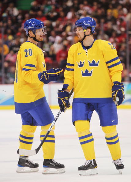
My guess is the whole look ends up looking similar to what Team Sweden has been wearing forever.I'd like to see blue helmets and pants with mostly yellow gloves. Yellow socks with similar blue/white striping to the jersey and I think it would be a nice look...or at least as pleasing as you can get with bright yellow as the base color.
I wouldn't want these as a regular jersey, but I think they can look good as a one-off 'look at the outrageous color scheme' jersey, I think they look pretty good.
And honestly, that’s not a bad look!
mk80
Registered User
- Jul 30, 2012
- 8,381
- 9,033
This round of reverse retros is a much better look across the entire league. I love ours this time around too, and might have to spend some money on it!
Davimir Tarablad
Registered User
- Sep 16, 2015
- 9,951
- 13,887
These jerseys would look great on Berglund 
- Status
- Not open for further replies.
Latest posts
-
-

-
 Speculation: Roster Building Thread : Part XVIII ( TDL is March 7th)
- Latest: SnowblindNYR
-

-
 AHL: Wilkes-Barre/Scranton Penguins: '24-'25 The Players Sully Hates
- Latest: Darren McCord