OT: - The Re-Brand Of The Avalanche | Page 32 | HFBoards - NHL Message Board and Forum for National Hockey League

OT: The Re-Brand Of The Avalanche

Status
Not open for further replies.
I loved the old third jerseys and because of the simplicity of the design, it would be hard to screw up even for Reebok.

avs-maroon.jpg

This is what I want back. Burgundy = Avs.

Not blue like the current thirds.

I would love to bring back the burgundies and put the "foot" crest on the shoulders.

That would be a killer 3rd, I would buy one for sure.
 
This is what I want back. Burgundy = Avs.

Not blue like the current thirds.

I would love to bring back the burgundies and put the "foot" crest on the shoulders.

That would be a killer 3rd, I would buy one for sure.

That's what I'd like to see as well.
 
Ylogo in the NBA (this league has quite easily the worst logos and sports nicknames...seriously, Jazz? Utah Jazz? WTF? Lakers when Los Angeles is on the coast of an ocean? WTF.)

To be fair, those teams moved without changing their names. Minnesota Lakers (Land of 10,00 Lakes) and New Orleans Jazz. Some others that don't really fit are the Atlanta Hawks (Originally Chicago Black Hawks), and the Memphis Grizzlies were from Vancouver.

Also the Detroit Pistons were a team before they were in the Motor City...FT. Wayne Indiana's Zollner Pistons. Houston Rockets fits, as it did when the were founded in San Diego (where Atlas rockets were built).
 
Burgundy and Blue are both Avs colors. I remember a car commercial from back n the day with Sakic and Forsberg discussing what color to get, Indigo Blue, or Victory Red (neither of which were actual Avs colors, but was a cute tie-in)

My personal favorite is the 97-07 dark, and I am torn which burgundy I prefer. Right this moment, I say the later, darker one (99+)...but that will change at some point.
 
I love the way the burgundy 3rd is so simple and clean and yet it's a "90's team's design" and not the Dallas Stars re-brand kind.

Also, the darker blue is GOAT and needs to come back.

E: Icethetics put up a COL-DET Stadium Series concept that uses the SJ-LA template. They look okay I guess, but hopefully they change the template.
 
Last edited:
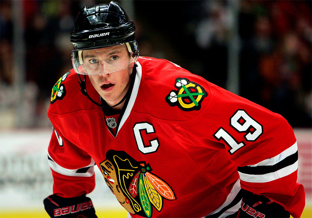
Those jerseys are very sexy. I know i'm alone on this but I would love for Gabe to have a normal looking C on the jersey. I keep hearing that the Avs logo is too 90's and I know what people mean but it's not something that needs to be changed. It's the orginal logo and I hope it never changes. The dumb looking C on the other hand looks 90's and old and should be changed imo. Clean it up and give our captain a clean, elegant, bold C on his chest.

toews.jpg


Now that's a C!!
 
Simply going back to what we had (both the normal jerseys as presented in several gorgeous concepts in this thread including the last one posted and the burgundy third) is so flippin' easy and makes so much sense and is wanted by such a high percentage of the fan base that it leads me to believe there is zero chance the organization will do it. They'll feed us some "modern" turd sandwich (which...will still be better than what we have now which is sad...you could literally smear poop on a blank jersey and it would be better than the piping-crazy BS we have been wearing for way too long now)...that way they can sell all new merch AND still use the classic jerseys for throwbacks and make money both ways.
 
Simply going back to what we had (both the normal jerseys as presented in several gorgeous concepts in this thread including the last one posted and the burgundy third) is so flippin' easy and makes so much sense and is wanted by such a high percentage of the fan base that it leads me to believe there is zero chance the organization will do it. They'll feed us some "modern" turd sandwich (which...will still be better than what we have now which is sad...you could literally smear poop on a blank jersey and it would be better than the piping-crazy BS we have been wearing for way too long now)...that way they can sell all new merch AND still use the classic jerseys for throwbacks and make money both ways.

Wealthy as they may be, the Kroenkes haven't shown much savvy when it comes to this sort of thing (with any of their franchises). They've never been at the tip of the spear when it comes to marketing, community outreach, social media presence, fan interaction, etc., and the best they've come up with driving excitement is their BS #hashtag attempts like "Avs New Age", "All About the A", "Imagine Avs" (just awful), etc. Heck, even Bernie is a sham (you had a sweet mascot you could have brought back in Howler...).

I doubt they have any clue when it comes to revamping the Avs brand, especially from an aesthetic standpoint. Even if it would be so simple as going back to an old design. They're just a bunch of dinguses.

I know, it's a total money grab to introduce new jerseys but fans want it badly and they still won't do it. They are leaving so much free money on the table.

I agree though, the simple answer is probably they don't see anything wrong with it and it's never occurred to them to make a change. They are still in the dark ages in so many ways. I think on social media and in content they've improved a good bit, they've hired younger guys who know how to create content. But marketing they are still a ways behind. I don't get why they can't manage to throw together any sort of fan fest. A bunch of kids getting to meet and get MacKinnon's autograph, they will be fans for life. It's a total no brainer. They players have to advocate for the brand a little too, get more visible and connect with the community. Doing things only for charity is great but they have to get out from behind the velvet rope a little and try to get in front of the general public too. Those things frustrate me as well.
 
It's been a while since I've posted anything here, but I still pop in from time to time. I noticed that Avs concept over at icethetics and coincidentally, I have just finished an Avs concept myself. I sent it in to Icethetics the other day, but I'd like to hear the reaction from my fellow fans first and where better than from you fine people.

026c785b-c6a7-469d-afc8-d87794b98479_zps1yrhzmt7.png


As you can see it is a redux of sorts but introduces something familiar in a classic, but modern way. Things are a little simpler without loosing the uniqueness that screams Colorado. In past uniforms, the home and away haven't completely matched up in terms of color. The white sweaters used grey/silver, but the dark uniforms did not and instead utilized white and black (although there was grey in the socks, but they didn't quite match the piping in the rest of the jersey). I wanted to sync things up by making the set more uniform in their color scheme. I thought of eliminating black, but having the gloves, pants, and helmets any other color looks weird. Instead, I managed to incorporate the white, black, and grey in both primary uniforms without making too big of a change.

As for the alternates, they obviously take inspiration from the past uniforms of the Quebec Nordiques. I think it's important for teams to pay tribute to their roots without going overboard with it. The Avs are no longer in the Nordiques, but I think that a subtle nod to the previous organization would be a good thing. However, in doing so they don't change their identity. This is an Avalanche sweater plain and simple. The highlighting of blue, white, and grey reminds one of the chilly snow capped rockies, but does so in such a way that it creates a certain continuity if you will. As much as we all love those glorious burgundy thirds, I decided to go in a different creative direction that heralds to a little bit of history of the Avalanche club.

Anyhow, what do you guys think?
 
Those aren't that bad either...and I really like that blue alternate jersey. Of course, I've always been a fan of the "Avalanche Blue" color and have wanted them to embrace it more (hence my being a fan of the current Blue 3rd's)

But I don't think these are bad at all, rather sharp looking.
 
I like them, I like the idea of adding grey and black. I never liked how the black pants matched nothing in the home uniform so that makes sense. I like the heavier striping to break up the colors and a heavier white line is needed to lighten up the home uniforms, they are way too dark right now. I like the idea of the blue thirds, I wouldn't do the two tone blue. Either match the striping or eliminate it. With the Nords trying to come back as their own team I think the Avs have consciously avoided anything that ties back to them. I like recognizing history but they don't want to be representing another team that exists at the same time. Seems like a few simple changes would make the uniforms better. Here is to hoping!
 
It's been a while since I've posted anything here, but I still pop in from time to time. I noticed that Avs concept over at icethetics and coincidentally, I have just finished an Avs concept myself. I sent it in to Icethetics the other day, but I'd like to hear the reaction from my fellow fans first and where better than from you fine people.

026c785b-c6a7-469d-afc8-d87794b98479_zps1yrhzmt7.png


As you can see it is a redux of sorts but introduces something familiar in a classic, but modern way. Things are a little simpler without loosing the uniqueness that screams Colorado. In past uniforms, the home and away haven't completely matched up in terms of color. The white sweaters used grey/silver, but the dark uniforms did not and instead utilized white and black (although there was grey in the socks, but they didn't quite match the piping in the rest of the jersey). I wanted to sync things up by making the set more uniform in their color scheme. I thought of eliminating black, but having the gloves, pants, and helmets any other color looks weird. Instead, I managed to incorporate the white, black, and grey in both primary uniforms without making too big of a change.

As for the alternates, they obviously take inspiration from the past uniforms of the Quebec Nordiques. I think it's important for teams to pay tribute to their roots without going overboard with it. The Avs are no longer in the Nordiques, but I think that a subtle nod to the previous organization would be a good thing. However, in doing so they don't change their identity. This is an Avalanche sweater plain and simple. The highlighting of blue, white, and grey reminds one of the chilly snow capped rockies, but does so in such a way that it creates a certain continuity if you will. As much as we all love those glorious burgundy thirds, I decided to go in a different creative direction that heralds to a little bit of history of the Avalanche club.

Anyhow, what do you guys think?

Those aren't that bad either...and I really like that blue alternate jersey. Of course, I've always been a fan of the "Avalanche Blue" color and have wanted them to embrace it more (hence my being a fan of the current Blue 3rd's)

But I don't think these are bad at all, rather sharp looking.
Thanks very much Rocklobster, I'm happy you like 'em.

I like them, I like the idea of adding grey and black. I never liked how the black pants matched nothing in the home uniform so that makes sense. I like the heavier striping to break up the colors and a heavier white line is needed to lighten up the home uniforms, they are way too dark right now. I like the idea of the blue thirds, I wouldn't do the two tone blue. Either match the striping or eliminate it. With the Nords trying to come back as their own team I think the Avs have consciously avoided anything that ties back to them. I like recognizing history but they don't want to be representing another team that exists at the same time. Seems like a few simple changes would make the uniforms better. Here is to hoping!

I appreciate the kind words and constructive criticism tigervixxxen.
I think that the Home uniform appears dark because the other two use much more white. Maybe it could be lightened up, but compared to what they used to wear it isn't really that dark.
mj2TQQKwOdYrlN166OPNkfQ.jpg


I might tinker around with the third a bit more.
If you're referring to the darker blue creating the sublimated mountain effect I was a little unsure about that. However, perhaps it's just my screen, but I think the different shades of blue are subtle enough that it isn't really noticeable unless you look for it.

In regards to the Nordique connection you do have an interesting point. However, ever since the Dallas Stars redesigned their jerseys they seem to have made a connection, however subtle, to their own heritage in the Minnesota North Stars. The shade of green is extremely close to what Minnesota used to wear and even the striping patterns are similar. That being said, I think the Avs could easily have a jersey like this even if the Nordiques are resurrected. There is nothing on the jersey itself that would compromise the Nordique identity. It's different enough to distinguish the two clubs, but similar enough to bring back memories. Whether Quebec likes it or not, the Avs do have ties to them and I think its good to recognize that without actually making it a huge thing.

Thanks for your comment!
 
Just to be clear, I meant what they currently use is too dark. The way you've added the heavier white stripe helps that.

I agree using the color is more than subtle enough to make a nod to the past, nothing wrong with that. I just wouldn't go to any specific style points or logos especially until we see what they come back as.

Really though I like the design a lot and would be more than happy with it.
 
Status
Not open for further replies.

Users who are viewing this thread

Ad

Ad