
Shark Finn
uɐℲ ɥʇ8 ,sǝıddn⅁
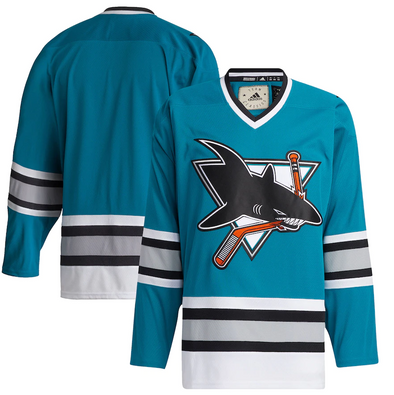
f*** this yet another atrocious black jersey
How about Philly?Always thought SJ had the nicest black jersey in the league (most others are pretty bad to be fair) and this one looks pretty slick so far as well
I was a fan of their heritage jerseys, they should've stuck with that full time. They were a beauty
Their current uniforms look like pajamas. They really lean into the 'put me to sleep' idea in those uniforms and the way they play.
Tavares is listening...
What's with this trend of making designs in places that nobody can see it?


