Xenforo Cloud will be upgrading us to version 2.3.5 on March 3rd at 12 AM GMT. This version has increased stability and fixes several bugs. We expect downtime for the duration of the update. The admin team will continue to work on existing issues, templates and upgrade all necessary available addons to minimize impact of this new version. Click Here for Updates
I'm fine with the name remaining as the Nordiques but just for fun and in the spirit of trying something new
and going completely off the board .. but still relating to the wild north ...
I thought the Quebec Loups-Garou could be interesting. Loups-Garou being french for Werewolves.
Could have some fun with the logo and a werewolf of course is a fierce adversary.
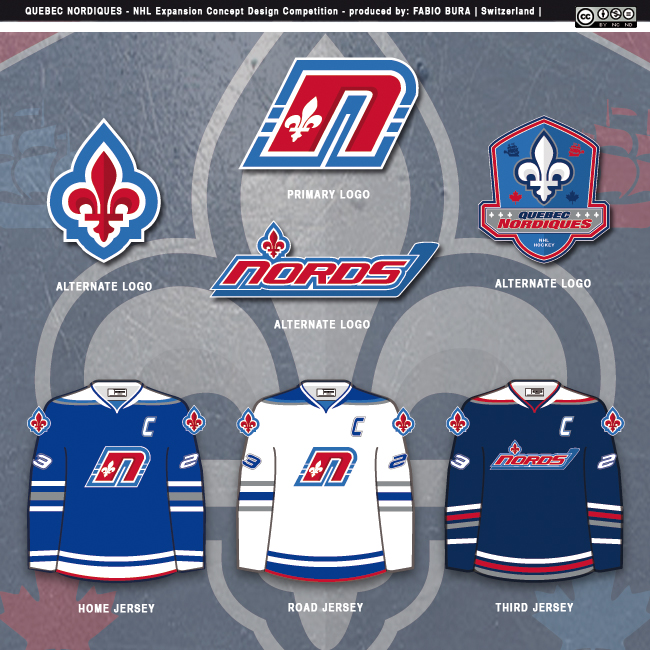
In a vacuum, the logo is great, but the igloo and stick is iconic. With a stronger outline to modernize it + your sky blue design.. it could be pretty good.
The classic Nordiques logo is one of my favorites. I guess it's an igloo/N with a hockey stick and puck, but that doesn't really matter to me. What is great about it, I think, is just the particular style of it. I guess it is appropriate here to call that je ne sais quoi, so don't throw things at me for saying it.
The classic Nordiques jersey with the blue background I prefer most. The jersey with the white background and the ship on it, from earlier in this thread, is good. It could easily be a third jersey.
I mean the white jersey with the ship on the bottom right in post #72 (not the one with yellow, but the one with the white background, red, and baby blue).
This site uses cookies to help personalise content, tailor your experience and to keep you logged in if you register.
By continuing to use this site, you are consenting to our use of cookies.


")