Raccoon Jesus
We were right there
Concept:
Feedback? Add frames drop frames? Change colors? Need a font suggestion too
Feedback? Add frames drop frames? Change colors? Need a font suggestion too
Concept:
Feedback? Add frames drop frames? Change colors? Need a font suggestion too
I like it! Good job.
Updated ever so slightly but felt like it works better
Thanks! Just want to identify any issues/growth opportunities before going off and mass producing

For JAD or SPence maybe
Updated ever so slightly but felt like it works better
Looks awesome RJ.
About the only suggestion i could think of was to perhaps make the crossed out cup stronger and /or change the font on the (corrected to) statue to make it clearer. Its probably my shitty old phone but it may be too subtle for half the plebs on the main boards.
so maybe like
View attachment 683463
edit: couple more font options:
View attachment 683466
View attachment 683469
I really like the last one but still unclear
View attachment 683471
View attachment 683474
Edit Edit: I think that last one is it from a clarity and 'scribbles' sake
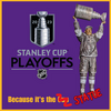
Concept:
Feedback? Add frames drop frames? Change colors? Need a font suggestion too
Yeah im no expert, that does look clearer. Can you make the corrected "statue" the same colour as the squiggle cross out,so it looks like a last minute correction. Like you've crossed it out and written "statue" with a pen.
Just to clarify, I think it looks great, dont spend all day tweaking it just cause ive got a shitty phone.
ConcurEdit Edit: I think that last one is it from a clarity and 'scribbles' sake
Byfield: 25% of Stutzle’s point totals.