
NHL unveils reverse retro jerseys
- Thread starter MMC
- Start date
You are using an out of date browser. It may not display this or other websites correctly.
You should upgrade or use an alternative browser.
You should upgrade or use an alternative browser.
- Status
- Not open for further replies.

IamNotADancer
Registered User
- Feb 16, 2017
- 2,419
- 2,783
Extremely disappointed with the Rangers design. I was seriously looking forward to buy one, instead Ill stick with ebay and just buy an old lady liberty jersey
BigBadBruins7708
Registered User
Florida, Minny and Columbus should make those their actual jerseys. Amazing
Arizona is my biggest disappointment, why go with just the stupid head and not the full kachina doll? Golden opportunity blown.
Arizona is my biggest disappointment, why go with just the stupid head and not the full kachina doll? Golden opportunity blown.
uncleben
Global Moderator
Completely subjective but here are my takes on a few of them
Leafs, the logo is way oversized... Could've been worse, but had potential to be much better
Boston, beautiful colour pop.
Detroit... I am sorry Red Wings fans...
Florida - BEAUTIFUL
Dallas, not sure what happened there... dropped in bleach?
Blue Jackets, I can get on that train..!
Islanders uninspired and dropped the ball on bold opportunity. It just looks the same. Oilers too.
Rangers, glad to have lady liberty back, but it is uninspired too. Hate the stripeless waist.
Both Winnipeg and Nashville actually surprised how much better they look on a jersey than on paper
Overall, I think the white jerseys lose. (Pittsburgh pulled it off best)
The colours pop so well (Boston), and the whites are just so uninspired by comparison
Last edited:
TaLoN
Red 5 standing by

Dexter Colt
Registered User
That's the actual full uniform? Holy shit. I can understand such a concept in a thread that becomes a flame fest, but from an actual team? That's one of the dumbest things I've seen since Cooperalls.Did the Stars run out of color ? Why is there so much white ?
The 99's Whites weren't this white. Especially the full set-up is just hideous . Like come on. What the f*** ?
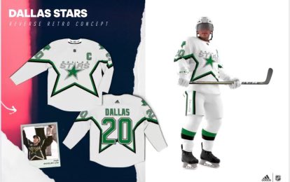
What the hell is this ?
canuckking1
Registered User
- Feb 8, 2015
- 12,609
- 14,117
ohheyhemsky
Regehr DooDoo
Toronto, Dallas and Detroit are easily my least favourite here.
robertmac43
Forever 43!
- Mar 31, 2015
- 23,488
- 18,419
Dexter Colt
Registered User
My nightmare of grey stripes was realized today, and now you gave me a new oneIf the Wings go completely white out this may grow on me..

XXIV97
Registered User
- Jun 2, 2016
- 3,627
- 3,247
Yup, as on Oilers fan, they are very nice jerseys. However, since these are retros, I would probably just put them around 15th in the leagueI think its a very nice jersey. I think it is a bit boring though compared to some of the other teams. But not really sure what else they could of done that would be cool but not awful.
YakDavid
Registered User
- Dec 12, 2010
- 5,477
- 3,525
Is detroits meant to look like a practice jersey because of how the game will be? I wonder if Chicago changed the logo and they are going to reveal it at a different time.
Kranix
Deranged Homer
- Jun 27, 2012
- 18,396
- 17,338
it's just the version from the 40sI wonder if Chicago changed the logo and they are going to reveal it at a different time.
Satans Hockey
Registered User
- Nov 17, 2010
- 7,779
- 11,660
I've never been a fan of the green and would be fine with never seeing green ever again but if they are going to make these can we at least not put the logo so low, the C is way too above the logo...


Kranix
Deranged Homer
- Jun 27, 2012
- 18,396
- 17,338
Vancouver fans can't be happy with this trash jersey. The Canucks have so many good options.
An alternate link with some commentary - NHL, Adidas Unveil Reverse Retro Jerseys for All 31 Teams – SportsLogos.Net News
Based on pure appearance, I think Montreal, LA, Florida, and Vancouver are the winners here. Sharp, attractive jerseys with excellent colours. I would proudly wear any of them.
Middle tier, the Caps look good in red. New Jersey the green is a good choice. Phoenix the purple makes it look like sky, and improves the old look. Minny is ok, but I don't think the yellow works in the logo. Bold use of red for the Blues, but it's just ok.
A whole bunch of teams didn't seem to get the memo and basically just made their already existing jerseys, Philly, Rangers, Isles, Pens, Flames, Bruins, Preds, and Oilers.
Winnipeg, San Jose, Detroit, Dallas and Anaheim need to be burned, and never spoken of again.
End of Line
John Price hater
- Mar 20, 2009
- 25,693
- 9,509
Is this a practice jersey? Where is the colour?
Detroit Buckeyes
coladin
Registered User
- Sep 18, 2009
- 11,850
- 5,023
Overall very good!
I am happy Minnesota didn't put the "N" logo. Like, as much as the Hurricanes jersey is gorgeous, the logo , as does the Avalanche jersey , simply don't make any sense. In that sense, Minny got it 100% right, but the other two, as beautiful as they are, are stupid.
I am happy Minnesota didn't put the "N" logo. Like, as much as the Hurricanes jersey is gorgeous, the logo , as does the Avalanche jersey , simply don't make any sense. In that sense, Minny got it 100% right, but the other two, as beautiful as they are, are stupid.
- Status
- Not open for further replies.
Users who are viewing this thread
Total: 2 (members: 0, guests: 2)
Latest posts
-
 Proposal: Would the Sharks fancy all of the Canadiens picks for 2nd overall? (16 Viewers)
- Latest: matt trick
-

-

-

-
 Series Talk: ECSFs Discussion - All The Smoke Edition - Panthers Tied 2-2 (56 Viewers)
- Latest: PSLguy