
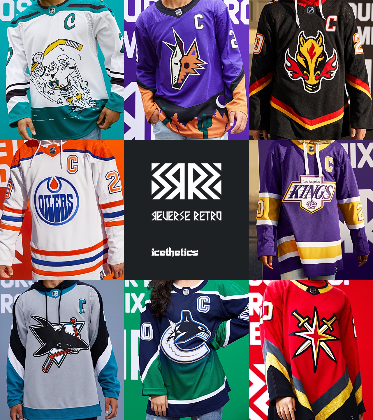
NHL unveils reverse retro jerseys
- Thread starter MMC
- Start date
You are using an out of date browser. It may not display this or other websites correctly.
You should upgrade or use an alternative browser.
You should upgrade or use an alternative browser.
- Status
- Not open for further replies.

BKarchitect
Registered User
Nordalanche is gorgeous.
Yeah it’s kinda non-sensical. It’s truly a Nordiques jersey but that’s fine with me since I was a Nordiques fan back in the day before they moved.
Would love to see a matching home version although the navy may look odd as the primary color versus the old QC blue. The white away works beautifully because the burgundy replacing the red is more subtle.
ScaredStreit
Registered User
uncleben
Global Moderator
As much as I am down for them borrowing the jersey designs, I'm not as huge on them borrowing the logos. For that reason, I agree about Minny. Though, what they settled on, with the yellow bear head isn't that great, imo.Overall very good!
I am happy Minnesota didn't put the "N" logo. Like, as much as the Hurricanes jersey is gorgeous, the logo , as does the Avalanche jersey , simply don't make any sense. In that sense, Minny got it 100% right, but the other two, as beautiful as they are, are stupid.
Last edited:
BKarchitect
Registered User
And yeah the Wild crushed it. Such a bright and vibrant look. It’s gonna look great on the ice and makes their traditional color scheme look dull and muddled.
Sauce12
Unregistered User

BOS: That's how a yellow jersey should look like 9/10
BUF: Meh 5/10
DET: Seriously? 0/10
FLA: Very sharp 9/10
MTL: Habs in blue is weird, but that jersey is gorgeous 10/10
OTT: Needs more white, at least make the numbers white 6,5/10
TB: Should be their home jersey 8/10
TOR: Not a fan 4/10

CAR: A grey jersey that looks really nice 9/10
CBJ: I can't say why, but this looks sharp 8,5/10
NJ: Like that color scheme 8,5/10
NYI: Pretty, but uninspired 6/10
NYR: Love that logo, but the jersey needs more red 6,5/10
PHI: Okay, I guess 6/10
PIT: Meh 5/10
WSH: Was never a fan of the original one, and I'm not a fan of this one. 4/10
ANA: For one or two games? Cool, I guess 7/10
ARI: Pure ugliness. Glorious 10/10
CGY: Meh 5/10
EDM: Classic, I like it 9/19
LA: Looks pretty sharp 9/10
SJ: Meh 5/10
VAN: Kinda ugly, kinda sharp. Not sure on that one 6.5/10
VGK: Hate that logo, the design is meh 3,5/10

CHI: Solid, but kinda boring 6,5/10
COL: Beautiful 9,5/10
DAL: Why? 1,5/10
MIN: Fantastic 10/10
NSH: Looks better than I expected, and way better than their home jersey 8/10
STL: Meh 5/10
WPG: Too much grey, not a fan 3/10
Last edited:
Anaheim: 4/10
Arizona: 3/10
Boston: 5/10
Buffalo: 6/10
Calgary: 4/10
Carolina: 7/10
Chicago: 6/10
Colorado: 5/10
Columbus: 3/10
Dallas: 4/10
Detroit: 3/10
Edmonton: 8/10
Florida: 6/10
Los Angeles: 6/10
Minnesota: 7/10
Montreal: 7/10
Nashville: 8/10
New Jersey: 9/10
NY Islanders: 8/10
NY Rangers: 7/10
Ottawa: 8/10
Philadelphia: 7/10
Pittsburgh: 7/10
San Jose: 4/10
St. Louis: 5/10
Tampa Bay: 6/10
Toronto: 5/10
Vancouver: 6/10
Vegas: 5/10
Washington: 9/10
Winnipeg: 2/10
BringTheReign
Registered User
As a Kings fan, my biased top 5:
1. Avalanche
2. Canadiens
3. Kings
4. Wild
5. Bruins
I like this Kings jersey better than the concept in my avatar. Also, the blue base Canadiens jersey is going to look amazing as a full kit; I hope they go for the leather-colored shell coverings on the pants.
1. Avalanche
2. Canadiens
3. Kings
4. Wild
5. Bruins
I like this Kings jersey better than the concept in my avatar. Also, the blue base Canadiens jersey is going to look amazing as a full kit; I hope they go for the leather-colored shell coverings on the pants.
BKarchitect
Registered User
Florida and Tampa need to switch to these designs full time. Their current looks are so freaking boring. Tampa used to have a great set with the old logo and black before it got “Maple Leafed”. The navy with the gold accent for Florida is lovely.
Nashville and Washington definitely need to make those their full time home jerseys. Also, is it just me or is the logo on the Devils jersey a bit low? Other than that it's a gorgeous jersey!
BKarchitect
Registered User
Nashville and Washington definitely need to make those their full time home jerseys. Also, is it just me or is the logo on the Devils jersey a bit low? Other than that it's a gorgeous jersey!
Agreed on all. There a few really ugly ones but many of them frankly look nicer than their team’s actual current looks.
Seeing Arizona and LA makes me crave some purple jerseys...that shade of purple looks so good on the ice.
What is up with the Islanders one, it’s literally the same thing. Why would any NYI fan buy that
Adam Fox Time
Registered User
- Jan 1, 2020
- 606
- 854
A few of these are better than the team's primary jerseys:
Florida
LA
Minnesota
Nashville
NJ
Tampa Bay
Washington
Florida
LA
Minnesota
Nashville
NJ
Tampa Bay
Washington
BKarchitect
Registered User
They aren’t all great aesthetically but I do appreciate some of the teams that went “ugly Christmas sweater”. Coyotes, Ducks, Flames (the stupid flaming horse logo), Blues.
Wings and Stars look like pajamas.
Jackets look sharp but am I the only one who sees a retro Caps jersey with the res, white shoulders and stars?
Wings and Stars look like pajamas.
Jackets look sharp but am I the only one who sees a retro Caps jersey with the res, white shoulders and stars?
Isles Junkie
Registered User
jetsforever
Registered User
- Dec 14, 2013
- 27,705
- 26,721
Here's my initial ranking (in tiers):
Best:
Arizona (colour looks great, vibrant but not too crazy - best overall IMO)
NJ (Christmas colours still strange but this does what it needs to)
Colorado (still torn if they should be using Nordiques branding but it's pretty sharp)
LA (while I don't really like any LA logos, the colour scheme is refreshing)
Minnesota
Good:
Ottawa
Vegas (logo is a bit big, otherwise decent)
Pittsburgh (simple, classic)
Montreal (not a huge fan of the blue but it's still a Montreal jersey)
Carolina (blatant Hartford usage, although it's obviously a nice jersey)
Calgary (we finally got rid of black, now it's back?)
Chicago
Florida (I like the updated colour scheme)
Vancouver (gradient is a bit odd but the colours are good)
Boston (Nashville take note)
Fine:
Anaheim (weird but definitely retro)
Buffalo (a great design saves this one because I hate the wordmark/font at the bottom)
Islanders
Detroit (it's fine but underwhelming)
Toronto (terrible by Toronto standards - logo is too big etc.)
Edmonton
Rangers (boring)
Philadelphia (I don't like the yoke/sleeve design)
San Jose (bit of an upgrade on the retro ones, still worse than currents though)
St. Louis (the Blues are red?)
Washington
Winnipeg (looks good for a fan to casually wear, but somewhat boring)
Tampa (colours are better than currents but I always disliked that logo)
Bad:
Dallas (positioning of the star seems bizarre)
Columbus (that logo should have been left dead)
Nashville (they just need a rebrand IMO, nothing ever works)
I'm absolutely loving Washington, Tampa, Carolina, Colorado, Philadelphia, Rangers, Nashville, Minnesota, Florida, New Jersey, and Buffalo.
Dislike Dallas, Detroit, Toronto, Chicago, Phoenix, Anaheim, Ottawa. Neutral/slightly like the rest.
Overall, great batch. In love with these.
Tampa, Florida, and Nashville. Please make these your regulars")
Dislike Dallas, Detroit, Toronto, Chicago, Phoenix, Anaheim, Ottawa. Neutral/slightly like the rest.
Overall, great batch. In love with these.
Tampa, Florida, and Nashville. Please make these your regulars
Last edited:
Sheppy
Registered User
Bouboumaster
Registered User
- Jul 4, 2014
- 9,828
- 11,291
Colorado, Edmonton, Washington, Carolina and New York (both teams) = good job.
Especially Colorado
Especially Colorado
BKarchitect
Registered User
The Buffalo one is fine but their new regular set is so gorgeous that this RR jersey is now a downgrade.
Love the Rangers liberty logo but I feel like as a whole that jersey was kinda left “incomplete”.
Isles with a major disappointment to not being back the Gordon’s fisherman logo and wavy jersey design. Get some balls and do something fun guys! Loved me some Ziggy Palffy fishsticks. At least should have used the wave jersey pattern:
kingsboy11
Maestro
I wasn't a fan of the Kings jersey in concept art, but they look so much better in person. Of the others I was blown away by the Wild's. Easily my favorite of the rest. I think they were the only team that really understood reverse retro.
MillanDynasty
Registered User
Jesus, almost all expect a handful of them look like they were come up within a day.
What a great opportunity to rake in money pissed away.
What a great opportunity to rake in money pissed away.
- Status
- Not open for further replies.
Users who are viewing this thread
Total: 1 (members: 0, guests: 1)
Latest posts
-

-

-
 Miscellaneous NHL Discussion CXI: The Last One Went So Long Because I Didn't Know What The Next Number Was (12 Viewers)
- Latest: FlyerNutter
-

-
