Jets possibly doing a jersey rebrand, alternates could become new home uniforms

MOGlLNY

Registered User
Jan 5, 2008
12,214
12,364
I love the Jets logo personally. But their alternates are good too. Would hate to see their current logo go just to go back to another throwback look. but at least they’re not switching to some abomination new logo in place of it.
 
  • Like
Reactions: rfournier103

Koivu11

HFBoards Sponsor
Sponsor
May 4, 2004
5,695
18,564
Jets04.png


Jets10.png


Do you guys prefer their 1980-90 jerseys or the 1990-96 ones?
 

ichbinkanadier

Registered User
Apr 22, 2023
847
483
I like their jerseys but I find they're very subdued.

When you're the smallest market in the NHL (and probably the second or smallest in the big 4 - depending on how you define the Green Bay market), perhaps a splash is in order?
 

Devils 3silverones

Registered User
Sep 13, 2017
256
164
I like their jerseys but I find they're very subdued.

When you're the smallest market in the NHL (and probably the second or smallest in the big 4 - depending on how you define the Green Bay market), perhaps a splash is in order?
I kinda think smallest market is a non issue. I m aware of cities with millions of people that could use more than a uniform splash...
 

Albatros

Registered User
Aug 19, 2017
13,619
8,916
Ostsee
It'd be an improvement, but mostly because the current uniform is as bland as they come. Nothing really special about that alternate either.
 

MarkusNaslund19

Registered User
Dec 28, 2005
5,709
8,442
Super needed. I was stoked to see the Jets return and figured they would be one of my favorite non-Canucks teams in the league. But their blah jerseys singlehandedly made me lose interest in them.

Go back to some rendition of the 90's jerseys is my suggestion, liked those ones.
 
  • Like
Reactions: Kryten

Turin

Erik Karlsson is good
Feb 27, 2018
23,811
28,044
I'm pretty against wordmark logos and actually like the Jets current logo, but the entire kit design for the current sets was too bland. The font was modern and lame, and red only featured in the logo itself and not on the uniform which was a missed opportunity. Their alts are nice to look at, even though they are uninspiring from a creativity or originality standpoint.
 

ichbinkanadier

Registered User
Apr 22, 2023
847
483
I kinda think smallest market is a non issue. I m aware of cities with millions of people that could use more than a uniform splash...
All I know is the Jets aren't must-see tv for me. It's all about branding, and as of now, they don't have much going for them- not their city name, team name, uniform, players on the ice...
 

tarheelhockey

Offside Review Specialist
Feb 12, 2010
86,332
142,962
Bojangles Parking Lot
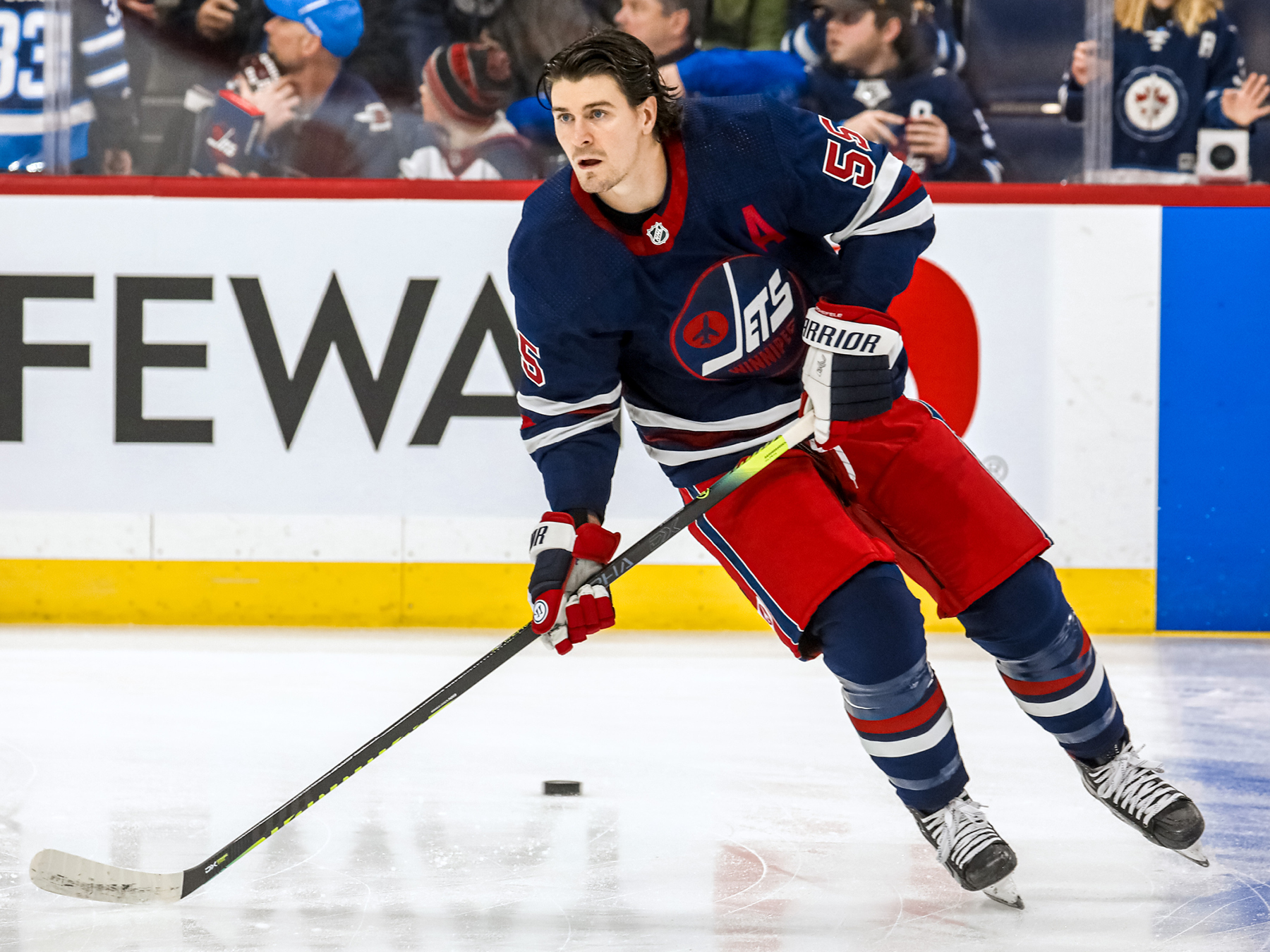
This is the current alternate jersey I believe they are referencing:

E8rjYRCWYAETtCg

cut.jpg

To me, this is not an improvement.

The current set is not bad, it’s just a bit bland in a corporate kind of way. It’s what you would get if you asked an insurance company to design a uniform. Nice and clean, very pro-looking, but no personality.

The old logo is a 1970s aesthetic disaster. I have no idea what people see in it. The jersey set quoted above is fine in a vacuum, but in an NHL context it’s a Rangers copycat. The actual old jerseys were much better except for the awful logo.

IMO they should either combine the best elements of old and new, or just scrap the whole thing and start over with a new identity altogether. They can always roll out retro jerseys as an alt a few times a year. Playing to nostalgia only goes so far, especially when the nostalgia is for an era of perpetual mediocrity.
 

Weztex

Registered User
Feb 6, 2006
3,136
3,825
It’s a bit tiring to see teams not trying to come up with new designs anymore. Whatever they come up with, nostalgia will always come full circle and trump everything.

I don’t know if it includes reverting back to the old logo, but I agree with @tarheelhockey that the old one is not aesthetically great and feels dated not in a good way (Islanders feels the same but it has the benefit of dating back to their glory days). While I don’t feel that the actual Jets logo is top tier, I was at least happy that they didn’t pander to the ‘’it has to be exactly as it was before because, you know… that’s how it was before’’ crowd.
 

BB79

Partially deceased
Apr 30, 2011
5,752
6,811
Jets04.png


Jets10.png


Do you guys prefer their 1980-90 jerseys or the 1990-96 ones?
90-96 definitely. The 80s ones remind me of the NYR too much. Maybe the 90s jersey with the 80s two toned numbers would look good?
 

Ad

Upcoming events

Ad

Ad