Rumor: Images of a possible third jersey posted on Reddit four months ago.

Why claim "boots on the ground" then? Poisoning the well?

It was meant as a satire of people who clamour to be Twitter/board insiders. I edited the thread title to clarify that I found this on Reddit because I respect the sanctity of making a new thread, and I understand that only 3 people here actually say hi to people in Ceci jerseys and might actually be confused into thinking I'm claiming to be an actual #BoardInsider.

I don't mean to break the immersion again, but it's clearly meant as satire when I joke that I "broke the Norris trade" because I saw two strategically placed racks filled with Norris jerseys a week or two before he was traded and reported on it in the game day thread. I do not actually ask the Tim Hortons cashiers or the 404 driver if they heard anything about whether Staios is working on getting a bottom pairing D.

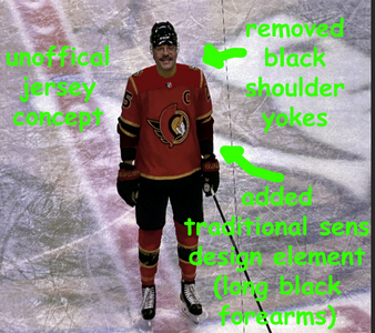
Whether I actually wear a Ceci jersey, I can't divulge that. It would be like telling someone Santa isn't real.
 
Last edited:
I wouldn’t mind it, I think it looks good with the full kit.

Though I wouldn’t mind something completely different with a different logo.

I don’t see the Ketchup Mustard thing. It’s gold and red which are the colors of the team…
 
There's something strange going on here. Either someone affiliated with the team posing as a 'fan' in a deep dive for corporate intel or a foreign agent looking to instill a sense of chaos amongst a fanbase on the eve of a playoff birth.
 
giphy.gif
 
I wouldn’t mind it, I think it looks good with the full kit.

Though I wouldn’t mind something completely different with a different logo.

I don’t see the Ketchup Mustard thing. It’s gold and red which are the colors of the team…

I don't think you can really judge the colours off that photo. It's clearly gold but it just doesn't look like it. I doubt it will actually look "ketchup and mustard". If you look at the special event jerseys Fanatics released so far, they all have really interesting details that sometimes look fantastic up close but don't always translate when seeing a jersey far away from the stands. In the photo, it looks like this has extra details on the arms in the black part (kind of like the Flames Blasty jersey).

I wish the team would embrace the black forearms. It was a big part of our visual identity at one point.
 
Screenshot 2025-03-30 at 3.57.13 AM.png


Another prototype that ended up on eBay or where ever and documented by the jersey collecting community. The point is to show how assuming the images that were posted on Reddit are legit, it doesn't mean that will 100 percent be the final jersey. Here is the Sens jersey, and it originally had the front basketball numbers and the round 2D logos on the shoulder.

I can't for the life of me find a photo of the Edge era away prototype. But Jersey Baron had it on eBay a few years ago, and it was the exact same as our eventual Reebok Edge away jersey, except it had the 2D crest like our CCM era away jerseys did.

Screenshot 2025-03-30 at 4.01.45 AM.png


I don't know how early in the process a major change like this would happen, but that is another prototype that shows you how drastically the final jersey can differ, in some cases. Although, it's possible that was meant to be a home/away set or something, and the light prototype is an away jersey that never materialized.

Point being, the person who posted the images claimed in their post that they were from November, so it is entirely possible it is one of many prototypes, or that they made changes since then.
 
Last edited:
It's really hemorrhaging from having zero white, just heavy colours slammed into each other. The numbers on the shoulders look like they're just floating around.
Hopefully the promo is they come with a bonus hotdog.

Opportunity missed to have the helmet have char lines from the BBQ

+1 for the cool sunbursty thing they have going in the helmet brush

I wish they'd re-imagine the uniform completely for the 3rd including red pants and helmet or shiny/matte finish or even wrapped ones ffs.. nobody done that yet.
 
Last edited:
This was posted on Reddit a few months ago. I found it in a Reddit thread when googling for jersey concepts - the person posted it in a year old thread 4 months ago, so I'm not sure if it flew under the radar or people just figured it was a photoshop because we didn't have the details of what the jersey might be.


View attachment 1002428

Here is a screenshot from said thread.

View attachment 1002457

source:

His face says it all
 
The closeup pic of him entering the ice (I think?) looks better than the middle of the ice one but I don't like the black shoulders. Logo looks really nice on a red jersey, I will say that.
 
Screenshot 2025-03-30 at 5.51.13 PM.png


I am not a photoshop guru but I made some changes to see if I could get the jersey to look like how I'd hope a red Sens jersey would look, without making any huge changes.

I removed the gold stripes on the shoulder. Honestly, adding the forearms and removing the business on the shoulders and IMO it's a fantastic jersey. There is too much going on in the original design and it doesn't fit with our crest, which is already a very large and busy crest that dominates the area it is placed on.

The coloured forearms are a really big part of this teams early identity. For the first 15 or so years, it was a big part of the image on the white jersey, and also on the black and gold third jersey. You could also argue that the 2D jersey had something like that going on. Take the crest off of this jersey, and it LOOKS like a Senators jersey once you add the forearms and remove the yokes. Show that to 100 hockey fans without the crest, 99/100 would guess it is the Senators. That's how iconic of a design element the long forearms are for the Sens.

There are a few other Photoshops attached below with different logos and stuff.

Hopefully the leaked version is only one of the prototypes. If they at least removed the black yokes, it takes the jersey up big time. Adding the complete black forearms makes it actually look like a Sens jersey.
 

Attachments

  • Screenshot 2025-03-30 at 5.49.07 PM.png
    Screenshot 2025-03-30 at 5.49.07 PM.png
    2.5 MB · Views: 2
  • Screenshot 2025-03-30 at 5.47.03 PM.png
    Screenshot 2025-03-30 at 5.47.03 PM.png
    2.4 MB · Views: 2
  • Screenshot 2025-03-30 at 5.43.05 PM.png
    Screenshot 2025-03-30 at 5.43.05 PM.png
    2.5 MB · Views: 1
  • Screenshot 2025-03-30 at 5.40.20 PM.png
    Screenshot 2025-03-30 at 5.40.20 PM.png
    2.5 MB · Views: 1
View attachment 1002431

You can tell it's not a deepfake because the scoreboard is broken just like it was earlier in the season (and still is?). I doubt it is a Photoshop, but obviously it is tagged Rumor for a reason so it could be fake until we see it officially.

I'd say it's fake because this guy doesn't look like Brady Tkachuk much... hard to believe all we see on the internet today! It's probably AI
 
I'd say it's fake because this guy doesn't look like Brady Tkachuk much... hard to believe all we see on the internet today! It's probably AI

Brady is one of a kind.

I don't personally think it is fake, but it may not be the final jersey.

I went into this earlier in this thread but the way jersey prototypes work is they usually have generic cresting that says something like PLAYER or SENATORS on the nameplate, a random number, and patches. It's meant to display what the jersey looks like so that the team can decide on a final design. The reason I know this is because if you collect jerseys, prototype jerseys leaking out is fairly common. They do sometimes make them with a player name (there is an early Reebok Edge Alfredsson red swoosh jersey, that when originally sold the story was that it was originally acquired after the CTC basement flooded).

For it to be fake would be a huge stretch. To me, the big question isn't whether it is fake, it's why did someone randomly post it on Reddit in the most obscure way by replying to a dead thread. It's been around for months but I guess nobody put together that it wasn't just a fan concept since it was posted in an already dead thread for concept jerseys. Reddit is a really stupid website to browse, maybe I'm just old or something, but you can't just read a thread, there are a million buttons and it hides anything remotely "controversial" or not voted up. It would be like if you guys could never see my posts here.

It was meant to be a joke... because that picture has the C and only Brady can have the C
 

Ad

Ad