
Game Schedule - Reverse Retro & St. Pats
- Thread starter MattySnipes
- Start date
You are using an out of date browser. It may not display this or other websites correctly.
You should upgrade or use an alternative browser.
You should upgrade or use an alternative browser.


Stephen
Moderator
- Feb 28, 2002
- 83,147
- 62,082
The reverse retros look less weird in the full uniform, but definitely not my favorite look. Curious to see how they look on the ice.
St. Pat's look so fresh. Imagine some bizarro universe where they never changed their name...
St. Pat's look so fresh. Imagine some bizarro universe where they never changed their name...
LeafalCrusader
Registered User
Love the St Pats jerseys. The only thing that bothers me is the back where the numbers are, can't quite remember but i think with some numbers it looked like there were three numbers, like 13 looked like 113 or something like that.
MattySnipes
Registered User
I know what you're talking about.Love the St Pats jerseys. The only thing that bothers me is the back where the numbers are, can't quite remember but i think with some numbers it looked like there were three numbers, like 13 looked like 113 or something like that.
Last edited:
Leafs1993
Registered User
I didn't like the reverse retro at first, but I have to admit it is growing on me. It looks a lot better then it does in pictures.
Went out and bought a Matthews reverse retro jersey and have had no regrets.")
Went out and bought a Matthews reverse retro jersey and have had no regrets.
Judas Tavares
S2S (Sundin2Sandin)
- Feb 9, 2007
- 10,188
- 3,632
Jerseys always look better paired with the full uniform and live in play. So that means it can go from hideous to just ugly. Or beautiful to absolutely gorgeous.
So I think the RR jersey will grow on many once seen in action. The jersey has its faults for sure (didn't stop me from buying one) but I've seen a lot worse. Logo should probably be smaller and white. I don't mind the grey at all but I get why some dislike it. I rate the jersey as slightly better than meh, maybe even good, but not great.
So I think the RR jersey will grow on many once seen in action. The jersey has its faults for sure (didn't stop me from buying one) but I've seen a lot worse. Logo should probably be smaller and white. I don't mind the grey at all but I get why some dislike it. I rate the jersey as slightly better than meh, maybe even good, but not great.
CanadasTeam
Registered User
I'm kind of excited to see them wear their retros this Sat.

Does anyone know if EDM will wear theirs?
Mickey Marner
Registered User
Using the retros for the HNIC game, is like showing off the exam you failed.
nsleaf
Registered User
- Oct 21, 2009
- 4,122
- 1,538
The reverse retros look less weird in the full uniform, but definitely not my favorite look. Curious to see how they look on the ice.
St. Pat's look so fresh. Imagine some bizarro universe where they never changed their name...
Yea, instead of the "Buds" it would be the "Leprechauns"
Stephen
Moderator
- Feb 28, 2002
- 83,147
- 62,082
Jerseys always look better paired with the full uniform and live in play. So that means it can go from hideous to just ugly. Or beautiful to absolutely gorgeous.
So I think the RR jersey will grow on many once seen in action. The jersey has its faults for sure (didn't stop me from buying one) but I've seen a lot worse. Logo should probably be smaller and white. I don't mind the grey at all but I get why some dislike it. I rate the jersey as slightly better than meh, maybe even good, but not great.
The numbers and logo should have definitely been the grey colour they're introducing, and probably not the Centennial Leaf. That's probably our worst and weirdest Leaf logo.
Judas Tavares
S2S (Sundin2Sandin)
- Feb 9, 2007
- 10,188
- 3,632
They probably enjoyed the idea of using a logo that ended in 1970 with a jersey that started in 1970. Bringing 2 eras together and really putting to play the year they were assigned or chose. I get the idea the Ballard Leaf is not well viewed in the org right now and probably won't see the light of day for another 20 years. Which is another reason they likely chose the Centennial Leaf.The numbers and logo should have definitely been the grey colour they're introducing, and probably not the Centennial Leaf. That's probably our worst and weirdest Leaf logo.
Stephen
Moderator
- Feb 28, 2002
- 83,147
- 62,082
They probably enjoyed the idea of using a logo that ended in 1970 with a jersey that started in 1970. Bringing 2 eras together and really putting to play the year they were assigned or chose. I get the idea the Ballard Leaf is not well viewed in the org right now and probably won't see the light of day for another 20 years. Which is another reason they likely chose the Centennial Leaf.
The Ballard Leaf is actually on the shoulders, so I think this is more poor graphic design choices than any kind of intentional statement.
LeafsNation75
Registered User
Personally I think their StPats jerseys look a lot better than their retro jerseys.
Morgs
#16 #34 #44 #88 #91
MattySnipes
Registered User
Yup. That's what I voted for.Personally I think their StPats jerseys look a lot better than their retro jerseys.
Always liked the St. Pat's jerseys.
7even
Offered and lost
LeafsNation75
Registered User
I'm not a fan of jerseys where they are mostly white because all my Leafs jerseys are their blue ones. However that St. Pats jersey is one I might make an exception for.Yup. That's what I voted for.
Always liked the St. Pat's jerseys.
MattySnipes
Registered User
I'm from white home era.I'm not a fan of jerseys where they are mostly white because all my Leafs jerseys are their blue ones. However that St. Pats jersey is one I might make an exception for.
LeafsNation75
Registered User
This was the last Maple Leafs jersey I had where it was mostly white, however eventually it got more dirty because of that.I'm from white home era.

I've bought a ton of Leafs jersey's over the years, and am a sucker for new ones. But, I'm not touching the reverse retro (although I also haven't bought the current St. Pats jersey the Leafs wear).
If they made one of these two things for the reverse retro, I'd be lining up to give Adidas/NHL/MLSE my money. The first, is the 2000's era St. Pats jersey we wore, but in Blue and White. Or, if they made the current Leafs jersey in St. Pats colors.
If they made one of these two things for the reverse retro, I'd be lining up to give Adidas/NHL/MLSE my money. The first, is the 2000's era St. Pats jersey we wore, but in Blue and White. Or, if they made the current Leafs jersey in St. Pats colors.
Judas Tavares
S2S (Sundin2Sandin)
- Feb 9, 2007
- 10,188
- 3,632
justashadowof
Registered User
- Aug 15, 2020
- 4,025
- 4,230
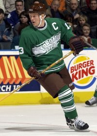
I picked up one of those numbered LE St. Pats jerseys in the early 2000's. Remember the brown pants? Ouch.
wore that one last night, no name on back. Didnt like it when it first came out, but after awhile it got better.This was the last Maple Leafs jersey I had where it was mostly white, however eventually it got more dirty because of that.