
- Dec 12, 2017
- 26,039
- 12,476
At least it's a jersey they are only wearing part time, since this was their full time logo during the Ballard era.I like the colour scheme blue and grey but I don't like the Ballard Maple Leaf.

I could have lived with those jerseys if the trim was white and not grey.
The grey was an abomination. Just awful.
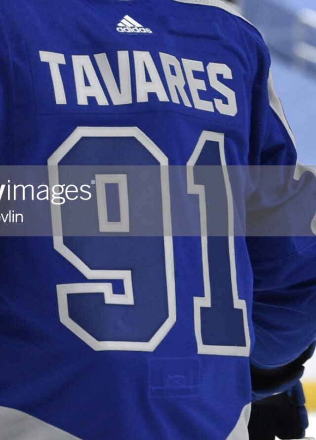
Whenever I Google “thick” I usually find something else...Did anyone notice the Leafs made changes to the thickness of the numbers on their retro jerseys.
Here they are last Saturday against Edmonton.
Here they are 1 week later against Vancouver.
Easiest $150 ever saved. $250 if you want a name and number on the back. Grey and Blue? sorry we're not the Detroit LionsI disagree, those jerseys last night were ugly and no one in their right mind will buy one.
You're right, you can't even see the logo and it's hard to see the numbers and read the names on the back.The grey and blue is absolutely horrible
The grey and blue is absolutely horrible
Seeing a lot of the RR jerseys in action of late have left me disappointed they missed the mark. A lot of them are looking gorgeous when you see them in action as opposed to just a release photo. Was hoping ours would follow suit. It did not.
Like even the Blasty Flames (which should have been a red or white jersey, rather than a cheaper version of the original, Lady Liberty Rangers is in that same boat for me as well) looked really good in action last night.
I think it's the opposite and they look in game action and worse in still photos.They look better as still photos than in game action, where there's not enough contrast between the blue and the grey.
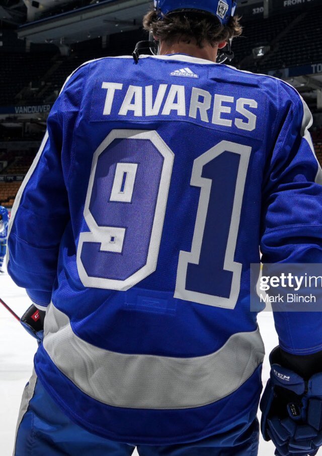
Did anyone notice the Leafs made changes to the thickness of the numbers on their retro jerseys.
Here they are last Saturday against Edmonton.
Here they are 1 week later against Vancouver.

Anyone know exactly what this is? I notice this thing on all the jerseys they wear.
Ah okay thanks. I thought only the Leafs had it and some kind of mic/listening device used by Amazon Prime "All or Nothing" docuseries coming out later this year.I think it's the embedded transponder that generates real time statistics.
Ah okay thanks. I thought only the Leafs had it and some kind of mic/listening device used by Amazon Prime "All or Nothing" docuseries coming out later this year.
I never would have noticed that if @CanadasTeam asked what it was.I think it's the embedded transponder that generates real time statistics.
I've always spotted it every single time but somehow only on Leafs playersI never would have noticed that if @CanadasTeam asked what it was.


