FRESH: CBJ/DET Stadium Series Jerseys
- Thread starter Satan
- Start date
-
Work is still on-going to rebuild the site styling and features. Please report any issues you may experience so we can look into it. Click Here for Updates
You are using an out of date browser. It may not display this or other websites correctly.
You should upgrade or use an alternative browser.
You should upgrade or use an alternative browser.
I'm probably in the minority, especially as a Jackets fan, I actually like Detroit's and I'm kinda meh on CBJs...
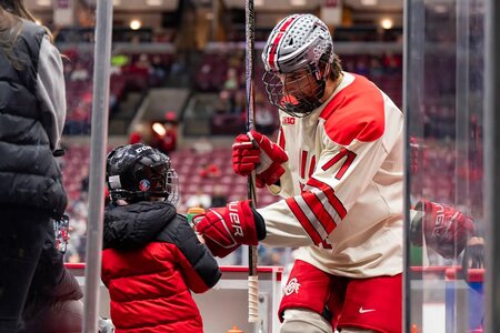
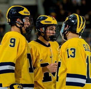
I think it would've been kinda cool to see Columbus do the reverse(inverse? I dunno, you get what I mean )of Detroits. Where Detroit's are white, Columbus jerseys would be blue and where Detroit's are red, ours would be white. Keep the pants, socks and helmets the same.. Though I wish OSU would've allowed the leaves on the helmets... Would've been a nice touch. Especially for all the UM kids on the team
I think it would've been kinda cool to see Columbus do the reverse(inverse? I dunno, you get what I mean )of Detroits. Where Detroit's are white, Columbus jerseys would be blue and where Detroit's are red, ours would be white. Keep the pants, socks and helmets the same.. Though I wish OSU would've allowed the leaves on the helmets... Would've been a nice touch. Especially for all the UM kids on the team

tarheelhockey
Offside Review Specialist
Really, I thought the stripe on the helmet sucked.
I’m not sure I love the aesthetic, but I’d probably like it a lot more if I’d been seeing helmets like that for a long time. I’ll give it a chance to start feeling a little more natural with time.
In general hockey teams just don’t do nearly enough with their helmets, so I appreciate the effort to try something and see what sticks.
Wayward Son
Registered User
- May 3, 2013
- 9,314
- 8,784
The stripe might have something to do with some sort of way of repping U of Michigan maybe with the stripes on their helmet? If you dont follow college football you'll probably not get it. But thats just my guess.Maybe it’s just me, but those both suck. The cannon looks awkwardly big to me, and who puts a freaking racing stripe on a hockey helmet?
Good God, I think they finally got em right here. Been a long damn time.
I'm pretty sure UM has the wings on their helmets. The helmets looks more like OSUs than UMs.The stripe might have something to do with some sort of way of repping U of Michigan maybe with the stripes on their helmet? If you dont follow college football you'll probably not get it. But thats just my guess.
Good God, I think they finally got em right here. Been a long damn time.
Attachments
BB79
🇺🇲
- Apr 30, 2011
- 6,890
- 8,444
Given their team name, I'm rather surprised they didn't work more union soldier uniform elements into their uniforms. Two tone blue, gold chevrons for elbow striping, maybe even a little battleship gray accent..they could easily make them look pretty badassThe best alternative would be a total rebrand from top to bottom, to get away from that cursed brand identity.
Just about any combination of name/colors/uniform would be better than what they’ve been rolling with.
dirtydanglez
Registered User
- Oct 30, 2022
- 5,736
- 5,814
hossua34
Mutt
featherhawk
Registered User
- Dec 13, 2006
- 14,484
- 5,147
the wings far too often use wordmarks...I dont like. the jackets look good. I really like the jackets alternate logos, have a alternate nash jersey and it sharp looking.
Canadiens Ghost
Mr. Objectivity
hossua34
Mutt
In the late 2000s the CBJ tried to introduce a new mascot which was a cannon but people said it looked like a dildo in a wheelchair and it didCBJ has huge jugs. EE?
SteelCityCannon
Registered User
Thats....thats actually a really good idea.Given their team name, I'm rather surprised they didn't work more union soldier uniform elements into their uniforms. Two tone blue, gold chevrons for elbow striping, maybe even a little battleship gray accent..they could easily make them look pretty badass
View attachment 962160
Ghost of Murph
Registered User
- Dec 23, 2023
- 1,577
- 2,664
Both jerseys look good to me. Sure beats putting the team/city name in big generic block letters across the front. Stadium series jerseys have largely been meh. Fortunately not this time.
IamNotADancer
Registered User
- Feb 16, 2017
- 2,466
- 2,780
Ad
Upcoming events
-
 Australian Open - Women Olga Danilovic vs Jessica PegulaWagers: 5Staked: $3,849.00Event closes
- Updated:
-
 Australian Open - Women Yulia Putintseva vs Daria KasatkinaWagers: 3Staked: $656.00Event closes
- Updated:
-

-

-


