FrolikFan67
Registered User
- Apr 29, 2012
- 7,449
- 4,336
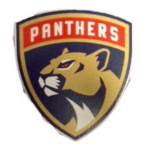
keep in mind the shield thing is because they wanted something similar to 101st airborne logo. both viola and cifu are from west point academy, theyre very big with the military. all their front office hires are also from there. so the decision to go with the shield was military inspired, and why they have the text above the logo as well.
some people are saying it should show teeth, which i don't think would be bad, but i think its fine like this too. its regal, serious, proud, simple, determined, i think its a good look. and i love the design of the panther overall. love the logo as a whole but i would prefer no text, either just the panther, or just the panthers with the blue background (which would still be a shield design but very close to an upside triangle).
some people are saying it should show teeth, which i don't think would be bad, but i think its fine like this too. its regal, serious, proud, simple, determined, i think its a good look. and i love the design of the panther overall. love the logo as a whole but i would prefer no text, either just the panther, or just the panthers with the blue background (which would still be a shield design but very close to an upside triangle).


