Ducks & Kings to Unveil New Logos

StreetHawk

Registered User
Sep 30, 2017
27,028
10,211
The LA Kings are the only ones who have officially released their “new” logo. The Ducks have had teasers and leaks, but @BKarchitect made a mockup that is pretty close.

So for folks keeping score, all 3 California teams have now “rebranded” to a essentially a version of their 1990’s identities within the last couple of years. The pull of nostalgia is strong

...and lucrative.

View attachment 885209
Feel like SJ and LA for sure could have had better logos. SJ added a couple of better ones that they used on their shoulder which is a cleaner look of the shark. Kings, just think a crown would be better than having to read Los Angeles Kings. I mean, a logo is just a symbol of the team, so should be able to just look at it and figure out the name. Ducks, little surprised they went back to the Disney one, but probably thought they would do the more front facing Duck that they use on their shoulder patch. All orange will take time to get used to, like it was for all Teal for SJ.

There is a fine line between simple and complicated for a logo. The more complicated it is, it loses that detail when the logo is used for small items like a hat, pin, scarf, etc. than on a T-shirt, jersey, jacket, etc. Some of those concept logos for the various Utah names on their board were way overly complex to be a logo.
 

Ruggs225

Registered User
Oct 15, 2007
8,859
4,842
Long Island, NY
Here's a bit of a clearer mock-up of the Ducks logo based on the jersey leaks/teasers.

- Orange eye
- Orange sticks
- Gold accents in lieu of silver
- Removed the extra striping around the puck
- Assuming the Orange and Gold pantones are the same as their current brand

iskSgsm.png
Ugh orange. Why?

Teal and Eggplant. Why is this so hard.
 
  • Like
Reactions: DingDongCharlie

Voight

#winning
Feb 8, 2012
41,213
17,684
Mulberry Street
I didn't mind their recent logo, but always loved the Gretzky era Kings logo so happy to see it back.

Ducks would've hit a homerun if they did what every single hockey fan wanted them to do and use teal + eggplant.
 
  • Like
Reactions: DingDongCharlie

Rich Nixon

No Prior Knowledge of "Flyers"
Jul 11, 2006
15,054
19,179
Key Biscayne
I’m not really a fan of the orange and black, as a Ducks fan, but I don’t get this at all. A couple of you have said this now about Philly owning orange and black. How many other teams in the league share similar color schemes and nobody seems to have an issue with it? The owners are embracing the county they play in, Orange County, for better or worse.

I actually do have an issue with it because I just like colors/design and hate watching two teams play in boring-ass kits when there are so many hues and combinations out there. The Rangers/Caps and Rangers/Canes series were like eye poison to me.

6 primary/secondary colors. 7 if you add black. 32 teams. There has always been and always will be significant overlap in color schemes, for anybody to say that one color belongs exclusively to one team is simply idiotic.

Haha. This is a dumb thought.

This is blue. This is also blue. Here's a green. Here's another green. This is a third green, just for fun.

Maybe if there were 150 teams in the league we could start encountering diminishing returns scenarios where we begin to have this conversation, but there are five teams who use red/white/blue schemes with a lot of overlap—the Habs, Caps, and Rangers live in similar palettes as each other, as do the Blue Jackets and Jets. Two teams in just white and navy, two in black and yellow, two in red/black/white (and another that's just red and white).

So when one team lands on the same shade of a primary color (primary as in their main uniform color, not primary color as in red yellow blue) as another, it's just like...why? Especially when that franchise can claim ownership of two otherwise-unused shades/colors across the league.

The Kraken managed to appear in the league with an entirely unique color scheme. The Golden Knights actually used a charcoal dark grey as their primary color at the start—though I assume that doesn't exist, because it's neither a primary color or...black. When mixing unique hues, the combinations and possibilities are quite literally infinite. "With 32 teams, it's inevitable" is a very silly thing to say.
 
Last edited:

BKarchitect

Registered User
Oct 12, 2017
7,524
13,097
Kansas City, MO
The Ducks orange isn’t and has never been the same Pantone as the Flyers…and is even less close to the Flyers since Philly switched to the darker burnt orange this past season.

Orange has been a part of the Ducks brand for two decades and is actually, you know, a color found on certain features of a duck.

I think the eggplant and teal is hard to beat but if the Ducks want to embrace orange, great, that’s up to them.
 
  • Like
Reactions: Crazy8oooo

Rich Nixon

No Prior Knowledge of "Flyers"
Jul 11, 2006
15,054
19,179
Key Biscayne
The Ducks orange isn’t and has never been the same Pantone as the Flyers…and is even less close to the Flyers since Philly switched to the darker burnt orange this past season.

Orange has been a part of the Ducks brand for two decades and is actually, you know, a color found on certain features of a duck.

I think the eggplant and teal is hard to beat but if the Ducks want to embrace orange, great, that’s up to them.

The Ducks updated their orange for this rebrand and yes, the color is incredibly similar to the one the Flyers just embraced. Icethetics claims it's the exact same Pantone code—I don't think it will be that identical when revealed in full, but it's certainly damn close in the "spooky uniform reveal photography" lighting. I think the Ducks went a bit darker.

1500x500


Home-Jersey-1-1-.jpg


I have never seen any color remotely like that on a duck, by the way. It's just the "Orange County" thing driving the change.

You know what color I have seen on a duck? Teal! Or, more fittingly, I've seen teal on a teal. The word "teal" is a synonym for "duck." In fact, the name of the color derives from certain species of the animal.

It's also not uncommon for mallards to feature deep purplish hues on their rear feathers or, in rare occasions, on their heads. It's why the OG Ducks scheme was so good! Because it was related to ducks!

800px-Flickr_-_law_keven_-_Happy_Feathery_Friday......jpg

8603439880_83719f4e38_b.jpg


(I'm having fun on a dead Friday afternoon at work, this is not all that serious. But seriously.)
 
Last edited:

cptjeff

Reprehensible User
Sep 18, 2008
21,097
36,730
Washington, DC.
I actually do have an issue with it because I just like colors/design and hate watching two teams play in boring-ass kits when there are so many hues and combinations out there. The Rangers/Caps and Rangers/Canes series were like eye poison to me.


Haha. This is a dumb thought.

This is blue. This is also blue. Here's a green. Here's another green. This is a third green, just for fun.

Maybe if there were 150 teams in the league we could start encountering diminishing returns scenarios where we begin to have this conversation, but there are five teams who use red/white/blue schemes with a lot of overlap—the Habs, Caps, and Rangers live in similar palettes as each other, as do the Blue Jackets and Jets. Two teams in just white and navy, two in black and yellow, two in red/black/white (and another that's just red and white).

So when one team lands on the same shade of a primary color (primary as in their main uniform color, not primary color as in red yellow blue) as another, it's just like...why? Especially when that franchise can claim ownership of two otherwise-unused shades/colors across the league.

The Kraken managed to appear in the league with an entirely unique color scheme. The Golden Knights actually used a charcoal dark grey as their primary color at the start—though I assume that doesn't exist, because it's neither a primary color or...black. When mixing unique hues, the combinations and possibilities are quite literally infinite. "With 32 teams, it's inevitable" is a very silly thing to say.
Okay, now do how many teams use the exact same royal blue. Or navy blue. Or black. Or shade of red. Because a lot of those exact shades are identical and nobody has ever given a crap. Many times they're identical because the colors that can be reliably reproduced and are available for jersey fabrics and equipment as well as fan gear are limited. As they always have been for all of sports equipment history.

The Flyers used to use a brighter orange. Now they're using a darker one. It got very little attention because they're still an "orange" team, not a "PMS 172 C" team.

And let's be real, Even if the ducks were using a different shade of orange people would still be whining about the exact same thing. The exact shade is totally irrelevant to this discussion, and you are smart enough to know that.

And yes, it is possible to find unique shades, but there's also going to be substantial similarity and overlap. And guess what? That's okay.
 

StreetHawk

Registered User
Sep 30, 2017
27,028
10,211
Okay, now do how many teams use the exact same royal blue. Or navy blue. Or black. Or shade of red. Because a lot of those exact shades are identical and nobody has ever given a crap.

The Flyers used to use a brighter orange. Now they're using a darker one. It got very little attention because they're still an "orange" team, not a "PMS 172 C" team.

And let's be real, Even if the ducks were using a different shade of orange people would still be whining about the exact same thing. The exact shade is totally irrelevant to this discussion, and you are smart enough to know that.

And yes, it is possible to find unique shades, but there's also going to be substantial similarity and overlap. And guess what? That's okay.
Orange, unless it's burnt like U of Texas or Creamsicle like the old TB Bucs or U of Tenn, not going to notice much of a difference. Same with all of the pure red NHL teams in chi, det, mon, wash, nj, cal, etc. Only if you get deeper reds like wine red or something would you see a difference, like AZ.
 

Rich Nixon

No Prior Knowledge of "Flyers"
Jul 11, 2006
15,054
19,179
Key Biscayne
Okay, now do how many teams use the exact same royal blue. Or navy blue. Or black. Or shade of red. Because a lot of those exact shades are identical and nobody has ever given a crap. Many times they're identical because the colors that can be reliably reproduced and are available for jersey fabrics and equipment as well as fan gear are limited. As they always have been for all of sports equipment history.

The Flyers used to use a brighter orange. Now they're using a darker one. It got very little attention because they're still an "orange" team, not a "PMS 172 C" team.

And let's be real, Even if the ducks were using a different shade of orange people would still be whining about the exact same thing. The exact shade is totally irrelevant to this discussion, and you are smart enough to know that.

And yes, it is possible to find unique shades, but there's also going to be substantial similarity and overlap. And guess what? That's okay.

I do hate that! I acknowledged in the post I'm quoting that I don't like all the overlap and I find it visually unappealing on TV to watch two teams face off in the same colors. So I'm responding to a team consciously making the decision now to continue that trend.

In the Rangers/Habs case, at least the Rangers use blue as their "primary" while the Habs are red-forward, and those teams are old as shit so, oh well. The Caps are those colors because MERICA, but they had a somewhat unique scheme when they went to the royal/black/gold, which could've been good with the right template. Just bored of that scheme. It is to hockey what just "RED" is to baseball. Cardinals, Angels, Phillies, Reds, all the same damn uniform from afar.

The Flyers have played with their orange in the past—it has moved through a few subtle shades, but mostly been the color they're wearing now. The lighter color from 2010-2023 was the deviation from their history, and why their new management made such a big show of reverting to the "good ol' days" shade of the color.

The Ducks are essentially going to an orange/white/black scheme with a gold accent, which is pretty redundant. I like the orange pants if they go that route. I'll like the jerseys too, because I'm fond of orange as a color. But it's already out there. It's not as if it's just the use of orange at all—a pretty similar orange is a major part of the Oilers' look, but it pops differently when it's accenting navy blue. Hell, the Ducks could've used the same damn shade of orange and combined it with their old eggplant purple and it would've looked AWESOME.

I just kinda find it frustrating and baffling when you have so many options yet end up with so little variety. Like, branding a sports team is one of the coolest things you can do. You get to build a whole identity from the ground up, and turn those colors into on-ice uniforms and off-ice merch that your devoted fans will want to wear day-in and day-out to show their pride in the team. My feeling about that is that you should always try to stamp out something that's distinctly unique and yours, just as a point of pride. I was equally miffed when the Tampa Bay Lightning decided that they, too, were going to be the Toronto Maple Leafs. Why? It's dumb!

This is all in good fun. My favorite part of the NHL games is Franchise Mode, specifically because I like building cool-ass looks for fake teams.
 
  • Like
Reactions: Evergreen

Turin

Erik Karlsson is good
Feb 27, 2018
23,077
27,024
I'll say the crown is improved here. The crown with the hockey sticks is.. Pejorative Slured.
 

StreetHawk

Registered User
Sep 30, 2017
27,028
10,211
I do hate that! I acknowledged in the post I'm quoting that I don't like all the overlap and I find it visually unappealing on TV to watch two teams face off in the same colors. So I'm responding to a team consciously making the decision now to continue that trend.
when Ana/Phi play, it will be: Phi in black pants white jersey/helmet vs an All Orange Ducks team. Or it's black pants/helmets and orange jersey vs Orange pants and white helmet/jersey of Ana.

I think that's more than enough of a contrast for those 2 teams.

NJ/CHI virtually the same with black and red. Same with Leafs/Bolts and NYR/CBS. That's where it's odd. Especially TB and Tor. Looks like a scrimmage when they play.

I also don't get the LA purple/yellow love. They've had black as their main color since 1988. 36 years. You'd have to be in your early 40's minimum to even remember their purple/yellow days. On this board, that's old.... as I'm in my 40's and I barely recall them in those colors.

I do think Purple is a massively underused color in the NHL and other sports, same with Green. Was hoping Seattle would have gone green vs another shade of blue.
 

Rich Nixon

No Prior Knowledge of "Flyers"
Jul 11, 2006
15,054
19,179
Key Biscayne
Many times they're identical because the colors that can be reliably reproduced and are available for jersey fabrics and equipment as well as fan gear are limited. As they always have been for all of sports equipment history.

Oh and I skipped this the first time around but it's also a crazy thing to say. What is this, the 1500s? Do we need to open new trade routes to India so we can get a purple team?
 

3074326

Registered User
Apr 9, 2009
11,621
11,084
USA
The Ducks updated their orange for this rebrand and yes, the color is incredibly similar to the one the Flyers just embraced. Icethetics claims it's the exact same Pantone code—I don't think it will be that identical when revealed in full, but it's certainly damn close in the "spooky uniform reveal photography" lighting. I think the Ducks went a bit darker.

1500x500


Home-Jersey-1-1-.jpg


I have never seen any color remotely like that on a duck, by the way. It's just the "Orange County" thing driving the change.

You know what color I have seen on a duck? Teal! Or, more fittingly, I've seen teal on a teal. The word "teal" is a synonym for "duck." In fact, the name of the color derives from certain species of the animal.

It's also not uncommon for mallards to feature deep purplish hues on their rear feathers or, in rare occasions, on their heads. It's why the OG Ducks scheme was so good! Because it was related to ducks!

800px-Flickr_-_law_keven_-_Happy_Feathery_Friday......jpg

8603439880_83719f4e38_b.jpg


(I'm having fun on a dead Friday afternoon at work, this is not all that serious. But seriously.)

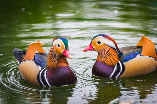
Ducks are neat. The mandarin duck has some pretty crazy colors, including some orange.

360_F_134364809_s5XjNOpJPTCXHAk4uYS1vrU4O9bqtduc.jpg
 

Rich Nixon

No Prior Knowledge of "Flyers"
Jul 11, 2006
15,054
19,179
Key Biscayne
Ducks are neat. The mandarin duck has some pretty crazy colors, including some orange.

360_F_134364809_s5XjNOpJPTCXHAk4uYS1vrU4O9bqtduc.jpg

Quite a bit of orange on those ducks (and that's a great purple too). Those are beautiful ducks. We live near a lake and my toddler is obsessed with ducks, so we spend a lot of time standing on the shore staring at ducks while she yells "duck! duck!" The variety of colorations and the richness of colors on even regular old North American mallards is crazy. Birds rock.
 

kvladimir

Registered User
Dec 1, 2010
787
395
I also don't get the LA purple/yellow love. They've had black as their main color since 1988. 36 years. You'd have to be in your early 40's minimum to even remember their purple/yellow days. On this board, that's old.... as I'm in my 40's and I barely recall them in those colors.
Being too young to remember seeing them play live in those colours doesn't mean you can't look at photos / mockups and be like "yep, that looks better" :skeptic:
 

Crazy8oooo

Puck Off!
Sep 12, 2010
2,417
1,361
Orange County
I actually do have an issue with it because I just like colors/design and hate watching two teams play in boring-ass kits when there are so many hues and combinations out there. The Rangers/Caps and Rangers/Canes series were like eye poison to me.


Haha. This is a dumb thought.

This is blue. This is also blue. Here's a green. Here's another green. This is a third green, just for fun.

Maybe if there were 150 teams in the league we could start encountering diminishing returns scenarios where we begin to have this conversation, but there are five teams who use red/white/blue schemes with a lot of overlap—the Habs, Caps, and Rangers live in similar palettes as each other, as do the Blue Jackets and Jets. Two teams in just white and navy, two in black and yellow, two in red/black/white (and another that's just red and white).

So when one team lands on the same shade of a primary color (primary as in their main uniform color, not primary color as in red yellow blue) as another, it's just like...why? Especially when that franchise can claim ownership of two otherwise-unused shades/colors across the league.

The Kraken managed to appear in the league with an entirely unique color scheme. The Golden Knights actually used a charcoal dark grey as their primary color at the start—though I assume that doesn't exist, because it's neither a primary color or...black. When mixing unique hues, the combinations and possibilities are quite literally infinite. "With 32 teams, it's inevitable" is a very silly thing to say.
Sure, a team can easily come up with a new color scheme that’s unique to only them. But why should they have to if they are fixated on a certain primary color? It’s not like he’s just being stubborn because he likes orange (or perhaps it could be an underlying reason), but it makes perfect sense for him to build off of orange when he’s implanted himself into Orange County and has spent billions of dollars contributing to the county. As a Ducks fan, it sucks that I think it’s an ugly color to wear around. I’d much more prefer to wear a different color scheme for a hat that I wear casually about. But other than that, I really think it’s silly to say he should come up with a different color because Philly just happened to join the league sooner and started using that color before the Ducks existed. It’s, of course, your prerogative to be annoyed by it, it just seems silly to me.
 

Rich Nixon

No Prior Knowledge of "Flyers"
Jul 11, 2006
15,054
19,179
Key Biscayne
Sure, a team can easily come up with a new color scheme that’s unique to only them. But why should they have to if they are fixated on a certain primary color? It’s not like he’s just being stubborn because he likes orange (or perhaps it could be an underlying reason), but it makes perfect sense for him to build off of orange when he’s implanted himself into Orange County and has spent billions of dollars contributing to the county. As a Ducks fan, it sucks that I think it’s an ugly color to wear around. I’d much more prefer to wear a different color scheme for a hat that I wear casually about. But other than that, I really think it’s silly to say he should come up with a different color because Philly just happened to join the league sooner and started using that color before the Ducks existed. It’s, of course, your prerogative to be annoyed by it, it just seems silly to me.

Yeah, we went through all the county discourse prior. I'd say if it were my team and they were switching up, I would not want them to go to colors that corresponded with an existing established brand in the same sport when there were so many unused options (and a unique existing palette in-house that no one else uses). I'm not legitimately annoyed by it because it's trivial as shit, I just have lots of thoughts about sports aesthetics and write lots of words fast.
 
  • Like
Reactions: Crazy8oooo

Crazy8oooo

Puck Off!
Sep 12, 2010
2,417
1,361
Orange County
Yeah, we went through all the county discourse prior. I'd say if it were my team and they were switching up, I would not want them to go to colors that corresponded with an existing established brand in the same sport when there were so many unused options (and a unique existing palette in-house that no one else uses). I'm not legitimately annoyed by it because it's trivial as shit, I just have lots of thoughts about sports aesthetics and write lots of words fast.
I hear you, man. And that’s what’s so good about these types of forums. We can all have different opinions and yet still find commonality in the sport itself. As I mentioned, orange wouldn’t be my first choice either, but for different reasons than yours.:cheers:
 
  • Like
Reactions: Rich Nixon

Ducks4Cup

Registered User
Jun 14, 2022
139
116
Thank you ducks for keeping the orange!
Everything you can do to distance the franchise from the embarrassment of the original Mickey Mouse tinker bell garbage is appreciated
 
  • Wow
Reactions: CanadienShark

DieSendungmitderMaus

Registered User
Apr 14, 2018
1,107
1,559
I've reached the acceptance stage about the Ducks being orange, don't love pairing it with gold though. I think that's why I'm lukewarm on these leaks while I love that the Flyers went back to full orange a decade+ ago (along with a healthy dose of nostalgia, for a lack of better word)

Was really hoping to see some diagonal/non-symetrical striping alas. I thought it looked fantastic on those old Ducks/Caps sweaters, but sadly I can't see any team that hasn't had them before going with it. That element actually makes the Ducks' cup winning Jersey tolerable for me.

It certainly is a big improvement on their current look though! So take what you can get.
 
  • Like
Reactions: DrandonBudinsky

Ad

Upcoming events

Ad

Ad