TheMoreYouKnow
Registered User
It was easy to dunk on the team, I mean it's based on a children's movie, it has a cartoon character logo. They typically sucked, and if you lived out East you could go a long time without actually watching any of their games as well.this is definitely true. It was the lame Disney jersey that only little kids liked. I guess in a way that makes sense though because all us little kids grew up and still love them and want them back.
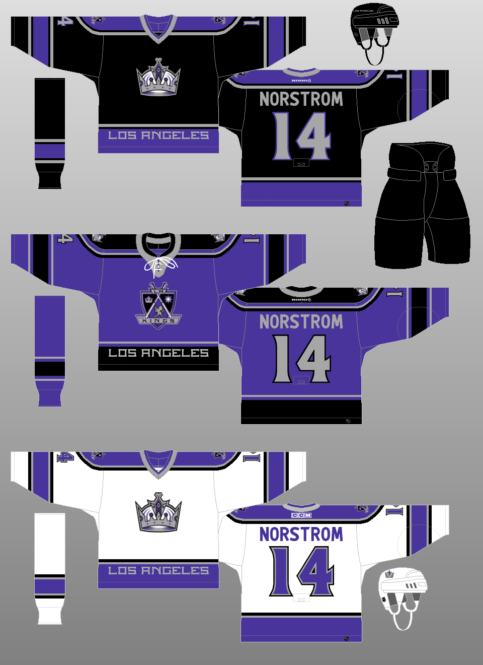
I also think their white (then home) look isn't all that popular even now. There's a reason here people go on about the 'aubergine'/'eggplant'/'purple' so much..which of course wasn't very prominent on their home whites at all (in fact given this was the age before HD broadcasting, it wasn't always easily recognized as such to begin with on TV).
It's clear though that the new owners hated all of it. After the sale but before the rebranding, i.e. during the 2005/06 season, the team wore the black alternates without the Disney logo as much as they possible could. And I actually think those black/aubergine jerseys were among the slickest new looks of the last 30 years. It's actually astonishing how much better they looked than the black/purple Kings jerseys of the 00s. The Kings went with a blue-ish matte purple which really didn't look particularly good on its own or with any combination of colors, meanwhile the Ducks' almost maroon like color really popped with white and black. I think if they had stuck with the eggplant as a secondary color instead of orange back then, their rebranded look would have become much more popular.