Ducks & Kings to Unveil New Logos

SettlementRichie10

Registered User
May 6, 2012
10,132
8,191
Those are obviously beautiful, but I've always wished they would run with a modernized version of these:
Kings29.png


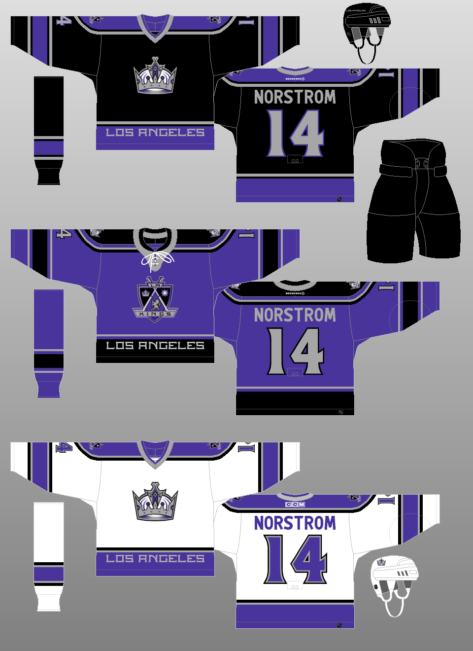
There's plenty of yellow/gold in the league already, and I've always thought purple/black/white/silver is an incredibly underrated colour scheme. I'd want to see some simplification of the design though, including an updated crown logo, removing the writing on the hem, changing the name and number font, and simplifying the outline of the shoulder yoke.

Middle ones are the best
 

BB79

Registered User
Apr 30, 2011
5,302
6,292
I can see that.

It took me a while to fully appreciate the ‘Coat of Arms” logos/crests they went with during the purple and black era. I liked the use of Crown/Sun/Lion to graphically convey Kings and Los Angeles.
View attachment 880746

It also took me owning one of these jerseys to realize that the lion wears sunglasses. 🤷🏻‍♂️
View attachment 880745
I never noticed the sunglasses on the lion until now, as I'm on the east coast and never saw the Kings alternates much but that's hilarious 😂 but that logo always reminded me of the free masons logo because of the shape that the crossed hockey sticks makes

They also would look a lot better without the "Los Angeles" wordmark on the lower portion, instead they should have used the same sleeve design there.
 
  • Like
Reactions: DrandonBudinsky

DrandonBudinsky

Black & Blueshirts
Mar 15, 2022
232
347
SADisonSquareGarden
I never noticed the sunglasses on the lion until now, as I'm on the east coast and never saw the Kings alternates much but that's hilarious 😂 but that logo always reminded me of the free masons logo because of the shape that the crossed hockey sticks makes

They also would look a lot better without the "Los Angeles" wordmark on the lower portion, instead they should have used the same sleeve design there.
Hah! Yup! I had to do a double take when I got the jersey delivered. Sure enough, freakin lion’s sportin’ shades!

Agreed.
I think these purple/black jerseys would probably benefit on the current Adidas/Fanatics jersey cut. I’d lose the “Los Angeles” on the bottom hem and make the shoulder yokes less busy. (May be too many accent stripes) And also, Crown crest >> Coat of Arms crest. It’s just less busy.

As an aside, being a Rangers fan, it kills me a little seeing Norstrom on the back of these Kings jerseys due to the byproduct of McSorley/Kurri heading the other way for a reunion with Gretzky in NY ☹️
 

Rich Nixon

No Prior Knowledge of "Flyers"
Jul 11, 2006
15,052
19,175
Key Biscayne
Is it the same? Hoping they release some more sneaks. But if it is similar, eh, it happens. 🤷🏻‍♂️

Hey, At least it’s not like these two.
When they play each other, it sometimes looks like an intersquad scrimmage when the screen is small enough

View attachment 883768
According to Icethetics, the same:

The Ducks have had the shittiest uniforms in the league the last two decades for no reason. I think these new uniforms are gonna look great, I'm excited to see them, but like...you're still trying to find good branding 30 years in, even though you have internationally-recognized IP, complete with unique colors, sitting in your back pocket if you just Wear the Stupid Movie Jerseys?

They're a company, they do the research, maybe they find that selling a whole new look to every member of their existing fanbase is more valuable than leveraging the wider recognizability of the original branding (even now that 90s kids are parents and its nostalgia cycle is peaking). I hope the template is good and unique, though. I really like the stuff they put out in their second little teaser tweet.

I think I've talked myself into being offended by this though--by the Ducks and their indecision about who they are and by the Flyers letting their brand get so weak that a team would even feel comfortable trying to forge its identity using that exact color. Ed Snider would've sued or blown up someone's car if he were alive :laugh:

Oh by the way I also think the Lightning look stupid as shit wearing Red Wings jerseys in Leafs colors. Literally infinite color combinations and uniform design opportunities and these dumb sports teams can't figure it out.
 
Last edited:

njdevils1982

Hell Toupée!!!
Sep 8, 2006
38,737
26,106
North of Toronto
Meh, it’s better than another team with a black jersey

im still pissed about the devils "jersey jersey"....

its a hawks jersey from 1927-28 which they used recently in an outdoor game in 2019

....what a farce


the devils thought a one season team (1928-28 ....which was bad) being used as inspiration for an alternate that was copied almost 100 years ago was good idea? who signed off on this shit.


zero thought was put into this one.

two f***ing times copied!!!!!!
 

NWWisconsinDuck

Registered User
Jun 28, 2023
103
252
My God, Philly fans are a sensitive bunch, not that we didn’t already know that. Being offended by another team’s color? Get a f***ing life.

I have looked forward for years to a return to the eggplant and jade but the owners have made it clear that isn’t happening. The Ducks have used slogans with the word orange, they’ve used orange rally towels in the playoffs, they have literally worn orange jerseys before and oh yeah, they play in ORANGE County.

How dare the Hurricanes choose red as a color knowing that the Red Wings also wear it. How dare any team choose Blue knowing there’s a team called the Blues. They should be sole owners of that color, obviously.

JFC.

As a side to this. I love the teaser and I am pumped about getting the best logo in hockey back that isn’t an original 6 one.
 
  • Like
Reactions: Raccoon Jesus

NYRfan85

D'oh!
Jun 2, 2020
442
510
South Carolina
I like that the Ducks are leaning into the orange and gold now; it makes sense for a team named the Ducks that plays in Orange County. Who cares if the Flyers already wear orange... Toronto/Tampa and Pittsburgh/Boston wear the same color scheme. The Flyers don't have gold in their scheme either. Looking forward to the reveal!

As for the Kings, I'd love if they returned to the purple and gold. They've been hitting the reverse retros out of the park, so they need to lean into those.
 

ujju2

Registered User
Apr 9, 2016
9,687
6,585
Edmonton, AB
The black jersey is very dark without any white. Should lose the shoulder colors IMO to clean it up.

Personally would go with either this crown logo or the more rounded one from the gold days. Don’t need to read Kings on the logo. Think the crown easily explains that this represents kings.

Yeah, I like these.

I would keep the silver in the crown and otherwise make the lettering white on the dark jerseys. It pops more.

Along with the other changes you suggested, I think they would have something there.

The Kings are one of those teams that makes me wish they switched it up every year like in soccer (or maybe every couple of years). They have a wealth of interesting elements to choose from and I don't really hate anything they've done.

I did a quick concept of the Kings a couple years ago. Not completely sure if this is still the logo I'd use today (as opposed to a modernized version of the classic crown), but otherwise this is what I came up with, and I still think it's the direction they should go. I would go with the purple at home, but they won two cups in black so I anticipate they'd want to keep the home jersey black.

LA Kings.png
 

StreetHawk

Registered User
Sep 30, 2017
27,022
10,201
I like that the Ducks are leaning into the orange and gold now; it makes sense for a team named the Ducks that plays in Orange County. Who cares if the Flyers already wear orange... Toronto/Tampa and Pittsburgh/Boston wear the same color scheme. The Flyers don't have gold in their scheme either. Looking forward to the reveal!

As for the Kings, I'd love if they returned to the purple and gold. They've been hitting the reverse retros out of the park, so they need to lean into those.
Probably the combo of Orange and Black. Isles and Oilers have done Orange jerseys, but their other color is a shade of blue. Going with a charcoal/cobalt Grey with Orange also works, but I think Anaheim is going with the Orange/Black vs going back to the Eggplant and Green.
 

thegazelle

Registered User
Nov 11, 2019
237
422
As long as it doesn't look like that cheesy triangular Penguins logo years ago (just awful), I look forward to the changes. Full on purple jersey would be great for the Kings.

Ducks could use a name change rather than a jersey change.
 

Ratsreign

Registered User
Mar 12, 2018
4,527
6,571
Fans: “purple. We want purple.”
Management: “Ok, and we hear you, but our research group is saying black and grey, not enough of that in the league. And.. powder blue, the toughest, least used color. Like what the Thrashers did, ya, that look. Anywho, are you excited for the new jerseys!?”

Hope I’m wrong, but I still hold a grudge over the buffaslug debacle. Claiming they got hacked when their own coding slowly revealed the coiled shit they placed on the jerseys, A+ as always from Buffalo.
It’s almost like they don’t want to look like the Lakers. I hated the purple when I was a kid, now I wish they would return to it, and the crown logo, too. Back to the Gretzky era Raiders look, instead.
 
  • Like
Reactions: TheDawnOfANewTage

Elvs

Registered User
Jul 3, 2006
12,317
4,743
Sweden
I'm happy to get the old logo back, but would much have prefered the old color scheme to return with it.

Imo, since they are so keen on using orange because of the team's location in OC, they might as well rebrand from "Anaheim" to "Orange County" while they're at it. Then the colors would make perfect sense and even be preferable, even if I'm personally no fan of orange.
 
  • Like
Reactions: piqued

cptjeff

Reprehensible User
Sep 18, 2008
21,090
36,713
Washington, DC.
Middle ones are the best
Really?

Like, actually really? You think those are good in any way?

0320-lak02a-pics.png


They were a muddled pile of three zillion things going on, none of them good. The black and grey didn't have much contrast. They floated on the purple rather than adjoining each other, so they blended into the background rather than standing out. The black didn't provide a very strong contrast with the purple either, so what you got was a mushed together pile of weak, dull elements that blur together even close up and far, far too many of them. Nobody could decided what the logo should be, so they slapped a bunch of ideas into a big crest thing. The "LA" on their logo wasn't enough, so they added a giant crotch wordmark- that era of the kings being the only time anyone's ever done that for very good reason. It was godawful and ugly.

I suppose it was considerate of them to add a bib for the messy eaters, though.

Seriously, that Kings uniform was one of the worst ever worn in the NHL. Burger King and Wild Wing included. Those at least were fun.
 

Zegs2sendhelp

HFBoards Sponsor
Sponsor
Jul 25, 2012
40,995
36,753
I'm happy to get the old logo back, but would much have prefered the old color scheme to return with it.

Imo, since they are so keen on using orange because of the team's location in OC, they might as well rebrand from "Anaheim" to "Orange County" while they're at it. Then the colors would make perfect sense and even be preferable, even if I'm personally no fan of orange.
I actually prefer the

Orange + green
Or
Orange + purple

Maybe not this, but something like this

198294AE-FD24-481D-AD7F-23F339B8B779.jpeg
 

DrandonBudinsky

Black & Blueshirts
Mar 15, 2022
232
347
SADisonSquareGarden
I did a quick concept of the Kings a couple years ago. Not completely sure if this is still the logo I'd use today (as opposed to a modernized version of the classic crown), but otherwise this is what I came up with, and I still think it's the direction they should go. I would go with the purple at home, but they won two cups in black so I anticipate they'd want to keep the home jersey black.

View attachment 883914
Nice job! These are cleaner lines and I agree about updating the collar and tie downs on all the sets. I’d even go bolder and suggest trying purple pantshells on at least the white and purple jersey sets 😮
 
  • Like
Reactions: ujju2

ujju2

Registered User
Apr 9, 2016
9,687
6,585
Edmonton, AB
Really?

Like, actually really? You think those are good in any way?

View attachment 883921

They were a muddled pile of three zillion things going on, none of them good. The black and grey didn't have much contrast. They floated on the purple rather than adjoining each other, so they blended into the background rather than standing out. The black didn't provide a very strong contrast with the purple either, so what you got was a mushed together pile of weak, dull elements that blur together even close up and far, far too many of them. Nobody could decided what the logo should be, so they slapped a bunch of ideas into a big crest thing. The "LA" on their logo wasn't enough, so they added a giant crotch wordmark- that era of the kings being the only time anyone's ever done that for very good reason. It was godawful and ugly.

I suppose it was considerate of them to add a bib for the messy eaters, though.

Seriously, that Kings uniform was one of the worst ever worn in the NHL. Burger King and Wild Wing included. Those at least were fun.

I personally think these were a good idea with poor execution, but the general idea and colour scheme I think would look great (with white added). Curious what your thoughts are on my concept which I posted above.

Nice job! These are cleaner lines and I agree about updating the collar and tie downs on all the sets. I’d even go bolder and suggest trying purple pantshells on at least the white and purple jersey sets 😮
I think the black pants provide some needed balance, but that would definitely be interesting.

If the Kings don't adopt purple (and it looks like they won't) I really hope the Utah team will, following in the footsteps of the Jazz, once they actually finalize their branding next year. The NHL needs a purple team.
 

DrandonBudinsky

Black & Blueshirts
Mar 15, 2022
232
347
SADisonSquareGarden
I suppose it was considerate of them to add a bib for the messy eaters, though.
What is seen, cannot be unseen. Oh man. I did always think that grey collar is garishly big. Never saw anyone refer to it as a bib!

I agree with points in your post. This purple alternate was way too busy with many competing elements for attention. There’s too many piping stripes on the yoke (also too much space in between them) and that Coat of Arms crest is super busy.

If they’d gone with a simpler shoulder yoke, conventional collar, negated the huge LOS ANGELES lettering at the bottom and slapped on the crown crest instead, this may have been more streamlined. But, good points all around.

Hah! Bib.
 

SettlementRichie10

Registered User
May 6, 2012
10,132
8,191
Really?

Like, actually really? You think those are good in any way?

View attachment 883921

They were a muddled pile of three zillion things going on, none of them good. The black and grey didn't have much contrast. They floated on the purple rather than adjoining each other, so they blended into the background rather than standing out. The black didn't provide a very strong contrast with the purple either, so what you got was a mushed together pile of weak, dull elements that blur together even close up and far, far too many of them. Nobody could decided what the logo should be, so they slapped a bunch of ideas into a big crest thing. The "LA" on their logo wasn't enough, so they added a giant crotch wordmark- that era of the kings being the only time anyone's ever done that for very good reason. It was godawful and ugly.

I suppose it was considerate of them to add a bib for the messy eaters, though.

Seriously, that Kings uniform was one of the worst ever worn in the NHL. Burger King and Wild Wing included. Those at least were fun.


The business of the logo is one is the reasons I like it. It’s a coat of arms. Traditional coats of arms are busy and overdesigned with a lot of fine detail. Thats the point.
 
  • Like
Reactions: Raccoon Jesus

StreetHawk

Registered User
Sep 30, 2017
27,022
10,201
The business of the logo is one is the reasons I like it. It’s a coat of arms. Traditional coats of arms are busy and overdesigned with a lot of fine detail. Thats the point.
The Lion on the coat of arms might be better with just the head. Logos are more than just on a jersey, it's on hats, t-shirts, mugs, etc. Lose detail when it gets smaller, like the sunglasses on the lion.
Sometimes less is more. Either a nice detailed crown or if the coat of arms is the option, keep each of the 3 segments simple, which 2/3 are with the crown and sun. Maybe opt for the chess piece of the King, or just a Lion head.
 

PhysicalGraffiti

Bolts STM
Jul 26, 2007
4,311
1,904
NY to TB
I'm one the very very few who doesn't want the Mighty Ducks logo back and never really liked it.

I liked the webbed D, but it definitely is better as a shoulder/secondary logo.

I wish they would have done something cool with a unique name like the Ducks. It would have been great to see an actual duck head and body used.

Like this:

1718732847349.jpeg


I LOVE that logo.
 

Raccoon Jesus

Draft em but don't play em
Oct 30, 2008
62,398
63,500
I.E.
It’s almost like they don’t want to look like the Lakers. I hated the purple when I was a kid, now I wish they would return to it, and the crown logo, too. Back to the Gretzky era Raiders look, instead.

Our working theory is that Robitaille is colorblind

even going back to the Hull Olympiques he's worn greyscale uniforms
 
  • Like
Reactions: SirJW

DrandonBudinsky

Black & Blueshirts
Mar 15, 2022
232
347
SADisonSquareGarden
I'm one the very very few who doesn't want the Mighty Ducks logo back and never really liked it.

I liked the webbed D, but it definitely is better as a shoulder/secondary logo.

I wish they would have done something cool with a unique name like the Ducks. It would have been great to see an actual duck head and body used.

Like this:

View attachment 883953

I LOVE that logo.
For their first rebrand, Ducks tried going that route of moving away from cartoon duck to realistic looking duck. None of those designs quite landed (no pun) and they gravitated towards the Webbed D.

These are from Chris Creamer’s excellent book on jerseys, you can see where Anaheim’s agency was trying to go:
A379C419-AB56-4489-B063-37F71E98A805.jpeg
 

PhysicalGraffiti

Bolts STM
Jul 26, 2007
4,311
1,904
NY to TB
For their first rebrand, Ducks tried going that route of moving away from cartoon duck to realistic looking duck. None of those designs quite landed (no pun) and they gravitated towards the Webbed D.

These are from Chris Creamer’s excellent book on jerseys, you can see where Anaheim’s agency was trying to go:
View attachment 883960
I like a lot of those!

I like more complicated logos in general, but especially 90s era teams with unique names like the Ducks and Lightning, I feel like deserve something that goes with unique nature.
 

Ad

Upcoming events

Ad

Ad