Speculation: Caps General Discussion (Coaching/FAs/Cap/Lines etc) - 2020 Offseason Pt. 3

  • Xenforo Cloud will be upgrading us to version 2.3.5 on March 3rd at 12 AM GMT. This version has increased stability and fixes several bugs. We expect downtime for the duration of the update. The admin team will continue to work on existing issues, templates and upgrade all necessary available addons to minimize impact of this new version. Click Here for Updates
Status
Not open for further replies.


cut.png

cut.png
 
Really like them, looks like I’m spending 250 for another jersey lol. I wanted the Blue but Red came out better than I expected
 
I feel alright about it.

My least favorite part of the mock up was the amount of red they piped into the eagle logo, but this relatively simple navy and white doesn't look so bad.

I think overall they escaped into the upper half/third of the jersey ranks, which is fine by me.
 
  • Like
Reactions: JohnCarlsaurus
I would have preferred they just rework them in base white, or just rerelease the originals damnit, but I'll cop one.

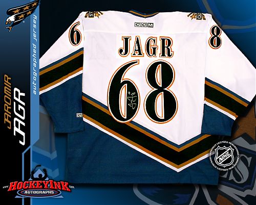
I still need a damn Kolzig white throwback though. >:(
 
Didn't think I'd like them but I think they're pretty great. Assume they will have a product line with sweatshirts, t-shirts, etc in this design? I'm not a huge jersey guy but definitely want some of this gear.
 
It's good. It's for just some games.

I also like when the "C" and "A" are on the other part of the chest. Like on Detroit's jersey
To be different than the rest of the teams.
 
Caps fans need to buy the new Penguins and take it to a good customerizer and have them remove the P and replace it with SH and wear them all when the Pens come to town. Ovi would love it!!
 
The real question is who’s sweater do I get. I already have Kuzy, Backstrom, Oshie and Carlson. Might have to get Ovechkin or Wilson
 
That's beautiful... hard to say until I see it in game but it's at least as good as our current jerseys.
 
I honestly hope that something about these refreshed throwbacks also brings back the period of hockey jersey prevalence in hip hop. One of the things that's keeping me from being too harsh on a lot of these is that they seem pretty intentionally designed to shake things loose and generate exposure. All these fresh looks might turn some heads and that's always positive.
 
  • Like
Reactions: AlexModvechkin8
I honestly hope that something about these refreshed throwbacks also brings back the period of hockey jersey prevalence in hip hop. One of the things that's keeping me from being too harsh on a lot of these is that they seem pretty intentionally designed to shake things loose and generate exposure. All these fresh looks might turn some heads and that's always positive.

I think they call it Marketing. ;)

give people a reason to buy another version of something they might have 5 of (or 500 COUGH**RIDLEY***COUGH)......
 
I'm not a fan of the angled stripes on the bottom. Goes back to an awful period in hockey sweaters. But the Blue on Red Screaming Eagle looks much better than the original. Also the Jolly Roger on the shoulder looks good, and they kept it fairly clean. Not a huge fan, but if your going to do a retro 90's look, this is about as good as you can do.
 
I forgot how much I hated the typeface of the numbers on the 90s/00s jerseys until now. The colors look sharp, though. Can't wait to see it on someone in full pads with the helmet and pants to get a proper feel for how it will look on the ice.


Hard to tell for certain from the video (pics don't show it at all), but it looks like they kept that awful, clunky 2 shape. Hopefully they at least updated the 6s and 8s to not be as terrible.

443.jpg

jaromir-jagr-washington-capitals-white-ccm-replica-jersey_33ba5b44b65b35ccbf48168dec5e933e.jpg
 
I think I like the Kings the best. Those things are absolutely gorgeous. And the Wild killed it too. Also really like the sweaters for Arizona, St Louis, Florida, Montreal, Edmonton, and New Jersey. Honestly I think the NHL did well with these except for...

Dallas, Detroit, Calgary, both New York teams, Winnipeg, and Toronto. Burn them all with fire.

I love the Nordiques look for Colorado but I don’t think they should use it — if an owner decides to move the team I think there’s no way they should use the old logo/colors/etc as a marketing ploy. f*** the Hurricanes wearing the Whalers jerseys forever.
 
  • Like
Reactions: JohnCarlsaurus
I think I like the Kings the best. Those things are absolutely gorgeous. And the Wild killed it too. Also really like the sweaters for Arizona, St Louis, Florida, Montreal, Edmonton, and New Jersey. Honestly I think the NHL did well with these except for...

Dallas, Detroit, Calgary, both New York teams, Winnipeg, and Toronto. Burn them all with fire.

I love the Nordiques look for Colorado but I don’t think they should use it — if an owner decides to move the team I think there’s no way they should use the old logo/colors/etc as a marketing ploy. f*** the Hurricanes wearing the Whalers jerseys forever.
I actually think the NHL made most of the right calls here. Honor franchise continuity (North Stars colors in the Wild jersey, Hartford colors, Nordiques template), except in the cases where the rebranding has since been rectified by other franchises (Jets maintaining Jets continuity instead of Arizona, the Wild not actually BEING the North Stars, etc.)

The NHL has a messy history and isn't exactly solid on some of these things but it feels like the most sensible outcome most of the time. If Quebec had a team, give it to them, but otherwise it's a much better historical jersey to revisit than the early Avalanche ones, and they kind of already shot their wad on their best chance at a reverse retro from their own time period when they released this dud a few years ago:
thumb.aspx


I guess maybe a white version of the maroon ones could have passed but what we got looks great so I'll let it slide, personally.
 
Status
Not open for further replies.

Ad

Upcoming events

Ad