Best NHL Jerseys of All Time

  • Work is still on-going to rebuild the site styling and features. Please report any issues you may experience so we can look into it. Click Here for Updates
Back before it meant anything to me (i.e., 1996 and earlier) I remember feeling it was in the realm of the Clippers, Pacers, Islanders as ugly, un-marketable names that seemed like leftovers from another era. I never, ever heard anything about the Whalers name or logo being a classic when people talked about the NHL.

Seems there's a pretty heavy retro-filter applied to it. Just IMO.
Throughout the 80's and into the 90's the Whalers logo was omni-present in every single conversation about the best logos in the NHL or even sport.
 
  • Like
Reactions: Whaleafs
meloche.jpg


howes.jpg


Original WHA Whalers (politically incorrect but hey, I like them,
love Whales too, not conflicted) & Seals a couple of my favorites
Yeah, those Seals unis are beautiful.
 
^^^ Yep. Always loved the Blues uniform, logo's brilliant, great color combination.... though why you'd post a pic of one of their many fashion crimes over the years in messing it up with "Blues" written across the front like that I dont know Bexly. :(
 
Seriously?

There are several much better Wings jerseys in hockey history.

I have HATED the Wings (in the 90's) but the franchise have had some sweet knitted jerseys with strings.

That red collared, Stanley Cup clashin' jersey shouldn't make any Detrit fan's top 5, unless of course Steve Yzerman signed it or something.

Here is a waaaaaaaaaay cooler Wings jersey, and not just because Gordie's wearing it.

gordie-how-900px.jpg


I wish I could find that ol' Wings knitted jersey with the strings. It's over a half century old but I can't recall on whom I saw it and thought: "Man, I'd wear that." And I ain't no Wings fan!

Dont care what you think, stick to baby blue and mustard Mr. Objective.
 
I think this is probably my favorite one, ever, in the NHL:

Montreal-Canadiens-Heritage-Home-1944-Sweater-N573_XL.jpg


It just looks so classy, clean, and uncluttered. (And I prefer the 'white' jerseys in general.)

I agree with the page 1 poster who nominated the Gretzky-Kings'-era jerseys, especially in his first two or three seasons there:

36029_01_lg.jpg


As far as the worst goes, it has to be any of the mid-to-late-90s' ones that were introduced, with the ridiculous "angled" lines on the arms and the super-complex logos (such as sampled on page one of this thread). Those were brutal. St.Louis's were particularly ugly in the mid-to-late-90s, as were most of the Ducks' ones.

I have to agree that Vancouver takes the prize as worst-jersey franchise. I don't even know how to begin to explain their ineptitude in basic graphic design. I just don't like Blue and Green in combination on sweaters (so I don't like the Whalers' ones), and the only thing worse than that was the 80s' ones, which defy description:

VCanucksRCCMV82RJB.jpg


But they're all terrible:
images
s-l225.jpg
mcKGMq0inY8GZYxnIS3-umw.jpg
images


Also, why have they had so many logos, all of them bad? The 'zooming skate' I sort-of get. The orca logo is just ugly. And what's with the hockey-stick one? Is that supposed to be a 'C', or is it just a stick for no particular reason?

I liked the 95 canucks jersey. The balck one. Other than that yea I agree. Nucks always had the bad end when it comes to jerseys.

VancouverCanucks92-93jersey.jpg
 
Hobnobs and I agree on squat these days, it seems.

The home white jerseys rocked everyone I knew back in Kamloops. It was RARE to see anyone who had bought the road black.

linden-skate.jpg
 
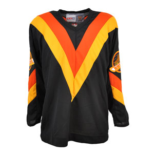
... call me weird.... been called a lot worse.... but I liked the Nucks' "Flying V" aka "Halloween Uni's".... the original circa 70 "Hockey Stick" & retro throwback they came out with a few years back. Not a fan of the above including their latest iteration/design.... I mean seriously VanIsle, that logo is just too big & busy for my tastes. Its wearing the player, he's not wearing it... and ya I know I know, Heresy. :naughty:
 
I admire how the Penguins and Oilers decided a few years ago to go back to their early color schemes. I wish more teams had the guts to do that instead of beating a dead horse. Teams like the Kings and Stars are constantly evolving into some ugly jerseys, instead of embracing their best ones (Gretzky era for the Kings and late 90's for the Stars)
 
  • Like
Reactions: Whaleafs
I always thought the combination of the Toronto Maple Leafs blues and the Los Angeles Kings whites always looked the best as far as two uniforms in game action. Greatest of all time:

cropped_gretzky.jpg

Have to agree, despite how triggering that picture is.
 
I think this is probably my favorite one, ever, in the NHL:

Montreal-Canadiens-Heritage-Home-1944-Sweater-N573_XL.jpg


It just looks so classy, clean, and uncluttered. (And I prefer the 'white' jerseys in general.)

I've always thought the one you posted was the nicest Habs jersey by far. Especially with the white on white numbers. (Ignoring the name plate foul)
s-l300.jpg
 
Last edited:
howes.jpg


Original WHA Whalers (politically incorrect but hey, I like them,
love Whales too, not conflicted) & Seals a couple of my favorites

I have to agree with you Killion. The WHA Whalers uniforms were very nice with the kelly green and gold colors. I actually thought they were nicer than the NHL Whalers uniforms.

161570112.jpg

s-gordie-howe-of-the-hartford-whalers-skates-against-the-boston-at-picture-id87129443
 
  • Like
Reactions: Killion
2eba51094f715e361ae157dfafdff6f5.jpg

This one-year iteration ('69-'70) of the original Oakland Seals jersey with the white shoulder yoke is my favorite of theirs.

xdetdelv_200805214.jpg

Simple design with only two colors but I like how the shoulder yoke encroaches onto the red sleeves.

stanmikita2.jpg

A work of art....

I really can't stop at three. So many great jerseys...
 
  • Like
Reactions: Killion
My favorite would have to be the those used by the Winnipeg Jets in the Heritage Classic game on October 23, 2016 as well as 2 other times during the 2016-17 season. The uniforms were based on those worn by the WHA Winnipeg Jets and should have been carried forward when the Jets joined the NHL in 1979. Unfortunately, Jets GM John Ferguson decided to switch to a replica of those worn by the New York Rangers from 1976 to 1978 when he was their GM.

mark-scheifele-of-the-winnipeg-jets-plays-in-the-2016-tim-hortons-nhl-picture-id620894084
plr279x2.jpg
 
Whalers jerseys are overrated. I like the Nordiques one better. Nicer colors and a bit more expressionistic.

I actually semi-like the Picasso Coyotes jerseys. They are still pretty ugly but there's something Tkachuk-Tverdovsky late 90s feeling about them I can tolerate, which is strange because I dislike Tkachuk and is indifferent towards Tverdovsky. I visited the States in the late 90s and I remember seeing Greg Adams on television in that jersey thinking he was past his prime. He still scored at a 50-point pace though.
 
^^^ Yep. Always loved the Blues uniform, logo's brilliant, great color combination.... though why you'd post a pic of one of their many fashion crimes over the years in messing it up with "Blues" written across the front like that I dont know Bexly. :(
Even stranger than adding the giant "BLUES" above the note was adding the tiny "St. Louis" on the note. Just a mess design-wise.
 
I liked the 95 canucks jersey. The balck one. Other than that yea I agree. Nucks always had the bad end when it comes to jerseys.

VancouverCanucks92-93jersey.jpg

The strange thing about this sweater, from a design point of view, is the odd choice to have the Canucks word mark and logo plummeting downwards. Generally you would think they would got for shooting skyward, but this logo, rather strangely, is plummeting down.

Also very odd is the space inside the two "C's" in the word mark. On the white sweater, it looks fine, but here on the black sweater, we actually see white in those spaces. It should be black like the rest of the logo. It's like they simply forgot to re-color that for the black sweater. Again, very very strange.
 
Last edited:
  • Like
Reactions: SealsFan
Even stranger than adding the giant "BLUES" above the note was adding the tiny "St. Louis" on the note. Just a mess design-wise.

Ya that was a strange one. Like we dont know where your from? Wouldnt be any wiser if someone didnt know as it would be too small to read unless you were right up close to it..... Vancouver again with their name plastered across the front... some however in terms of extremes, like this one below without the name written & all those feathers everywhere would have overwhelmed the logo however in the case of "Vancouver" over top of the 'C' & Whale logo it overwhelms, top heavy. Needless. Not just fashion blind but stunned.


PortWntrHwks_25yr00-01_TravisMit-1.gif


^^^ As for this.... remove the Nike swoosh, number, name & logo & it looks like a smock from a beauty parlor circa 1950's early 60's in some low market part of town.
 
The strange thing about this sweater, from a design point of view, is the odd choice to have the Canucks word mark and logo plummeting downwards. Generally you would think they would got for shooting skyward, but this logo, rather strangely, is plummeting down.

Also very odd is the space inside the two "C's" in the word mark. On the white sweater, it looks fine, but here on the black sweater, we actually see white in those spaces. It should be black like the rest of the logo. It's like they simply forgot to re-color that for the black sweater. Again, very very strange.

It's moving up from a left to right direction, so I don't know how that's plummeting...
 

Ad

Ad

Upcoming events

Ad